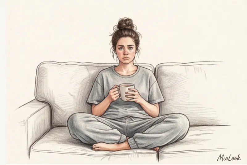
Let's try a little experiment. Close your eyes and think about what you're wearing at home right now. I bet you picture faded gray joggers, black leggings, or a bland "once-was-white" T-shirt. When choosing colors for our loungewear, we often follow a single rule: don't mind getting dirty. But you know what's ironic? According to the 2023 WGSN global report, modern women spend 60 to 70% of their time at home. So, we save beautiful shades for 30% of our lives, and spend the majority of our time compromising visually.
As a stylist with 12 years of experience, I can confirm that the color of the clothes you wear in the evenings directly determines the quality of your rest. We've covered the basic principles of building such a wardrobe in more detail in our The complete guide to creating a stylish home capsule , but today I want to talk about the most powerful tool in a stylist's arsenal - color.
The Gray Melange Trap: Why We Instinctively Choose Boring Colors for Loungewear
"Isabella, but gray melange is so cozy and practical!" I hear this phrase every other time I go through my wardrobe. And every time, I mercilessly toss the stretched-out gray suits into the recycling bin. Why?
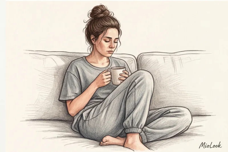
Gray melange is an optical illusion that works against you. Technically, it's a fabric woven from contrasting threads (usually white, light gray, and black). When you look at such a material, your optic nerve constantly registers this micro-contrast. This creates visual "noise" that prevents the eye from fully relaxing. Instead of the sensation of a soft cocoon, you get the effect of television static.
Moreover, light gray, when worn near a bare face, inevitably draws out the sallow tones of the skin. It highlights under-eye circles and makes one look downright haggard. Wearing old office or gym clothes around the house slowly but surely destroys self-esteem. You deserve to wear elegant colors not only for casual occasions, such as when you're out and about with colleagues and passersby, but also for the most important person—you.
Chromotherapy in the Closet: How the Colors of Your Loungewear Control Our Hormones
The influence of color on our mood is not esoteric, but pure physiology. When light reflects off the fabric of your clothing and hits your retina, a signal is transmitted to the hypothalamus, the part of the brain that regulates the endocrine system.
According to research by the Pantone Institute (2024), warm, complex earthy tones can reduce visual stress levels 15% more effectively than contrasting monochrome combinations. The wavelength of, for example, a soft terracotta color is physiologically perceived by us as the light of the setting sun. This signals to the body: "No danger, we can reduce cortisol production."
Your perfect look starts here
Join thousands of users who look flawless every day with MioLook. Our intelligent AI stylist will select the perfect palette for both home and outdoor use.
Start for freeNow think about classic office colors: crisp white, deep black, and crisp navy blue. They're designed to convey concentration, distance, and status. Wearing them at home is a fatal mistake, even if you work remotely. Your brain simply won't be able to switch from "combat readiness" to "restoration" mode.
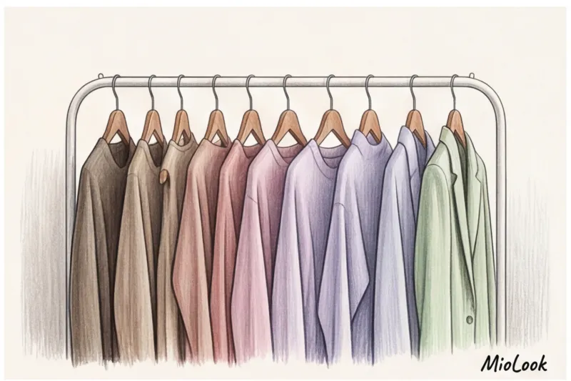
3 Color Capsules: Choosing Home Wardrobe Colors to Match Your Vacation Scenarios
In my practice, I've developed a unique method called "script capsules." Instead of dividing clothes into "beautiful" and "home," we divide them according to the tasks you perform at home. Each scenario requires its own palette.
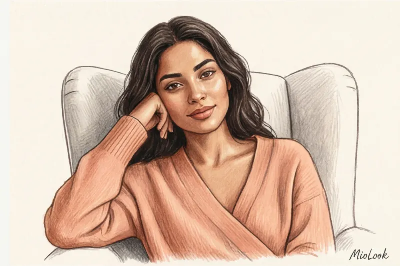
Scenario 1: Deep relaxation (evening after a hard day)
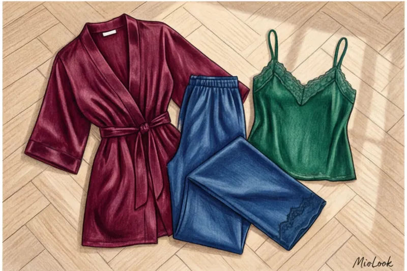
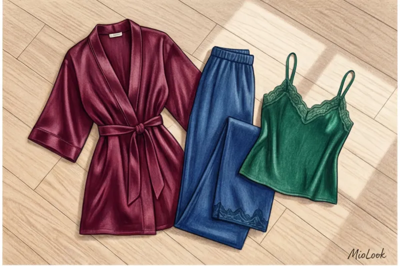
When you return home feeling drained, you need visual reassurance. Jewel tones are ideal here: emerald, deep sapphire, rich wine, and dark chocolate.
- Why they work: These dark yet rich hues absorb light, creating a sense of safety and security. Unlike black, which appears heavy and dull, gemstone tones have depth.
- The secret of the texture: These colors require careful application. They look flat on cheap polyester. Choose dense viscose (with 5% elastane added for comfort), modal with a weight of at least 180 g/m², or natural silk. The creases in these fabrics create a beautiful play of light.
"I'll be honest: this advice has one important caveat. If your bedroom or bathroom has cool lighting (bulbs with a color temperature of 5000K or higher), the sapphire silk will take on a deathly blue undertone and look clinical. In this case, opt for warm chocolate or wine tones."
Scenario 2: Weekend Energy (Household Chores, Hobbies, Family)
Need to clean, play with the kids, or cook dinner, but lack the energy? Forget the gray. What you need is a gentle energy boost.
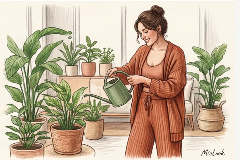
One of my clients, Anna, worked from home in IT and constantly complained about procrastination. On weekends, she couldn't even bring herself to unpack the dishwasher. We swapped her usual black fleece suit for a smooth knit set in a deep terracotta shade. And you know what? A week later, she wrote back that for the first time in six months, she happily repotted all her houseplants. The color worked like a light espresso.
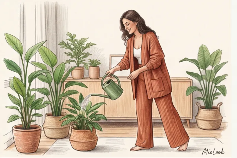
For active relaxation, choose terracotta, sage, soft peach, and warm mustard. Natural tones provide energy without being overbearing, unlike pure red or neon, which can quickly overwhelm the nervous system.
Scenario 3: Remote Office (Stress-Free Focus)
If you work from home, you need to find a happy medium. You should look professional on video calls, but not feel confined to the office corset.
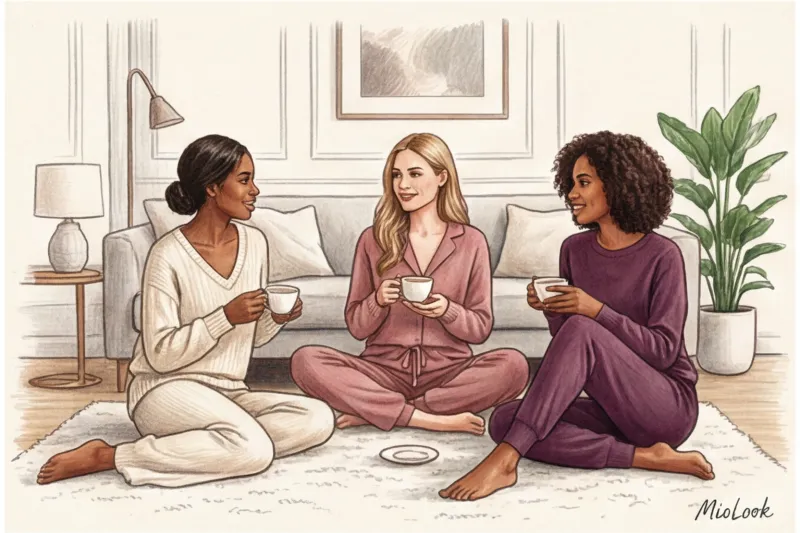
The perfect palette for Zoom meetings: dusty rose, camel, taupe, olive.
What should you absolutely avoid? Pure white near your face. Webcams often struggle with contrast: white overexposes the frame (throws out the exposure), and the camera automatically darkens your face, emphasizing all the shadows and uneven skin tones. Replace pure white with a shade of baked milk or ecru—the difference in reflected light will be dramatic.
How to choose the colors of your loungewear without makeup: secrets of your color type
At home, we often go makeup-free. And it's here that the color of our clothes, located right next to our face, takes on the role of foundation, blush, and concealer. If you choose the wrong shade for your homemade long-sleeve shirt, no eye cream will save you from looking tired.
How to use color as a cosmetic? The main rule: the shade of the fabric should match your skin tone. You can read more about How to mix warm and cool colors , but for a home base, remember the following principles:
- For skin with a warm (yellowish or olive) undertone: Choose peach, coral, warm beige, and tomato. These colors will instantly give your face a rested look, as if you've just returned from the Amalfi Coast. Avoid pale lilac and icy blue—they'll make you look sickly pale.
- For skin with a cool (pinkish) undertone: Your palette is dusty rose, berry, emerald, and cool taupe. Avoid mustard and pale yellow in the morning. The yellow reflection on fair skin without makeup will instantly highlight any redness and rosacea.
If you're unsure which shades are right for you, try image selection function in MioLook The app will help you analyze your appearance and create your perfect capsule wardrobe without leaving your home.
Stylish color combination formulas for the home from a stylist
Many people think they can just wear random pieces at home. But to feel like an Italian movie heroine in your own kitchen, you need a system. Here are my three signature style formulas that work flawlessly with brands of any segment (from basic Oysho and Uniqlo lines to premium silk):
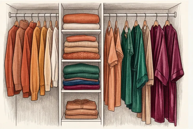
- Formula 1: Status Monochrome (Spa Resort Feeling)
Chunky knit milk cardigan + ribbed milk trousers + cream slippers.
A total, light monochrome always looks expensive. The secret to success here is in the contrast of textures. Pair smooth cotton with chunky knits to prevent the look from looking flat. - Formula 2: Analogue Triad (Mediterranean Comfort)
Terracotta trousers + peach long sleeve top + burgundy robe.
We use colors that are adjacent on the Itten color wheel. This creates an incredibly warm, enveloping effect without harsh contrasts. - Formula 3: Color Accent (Playful Mood)
A basic camel-colored knit suit + bright emerald (or berry) socks and a hair tie.
An ideal option for those who are afraid of bright colors in the portrait area, but want to add a little drive to everyday life.
Ready to update your home wardrobe?
Try MioLook's free plan—no commitments required. Upload photos of your belongings, and the AI will assemble them into stylish home storage capsules.
Start for freeChecklist: Auditing Your Home Palette
Stop reading—it's time to take action! Take 15 minutes today to do a quick audit of your loungewear shelf.
- Get rid of visual noise. Remove anything with pilling, stubborn stains, and those gray heathered pants. Even if you wear them "just to mop the floors," they'll ruin your mood for the entire evening.
- Apply the 3 color rule. To maximize your capsule wardrobe's versatility, choose one dark base color (e.g., chocolate), one light base color (e.g., ecru), and one accent color (e.g., terracotta or sapphire). If all your pieces fit into this scheme, you'll be able to pair any bottom with any top without any hassle.
- Calculate the cost per wear. We wear loungewear more than any other type of clothing. A high-quality, deep wine-colored silk robe that costs 10,000 € and that you wear 200 days a year costs you 50 € per outing. It's cheaper than a cup of coffee, but brings a hundred times more joy.
Your home is your place of power, and clothing is the layer closest to your body. Stop dressing on a leftover basis. Choose a color that makes you smile at your reflection in the mirror early in the morning, even if you have a long day ahead of you at the laptop on the kitchen counter.