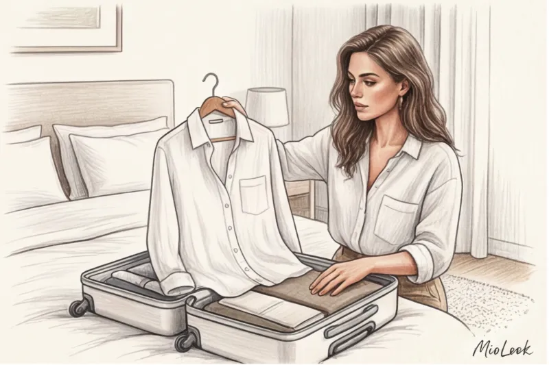
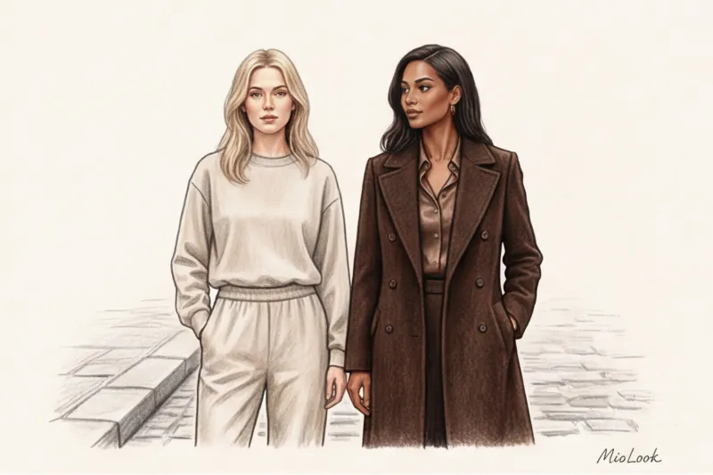
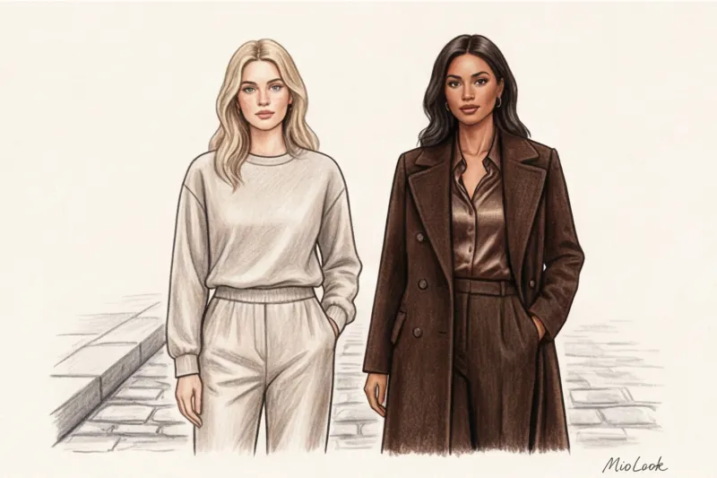
Пару месяцев назад ко мне пришла клиентка с классическим запросом: «Катажина, я хочу выглядеть статусно, но не тратить на это состояние». Она гордо продемонстрировала свежекупленный бежевый тотал-лук из популярного масс-маркета. Проблема заключалась в том, что этот «базовый» бежевый имел грязновато-желтый подтон на 100% полиэстере. Вместо ожидаемой роскоши, цвет мгновенно слился с кожей, подчеркнул следы усталости и визуально накинул девушке пять лет. Мы сдали эти вещи обратно и собрали капсулу в оттенках горького шоколада и глубокого navy из Massimo Dutti. Эффект был ошеломляющим — осанка изменилась, а образ стал выглядеть втрое дороже своей реальной стоимости.
Этот случай отлично иллюстрирует главное правило: благородные цвета в одежде — это не просто список оттенков, которые маркетологи назвали «трендом сезона». Это строгая математика пигмента, фактуры и контрастности. Подробнее о философии умного подхода к вещам мы говорили в нашем полном гиде Стиль вне времени: как создать элегантный гардероб. Сегодня же мы разберем анатомию цвета: почему один красный выглядит как униформа промоутера, а другой — как наряд королевской особы.
Что такое «благородные цвета в одежде» на самом деле?
Забудьте о чистых цветах радуги. Благородство цвета всегда кроется в его сложности. Согласно теории цвета Иоханнеса Иттена, глубина и статусность оттенка достигаются за счет добавления в чистый пигмент примесей серого, черного или коричневого. Именно эта приглушенность делает цвет «дорогим» для восприятия.
Исторически сложные, глубокие цвета (пурпур, индиго, изумруд) были прерогативой элиты просто потому, что добыть и закрепить такой многогранный пигмент на ткани было невероятно дорого. Наше подсознание до сих пор работает по этим старым лекалам. По данным исследования института цвета PANTONE и аналитиков WGSN (2024), около 70% людей подсознательно ассоциируют глубокие, приглушенные оттенки с высоким социальным статусом, надежностью и интеллектом.
Главное правило стилиста: цвет живет только на правильной фактуре
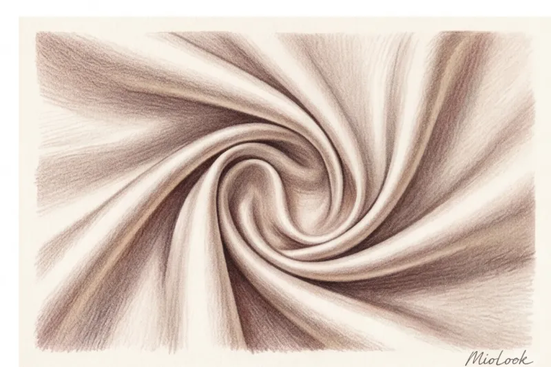
Самая частая ошибка, которую я вижу на улицах европейских столиц — попытка носить сложные цвета на дешевой синтетике. Технологии окрашивания неумолимы: натуральные волокна (шелк, кашемир, плотный хлопок, лен) имеют пористую структуру. Они впитывают пигмент глубоко внутрь и мягко отражают свет. Синтетика (акрил, 100% полиэстер) окрашивается поверхностно, из-за чего цвет получается «плоским» и часто блестит дешевым стеклянным блеском.
«Один и тот же оттенок винного цвета на шелковой блузе выглядит как произведение искусства, а на акриловом свитере — как выцветшая школьная форма. Если ваш бюджет ограничен, лучше купите вещь нейтрального цвета, но с хорошим составом (например, вискоза с добавлением шерсти), чем сложный цвет на чистом пластике».
Ваш идеальный образ начинается здесь
Присоединяйтесь к тысячам пользователей, которые каждый день выглядят безупречно с MioLook. Умный планировщик гардероба поможет сочетать фактуры и цвета.
Начать бесплатноМиф о бежевом тотал-луке: почему он работает не для всех
«Хочешь выглядеть дорого — надень бежевое». Этот стереотип, растиражированный инфлюенсерами, испортил немало гардеробов. В реальности бежевый — один из самых коварных цветов.
Проблема кроется в экономии брендов масс-маркета на качественных красителях. Дешевый бежевый пигмент часто уходит в грязный желтый, зеленоватый или мышино-серый подтон. Когда вы надеваете такую вещь близко к лицу, она работает как плохой фильтр: вытягивает на поверхность все покраснения кожи, синяки под глазами и делает лицо «уставшим». О том, как правильно интегрировать этот сложный цвет, можно прочитать в статье Бежевый цвет в деловом гардеробе: секрет мягкой силы.
Если вы не уверены в температуре своего бежевого, уводите его в нижнюю часть силуэта (брюки, юбки), а у лица используйте более контрастные благородные цвета в одежде. Это правило спасло гардероб десяткам моих клиенток.
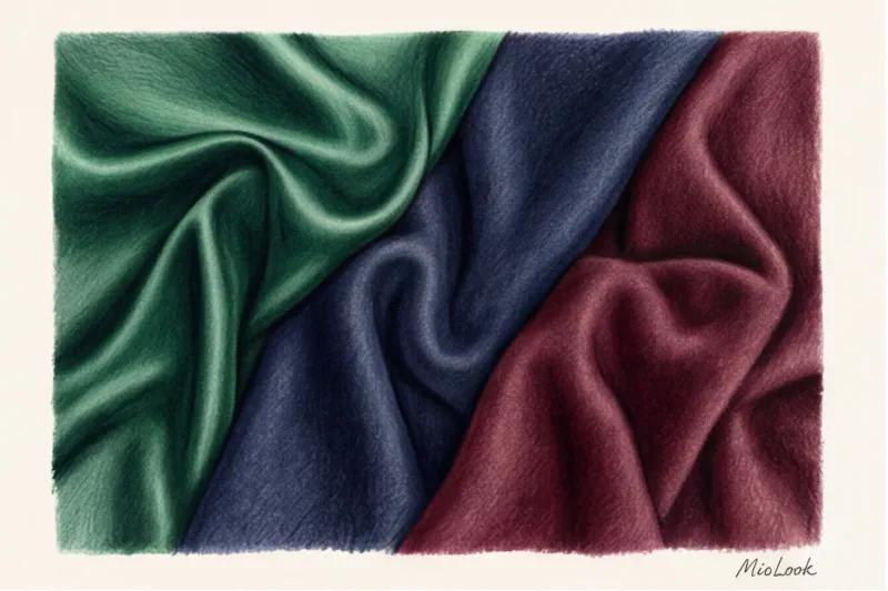
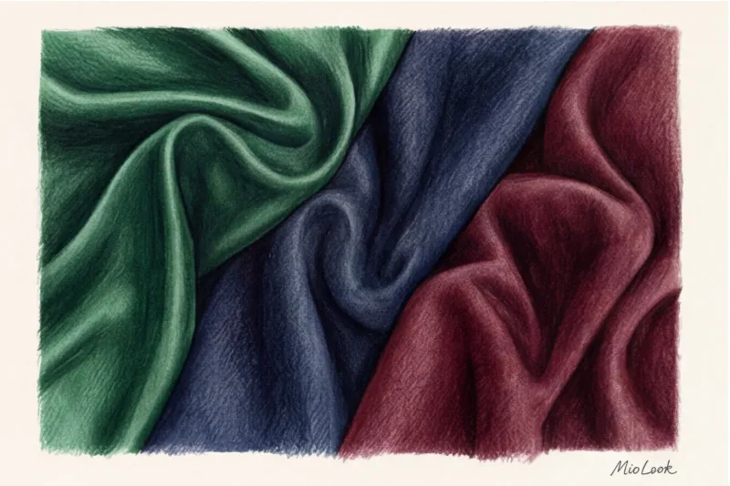
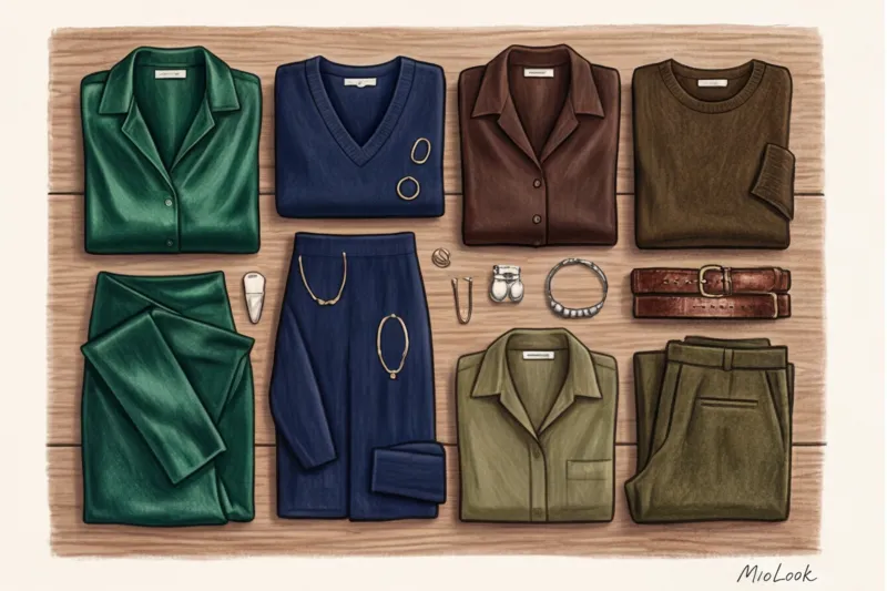
Топ-5 по-настоящему благородных оттенков для базового гардероба
За 12 лет работы персональным шопером я вывела пятерку беспроигрышных сложных цветов. Они выглядят статусно в любом ценовом сегменте — от H&M Premium до тяжелого люкса. Кроме того, статистика износа показывает: темные благородные цвета на смесовых тканях сохраняют первоначальный вид на 40% дольше, чем яркие неоновые или чистые спектральные цвета.
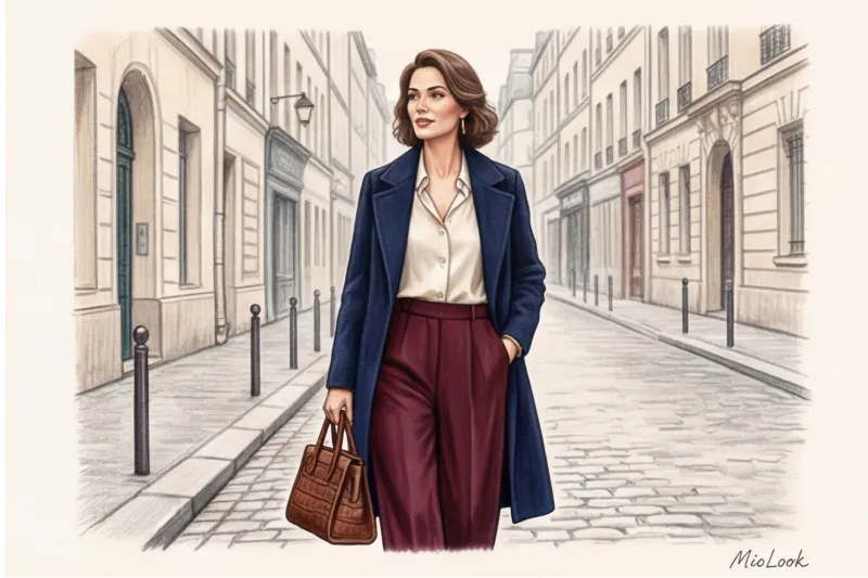
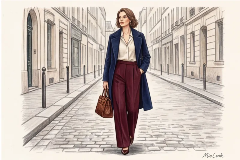
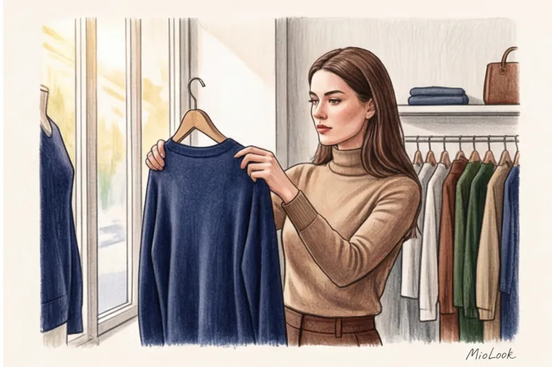
Глубокий синий (Navy Blue) — интеллектуальная альтернатива черному
Черный цвет у лица часто подчеркивает возрастные изменения и тени. Navy Blue (цвет формы британских моряков) работает иначе. В нем есть синий пигмент, который визуально «отбеливает» белки глаз и освежает цвет лица. Это идеальный выбор для пальто, жакетов и деловой капсулы. Зайдите в COS или Massimo Dutti — их базовые линейки всегда строятся вокруг идеального Navy.
Горький шоколад (Dark Chocolate) — тепло и статус
Самый актуальный цвет последних сезонов, который уверенно перешел в разряд вечной классики. Он несет в себе теплоту, но без излишней простоты коричневого. Долгое время считалось, что черный и коричневый не сочетаются — забудьте это устаревшее табу. Черные кожаные брюки и кашемировый свитер цвета горького шоколада — это квинтэссенция современной элегантности.
Винный и бургунди — акцент без крикливости
Алый цвет требует идеального кроя и безупречного макияжа, иначе он дешевит образ. Бургунди (смесь красного, коричневого и капли черного) прощает мелкие недочеты. Если вы боитесь носить винный цвет в портретной зоне, используйте его в аксессуарах. Сумка жесткой формы или кожаные лоферы цвета спелой вишни мгновенно повышают градус стиля всего наряда.
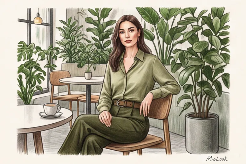
Изумрудный и оливковый — природная эстетика
Зеленые оттенки великолепно работают как связующее звено между базовыми цветами. Холодным типажам я всегда рекомендую глубокий изумруд (он роскошно смотрится на шелке и бархате). Теплым типажам — сложный оливковый. Оливковый тренч или брюки-палаццо выглядят гораздо интереснее набившего оскомину классического песочного цвета.
Жемчужный и молочный — правильный белый
Кипенно-белый цвет (цвет офисной бумаги) в природе встречается редко. В одежде он часто дает синеватый отсвет, который подчеркивает несовершенства зубов и кожи. Замените его на цвет экрю, слоновой кости, жемчужный или оттенок топленого молока. Эта микро-разница в пигменте колоссально меняет восприятие: образ становится мягким, лощеным и «дорогим».
Попробуйте MioLook бесплатно
Умный AI-стилист подберёт идеальный образ и поможет составить палитру, которая подходит именно вашей внешности.
Начать бесплатноКак внедрить благородные цвета в одежде в свой цветотип
Здесь я должна быть честной: не существует универсального цвета, который магическим образом украсит абсолютно всех. Благородная палитра требует адаптации под уровень контрастности вашей внешности. Если у вас мягкий, неконтрастный колорит (например, русые волосы и светлые глаза), глухой темно-синий или плотный бордовый у лица могут вас «задавить» — вы потеряетесь на фоне платья.
Как это обойти? Используйте правило портретной зоны. Все «не свои», но любимые благородные цвета мы уводим вниз: в юбки, брюки, обувь и сумки. А у лица оставляем те оттенки, которые подсвечивают кожу. Например, жемчужная шелковая блуза у лица и брюки цвета горького шоколада. Больше нюансов по подбору температуры оттенков можно найти в руководстве Деловой гардероб по цветотипу: ваши лучшие цвета.
Формула сочетания: как заставить палитру работать на вас
Собрать вещи правильных цветов — половина дела. Вторая половина — грамотно их стилизовать. Вот три практических приема, которые я использую на шопинг-сопровождениях:
1. Монохром через игру фактур. Надевать вещи одного цвета и одной фактуры (например, хлопковая рубашка и хлопковые брюки тон-в-тон) — скучно. Секрет дорогого монохрома в разнице поверхностей. Возьмите цвет Navy: шелковая струящаяся блуза + плотные шерстяные брюки со стрелками + замшевые лодочки. Свет отражается по-разному, и образ приобретает глубину.
2. Правило «2+1». Для повседневных образов используйте два базовых благородных цвета и один акцентный. Например: молочный свитер, брюки цвета горького шоколада и сумка глубокого винного оттенка. Это выглядит продуманно, но не перегружено.
3. Лайфхак с фурнитурой. Вы можете найти идеальный по цвету жакет в Zara или H&M, но его выдадут дешевые, блестящие пластиковые пуговицы. Мой любимый трюк: покупаем жакет хорошего кроя и цвета, идем в магазин тканей и покупаем роговые, металлические или обтянутые тканью пуговицы. Замена в ателье стоит копейки, но визуальная стоимость вещи вырастает на сотню евро. Дешевая фурнитура убивает самый дорогой цвет.
Чек-лист: проверяем вещь на «дорогой» цвет перед покупкой
Чтобы перестать скупать вещи, которые потом годами висят в шкафу, я рекомендую своим клиенткам проводить жесткий кастинг прямо в магазине. Вы можете сфотографировать вещи и загрузить их в MioLook, чтобы оценить сочетаемость, но физическую проверку ткани никто не отменял.
- Тест дневным светом. Лампы в примерочных (особенно в масс-маркете) настроены так, чтобы сглаживать цвета и льстить фигуре. Я всегда беру вещь и подхожу к окну или дверям магазина. Только при естественном дневном свете вы увидите истинный подтон ткани и поймете, нет ли в нем дешевой «грязи».
- Тест на подтон (с белым листом). Если сомневаетесь в оттенке молочного или бежевого, приложите к вещи обычный кипенно-белый лист бумаги (или белый экран смартфона). На контрасте с чистым белым мгновенно проявится скрытый подтон вещи — желтый, серый или розовый.
- Анализ состава. Читаем этикетку до примерки. Ищем смесовые ткани. Хлопок плотностью от 180 г/м², вискоза с добавлением 5% эластана, шерсть с акрилом (где шерсти не менее 50%). Если это 100% полиэстер — возвращаем вещь на вешалку, благородного цвета на ней не получится.
- Правило трех вещей. Перед походом на кассу мысленно (или в приложении) составьте с новой вещью три комплекта из того, что уже висит в вашем шкафу. Если благородный цвет не с чем носить, он превратится в «мертвый груз».
Элегантность — это не врожденный дар и не безлимитный бюджет на кредитной карте. Это дисциплина выбора. Благородные цвета в одежде работают только тогда, когда вы обращаете внимание на состав ткани, следите за фурнитурой и понимаете свою контрастность. Начните с замены черного на глубокий navy или горький шоколад, и вы увидите, как ваш гардероб задышит по-новому, приобретая тот самый лоск, к которому мы все так стремимся.