Print Combinations in Clothing: Why Patterns Are Ruining Your Capsule
Over 12 years of working as a personal stylist, I've sorted through hundreds of closets filled to the brim with clothes. And do you know what these wardrobes, whose owners utter the sacramental "I have nothing to wear" every morning, have in common? Their shelves look like a museum of contemporary art—abundant with intricate patterns, tropical florals, and abstractions. Women buy prints out of emotion, like a painting, completely forgetting that they'll have to wear this "painting" with other clothes.
Literate combination of prints in clothes — it's not just a visual trick; it's the foundation of an eco-friendly and functional wardrobe. We discussed color architecture in more detail in our a complete guide to the capsule's color palette , but today I want to talk about patterns. According to the WGSN report (2024), on average, women actively use only 20% of their wardrobe. The remaining 80% are typically impulse purchases, with items with complex patterns leading the way.
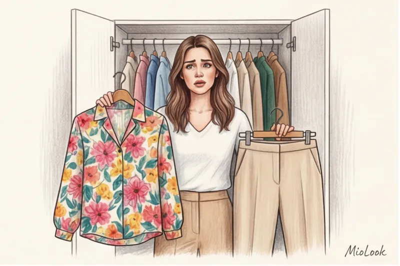
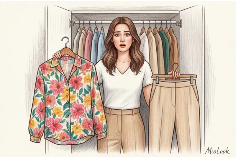
I had a client who bought a stunning silk blouse with large poppies. She built her entire capsule wardrobe around this complex pattern, adding red trousers, green jackets, and black bags. As a result, her wardrobe became a complete mess. The biggest mistake beginners make is trying to make the print the foundation rather than the icing on the cake.
Try MioLook for free
A smart AI stylist will select the perfect look based on your preferences and color type.
Start for freeThe 80/20 Formula: The Mathematics of a Smart Wardrobe
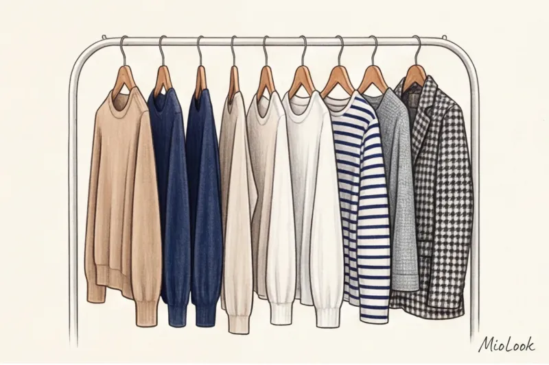
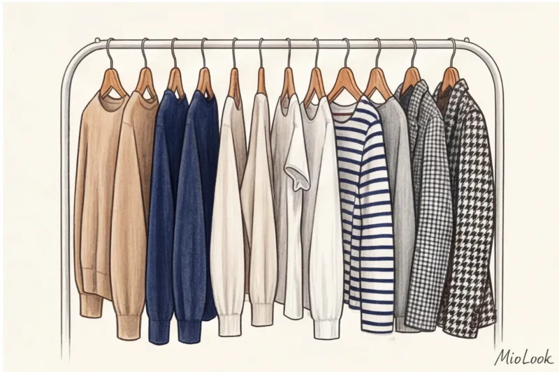
Sustainable fashion doesn't require you to give up shopping; it requires a mathematical approach. The ideal golden ratio for a functional capsule wardrobe is 80% solid items and a strict limit of 20% printed items.
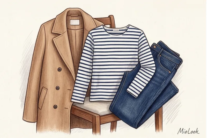
Why is this so? Imagine a capsule collection of 20 items. If 16 of them are high-quality solid-color base pieces (for example, a navy blue jacket, camel wool trousers, and a heavy white cotton T-shirt weighing at least 180 g/m²), and 4 are accent prints (a Breton striped shirt, a silk scarf, a checked skirt, and a structured houndstooth jacket), you get a mathematical infinity of combinations. Exceeding the 20% pattern limit dramatically reduces variability and inflates the cost-per-wear ratio. A striking daisy-print shirt will be remembered by colleagues the first time you wear it, and you'll wear it three times a season. A solid light blue poplin shirt will be worn 30 times, changing accessories.
"The most sustainable item is one you can wear for years. Smooth, solid-color fabrics offer maximum versatility, and if you're looking for a more dynamic look, use texture instead of print."
Texture (tweed, bouclé, grosgrain, cable knit) is a luxurious, prestigious, and eco-friendly alternative to flat printed patterns. It creates a play of light and shadow without disrupting the color harmony of the look.
Textile Truth: How Print Quality Affects Style
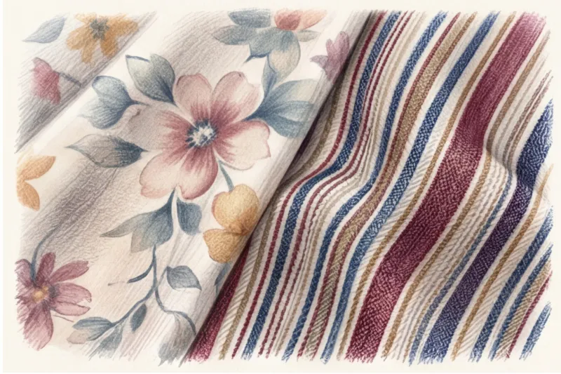
As a fabric specialist, I often see how cheap production ruins a designer's vision. In the textile industry, there are two fundamentally different ways to create a pattern: surface printing (screen printing) and the use of pre-dyed yarns (yarn-dyed, jacquard, and variegated).
When a print is simply "printed" onto smooth polyester or cheap viscose, the dye adheres only to the top layer of fibers. After 5-10 washes, the fabric's microfibers lift, the dye washes out, and the pattern fades. What happens next? That same blouse that perfectly matched your expensive burgundy trousers suddenly turns a faded pink and clashes with the base color. The color harmony of the capsule is ruined.
McKinsey analysts in their "State of Fashion" report note a massive shift among conscious consumers from fast fashion to long-term investments. That's why I always recommend my clients invest in woven Patterns. Classic Breton stripes, where dark blue and white threads intertwine, or Prince of Wales checks retain their geometric shapes and contrasts for decades. The color is inherent in the fabric's structure, preventing uneven fading and always retaining a classy look.
The Biggest Myth: "Animal print is the new base."
Open any glossy magazine, and you're sure to come across the phrase: "Leopard print is the new neutral." It's one of the most dangerous fashion myths, one I regularly debunk in my consultations.
The truth is, animal prints are extremely demanding. To avoid leopard or zebra prints looking vulgar, the fabric must be of impeccable quality: thick silk, structured cotton, or expensive wool. An animal print on thin, shiny mass-market polyester instantly cheapens the look. Moreover, these patterns have an aggressive visual dynamic that draws all the attention. They don't "dissolve" into the overall look the way a beige trench coat does.
Of course, this rule doesn't work for everyone. If your personal style is pure maximalism à la Iris Apfel, leopard print can become your signature. But if you're building a minimalist smart capsule collection, replace animal prints with abstract geometric patterns or classic polka dots. They're much safer, pair better with solid-color jackets, and don't evoke the fleeting trends of the 2000s.
Your perfect look starts here
Tired of racking your brain over outfit combinations? Upload your wardrobe to MioLook and get ready-made looks every day.
Start for free4 Pro Rules for Combining Prints and Solids
So, you have those 20% statement pieces in your closet. How can you make them work to their full potential without them becoming too gaudy? In styling, we use strict algorithms that allow us to flawlessly marry a complex pattern with a base fabric.
Color Anchor Rule
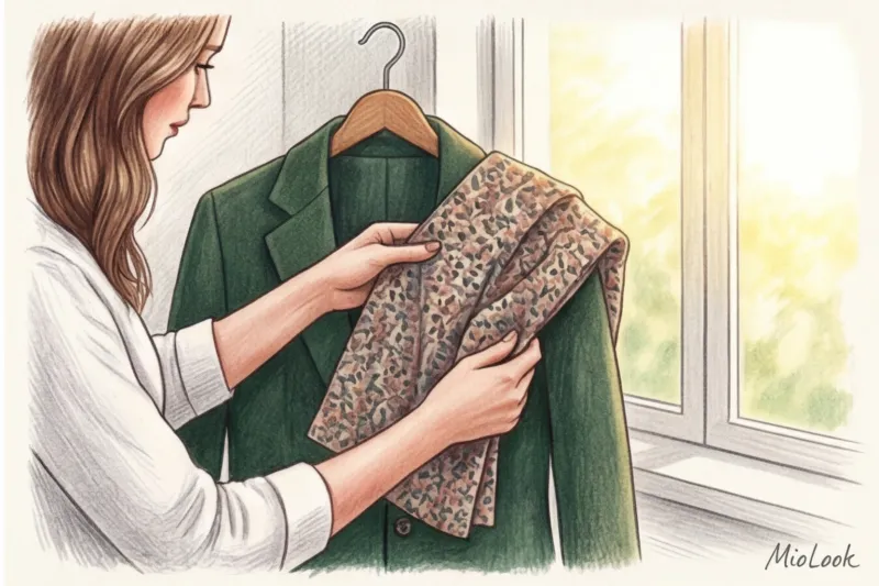
This is a basic technique for stylists on shoots. Carefully examine your print and find the most subtle, background, or secondary color. This shade should be "pulled out" and replicated in a solid color. For example, you have a blouse with a large dark blue floral pattern on a white background, but the floral core contains tiny burgundy flecks. By pairing this blouse with deep burgundy trousers (not blue, as would be expected), you'll create a sophisticated, incredibly harmonious, and luxurious look.
Pattern scale and figure proportions
Print is a powerful tool for manipulating attention and volume. Any contrasting pattern visually expands the area it's placed on. If you have full hips (a pear-shaped figure) and you wear a light, large-plaid skirt, you're deliberately enlarging your lower body. A rule of thumb: place a large, contrasting print in the area you want to add volume to or draw attention to. Save matte, solid fabrics in deep shades (navy, emerald, graphite) for areas you want to downplay.
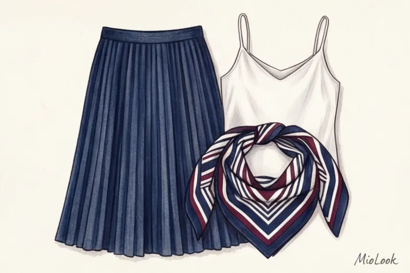
The Bridge Piece
What if you want to wear an emerald sweater and terracotta pants, but the look in the mirror seems torn in two? You need a "bridge piece." Typically, this is an accessory—a silk scarf, bag, or scarf—with a print that combines emerald and terracotta. This small patterned element visually justifies the presence of two vibrant solid color blocks and ties them together.
The rule of invoice balance
Never combine a bold print and a complex texture in the same design unless you're a pro. If your skirt has a bold geometric pattern, it should be made of a smooth fabric (silk, poplin, or fine wool). A solid-color top can be textured (fluffy mohair or chunky knit). A smooth print and a textured base = perfect balance. However, if the item is both printed and textured (for example, leopard corduroy), it's a stylistic time bomb.
Checklist: How to Choose Patterned Items for a Conscious Wardrobe
Before you take your next floral dress to the checkout, do a quick self-check. This process will help you avoid the mistakes we discussed at the beginning of this article.
- The rule of three images: Without buying anything new, can I create at least three different outfits with this item right now, using my solid-color base? If the answer is "no," the item stays in the store. You can add a photo of the item in advance. MioLook smart wardrobe , so that the algorithm can check for compatibility.
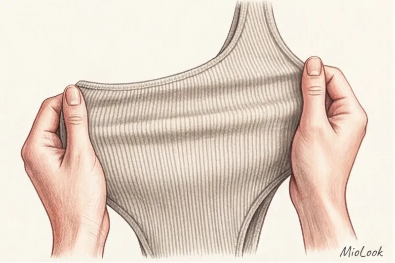
- Pattern Origin Test: Is this a cheap overprint or is the design woven from multicolored threads? Turn the item inside out: if the fabric is white on the inside and bright on the outside, the print will quickly wear off.
- Color DNA: Do the pattern's shades match your capsule's approved palette? If your base color is warm (camel, chocolate, gold), avoid prints with cool gray or icy blue undertones.
- Microtrend test: Isn't this pattern just a passing fad? Remember the tie-dye craze of a couple of years ago? Today, such pieces scream out of fashion. Opt for timeless classics.
Summary: The art of wearing patterns stylishly and sustainably
True style and the proverbial "quiet luxury" lie not in the number of bold accents in your outfit, but in the quality of fabrics, the perfect fit, and the perfect proportions. Prints are a wonderful tool for self-expression, but they should serve your wardrobe, not dictate it.
I encourage you to do a quick closet audit this weekend. Pull out all your printed pieces and ask yourself honestly: is there a perfect solid-color pair to go with them? Anything that's been sitting around for years is best recycled or donated. Keep only the 20% of patterns that give your basics a new look, and remember: in conscious fashion, less is more.