Last week, a client came to me with a typical request: "Sofia, I have a closet full of high-quality beige and gray clothes, but every morning I feel invisible." We opened her closet, and I saw the classic "quiet luxury syndrome" taken to the point of absolute automatism. The clothes were beautiful, but they were completely lifeless. When I suggested she try on a dark blue cashmere sweater with terracotta pants, she recoiled in horror: "I'll look like a flight attendant or a clown!" It was at that moment that I realized how much we've forgotten how to use contrasting colors in clothing.
We have already talked about the basic theory and the color wheel in more detail in our the complete guide to color combinations Today, we'll go beyond geometric patterns. As a textile expert and stylist, I'll show you contrast from a different perspective—through the lens of materials science, textures, and optical illusions. You'll learn why cheap fabric can ruin any bright hue, and how just two well-chosen pops of color can save your basic wardrobe from dullness.
What is a complementary combination and why are we afraid of it?
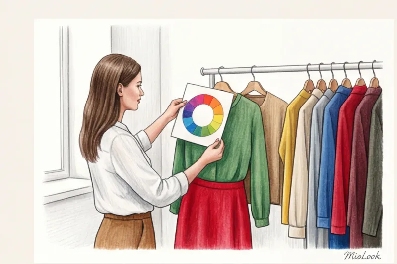
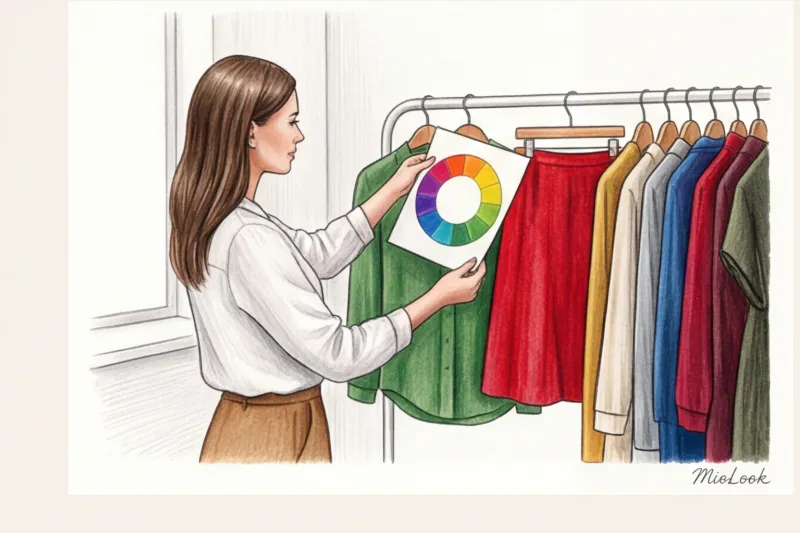
In classical color theory, complementary colors are those located directly opposite each other on the Itten circle. The most well-known pairs are blue and orange, red and green, and yellow and violet. The physics of our vision are designed so that these opposites maximally enhance each other. Next to blue, orange appears twice as bright as it actually is.
Why are modern women so afraid of this visual force? Over 12 years of working as a stylist, I've identified three main reasons:
- Association with uniform. Many corporate brands use clean contrasts (red with blue or yellow with green) to make their employees visible from afar.
- Fear of looking "too dressed up." In the era of minimalism and Scandinavian style, any bright color is perceived as a challenge to society.
- Bad past experience. Chances are, you've tried combining contrasting colors in clothing before, but you chose items of the same texture and in equal proportions, which led to a comical effect.
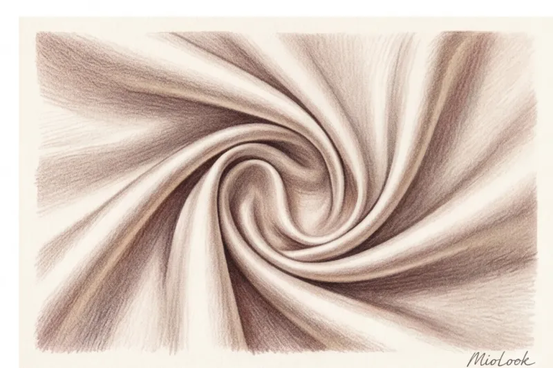
Have you ever noticed that complementary combinations in nature are never jarring? A purple iris with a yellow center or autumnal red foliage against a deep blue sky look flawless. The secret lies in texture and dosage.
Stylist's secret: contrasting colors in clothing require different textures
The biggest mistake I see 90% of women making when experimenting with color blocking is pairing two smooth materials. A smooth red cotton shirt with a smooth green cotton skirt. The result? You look like the flag of a European country.
Contrasting colors in clothing should ALWAYS be accompanied by contrasting textures. The difference in texture literally "calms" the visual conflict of opposing shades, elevating the look from "outrageous" to "couture."
Remember the three golden formulas for combining materials:
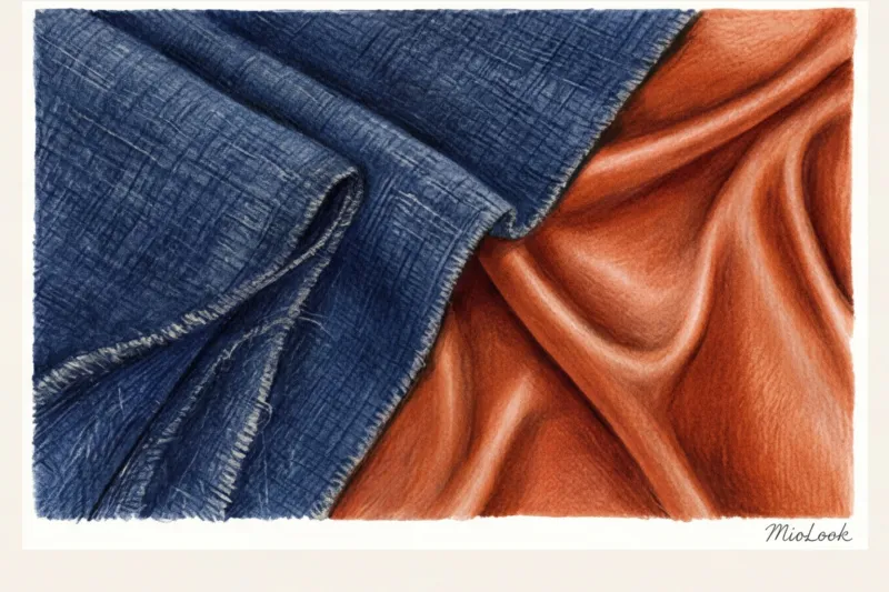
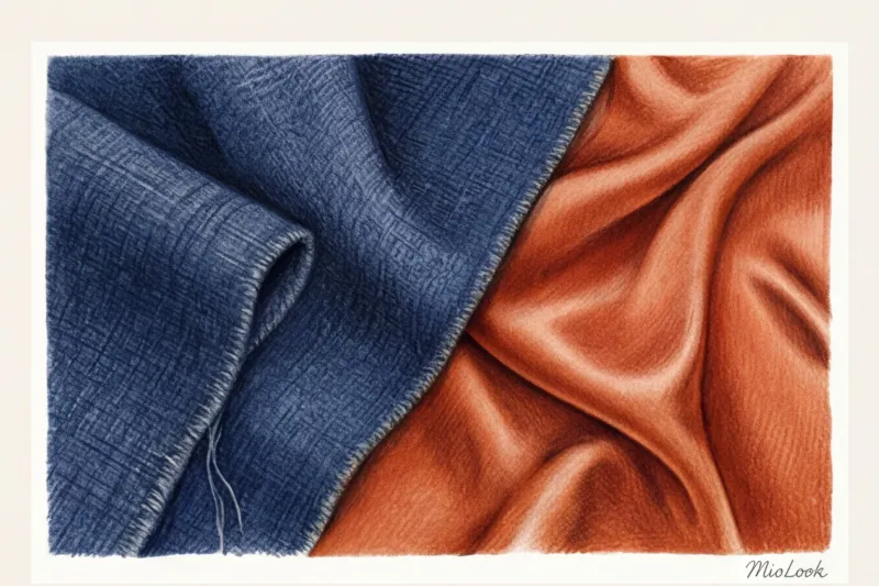
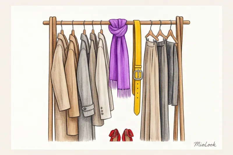
- Matte + Glossy: Deep matte wool absorbs light, while glossy silk or satin reflects it. Example: a navy blue oversized sweater and a flowing terracotta skirt.
- Dense + Translucent: Heavy tweed or denim paired with weightless organza or chiffon.
- Smooth + Fluffy: A smooth leather skirt in a complementary color paired with a mohair or angora jumper.
Linen, silk, and wool: how fibers absorb color
This brings us to my favorite topic: textile materials science. Have you ever wondered why the same emerald green shade looks regal on a silk blouse, but downright cheap on a $15 mass-market blouse?
The problem lies in the chemical structure of the fiber. Natural fibers (silk, wool, and cotton weighing over 180 g/m²) are dyed with reactive dyes. These penetrate deep into the fiber structure, creating a multifaceted, complex color that changes depending on the lighting. Cheap polyester is dyed with disperse dyes—the dye literally adheres to the smooth plastic surface of the fiber, producing a flat, dull reflection of light.
"When creating complementary looks, the quality of the fabric is paramount. A strong contrast works like a magnifying glass—it instantly highlights the cheapness of the material. If you're on a budget, invest in colorful accessories made of genuine leather or silk, and keep the base neutral." This is a rule I always emphasize during wardrobe reviews.
From a sustainable fashion perspective, buying one heavyweight merino wool item in a sophisticated mustard shade is far more eco-friendly than buying five cheap acrylic sweaters that will fade after the third wash.
Your perfect look starts here
Tired of racking your brain over texture and color combinations? MioLook's smart algorithm will analyze your wardrobe and suggest ready-made contrasting looks for every day.
Start for freeThe 80/20 Rule: Ideal Proportions for Contrasting Colors
Let's dispel one of the most persistent myths: complementary colors don't need to be worn 50/50. If you wear a yellow waist-length top and purple pants, you'll not only create a harsh horizontal line that will visually "cut" your figure in half, but you'll also quickly tire the eyes of others.
In his famous book "The Interaction of Color" (1963), art theorist Josef Albers demonstrated that colors have different visual weights. For them to harmonize, their areas must be unequal. In styling and visual merchandising, this has evolved into the 80/20 rule.
The "Background and Accent" scheme works flawlessly:
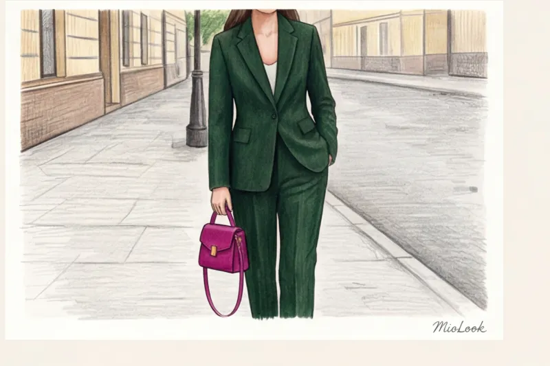
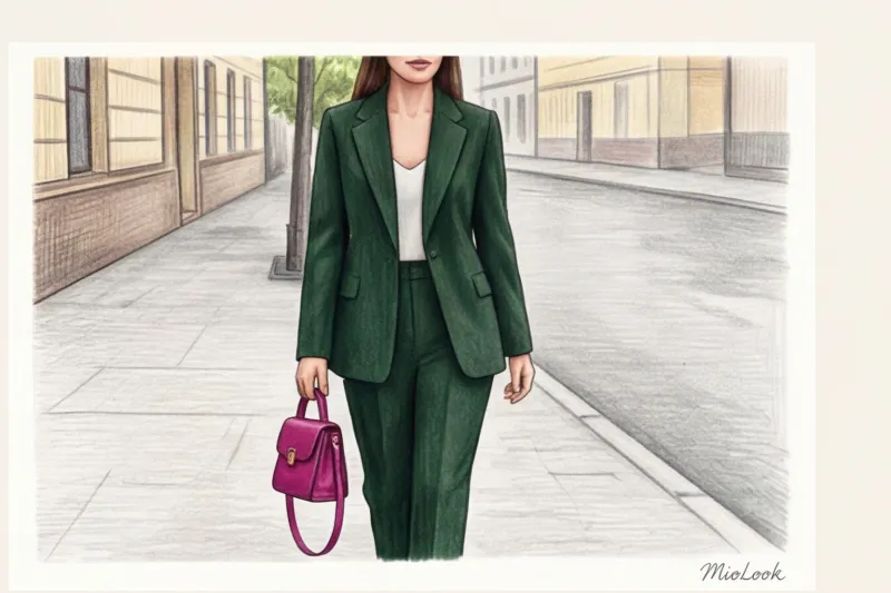
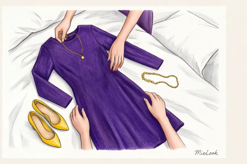
- 80% (Background): Choose one color as a base. Let it be a navy blue pantsuit or a long emerald dress.
- 20% (Accent): Use a complementary color as a "flash." This could be an orange bag, burgundy shoes, or a mustard turtleneck barely visible from under an unbuttoned jacket.
Fair Limit: This rule doesn't work if you have an apple-shaped figure and use an accent 20% of your waist (for example, a bright, contrasting belt). In this case, the contrast will draw attention to an area you might want to downplay. Shift the focus to your shoes or the portrait area!
The 'traffic light' myth: muted, contrasting colors in clothing
The word "contrast" conjures up images of neon signs. But complementary doesn't mean spectrally pure and garish. According to the Pantone Color Institute, the most sought-after shades of recent seasons are complex, muted tones with added gray or brown pigment.
If you work in an office with a relaxed casual dress code, you don't have to wear red and green in their original form. Play with light and saturation. Here are three pairs of elegant natural contrasts that look incredibly classy:
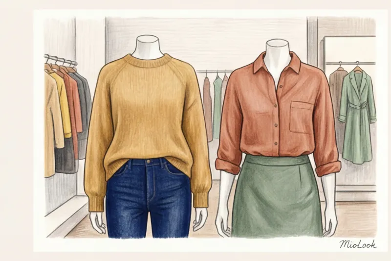
- Mustard and navy. A softened version of the yellow-purple/blue contrast. Perfect for fall coats and knitwear.
- Burgundy and emerald. A grown-up, upscale alternative to red and green, these colors look stunning in smooth leather and thick suede.
- Dusty rose and olive. A delicate combination for the spring/summer season. A linen olive suit with a dusty rose silk top looks sophisticated and fresh.
It's precisely these complex shades that make an image seem luxurious. The psychology of perception is as follows: the more difficult a color is to describe in a single word, the more elite it seems to our brain.
Try MioLook for free
Not sure which muted shades suit your skin tone? Our AI stylist will analyze your appearance and select the perfect palette.
Start for freeAn eco-friendly approach: how contrast expands a capsule wardrobe
Often, in pursuit of variety, we buy dozens of new styles of trousers, skirts, and jackets, forgetting that color is the most powerful tool for transformation. According to research by the global platform Lyst (2024), conscious consumers are increasingly opting for micro-wardrobe updates instead of full seasonal purchases.
Incorporating just two or three contrasting accessories increases the versatility of your basic capsule wardrobe by 40%. Think about it: instead of buying a fifth gray sweater, you buy one pair of fuchsia shoes. You wear them with gray trousers, a dark green dress (a complementary contrast!), or plain blue jeans—and you get a completely new look every time.
This directly impacts the cost-per-wear (CPW). Your old navy blue coat that you're already bored with will take on a completely different look if you tie a chunky terracotta mohair scarf over it. You're buying color, not a new, bulky item, saving money and reducing the carbon footprint of clothing production.
Checklist: How to Incorporate Contrasting Colors into Your Look Tomorrow
Theory is useless without practical application. I've put together a step-by-step algorithm that will help you safely and stylishly integrate contrast into your wardrobe tomorrow morning, even if you're heading to work.
- Step 1: Inventory the base. Find something in your closet in your favorite, familiar color. Let's say it's a basic blue shirt made of thick cotton.
- Step 2: Find a pair. Think of Itten's circle (or open it on your phone). Opposite blue is orange. We need its derivatives: terracotta, rust, peach, copper.
- Step 3: Checking the texture. Since the shirt is smooth and matte, a different texture is a good accent. A terracotta suede belt, a copper-toned silk scarf, or a glossy burnt orange bag would be perfect.
- Step 4: Assess proportions. Check yourself in front of the mirror. The accent color shouldn't make up more than 20-30%. If the proportions are right, the look is complete!
Combining contrasting colors in clothing isn't a magical gift reserved for select fashion bloggers. It requires the precise physics of light, an understanding of fabric properties, and a bit of mathematical proportions. Stop hiding behind safe beige. Choose one rich, complex color, find its opposite, add texture differences—and you'll see how not only your reflection in the mirror changes, but also how the world reacts to you.