Six months ago, I conducted an experiment: I analyzed over 500 looks generated by my clients in a wardrobe planning app. Do you know where 90% of style failures occurred? In attempts to "just add a little color." The girls took a great minimalist base and ruined it by randomly introducing bright accessories into the look. We've already discussed creating a harmonious background in more detail in our A complete guide to how to combine accessories without overloading Today, I suggest we forget the abstract advice from glossy women's magazines of the 2000s and approach color as a precise science.
The Mathematics of Color: Why Bright Accessories Require Calculation, Not Intuition
According to the Business of Fashion (BoF) 2024 State of the Industry report, consumer investment has finally shifted from basic clothing to statement accessories. Why? It's a clear return on investment (ROI). A bold, structured bag for €800 today "works" to enhance your status far more effectively than a black wool coat for the same price, because it's worn more often and immediately catches the eye.
But this global shift has created a new problem: we've started buying statement pieces without a clear understanding of their "visual weight." In the mathematics of style, visual weight isn't a product's physical weight. It's the area an object occupies on the observer's retina and how intensely it draws attention. Inept use of this tool disrupts body proportions and turns a laconic image into a visual mess.
Accent Formula: How to Calculate the Area of a Highlight
Forget the outdated "three colors per look" rule. It's hopelessly outdated. In 2025, a strict 80/15/5 ratio is used to create an expensive, sophisticated silhouette.
- 80% - basic neutral clothing (canvas).
- 15% - a supporting neutral or complementary shade (shadow).
- 5% - that same color explosion (anchor).
The paradox of perception is that 5% neon green (for example, a micro-bag made of smooth leather) is more powerful than 30% red (a classic jacket). The concentration of pigment in a small area creates a laser-like effect. This is why color "spraying" should be avoided.
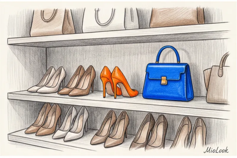
The most common mistake I see in practice is trying to "support" an accent with small details all over the body. A client buys emerald pumps and decides she absolutely needs an emerald belt and matching earrings. Algorithms MioLook They won't let us lie: when we tested the neural network, the analysis showed that adding more than two bright details to a single digital image is flagged by the system as visual overload in 85% of cases.
Visual weight: why red pumps are heavier than a yellow clutch
The texture of a material can multiply or divide the brightness of a color by two. The physics of light dictates the rules of fashion here:
- Suede and nubuck absorb light. They make the shade deep, soft, and matte.
- Smooth and patent leather reflect light, acting as a spotlight.
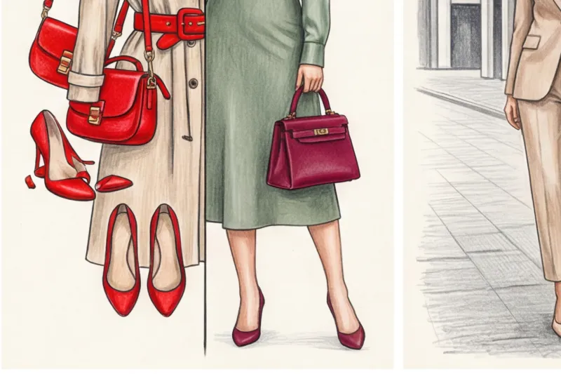
Therefore, red velvet pumps will have less visual weight than a tiny yellow patent leather clutch. Temperature is also important to consider: warm colors (orange, yellow, scarlet) visually approach the viewer and appear more voluminous, while cool colors (cobalt, emerald) recede and appear narrower.
Bag or shoes: what will control the gaze of others?
Research into the principles of visual perception in retail (WGSN, 2023) proves that the human brain automatically focuses on the brightest spot in the visual field in just 0.2 seconds. Color is like a remote control for other people's attention.
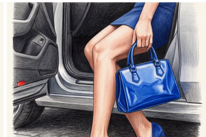
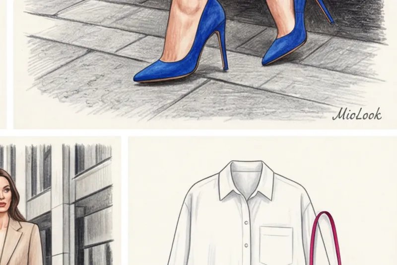
One of my clients (a top manager at a large IT company) couldn't figure out why, during important pitches, the board of directors looked everywhere but at her face and slides. We analyzed recordings of her presentations. The reason turned out to be strikingly simple. She wore a crisp, impeccably tailored dark blue suit and... bright red stilettos. For the entire 40 minutes of the presentation, the audience's gaze reflexively fell on her feet. Bright shoes literally "ground" the image.
As soon as we shifted our focus to the structured terracotta tote bag sitting on the table next to her hands and laptop, the audience's focus instantly returned to the speaker's face.
A bag is a powerful tool for shaping your figure. A crossbody bag worn at waist level broadens the waist. A bag with a long strap hanging at the hip accentuates the width of the hips. If you want to conceal bulk in your lower body, wear a bright, statement bag under your arm (a baguette style).
Try MioLook for free
A smart AI stylist will select the perfect look based on your measurements and the items in your closet.
Start for freeThe Mismatch Myth: Can You Match Your Bag to Your Shoes in 2025?
Perhaps the most radical change in style in recent years is the return of matching shoes and bags. For the past 15 years, fashion magazines have been aggressively hammering home the mantra: "Never match your bag to your shoes; it's bad taste and provincial." Today, this rule is officially dead.
But a new, much more sophisticated technique has come to replace it - Texture Blocking Perfect bright color matching now works, but only with extreme material contrast.
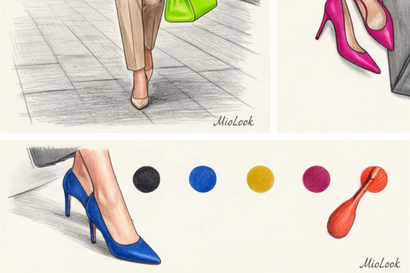
If you're carrying a glossy, electric-blue patent leather bag, you should be wearing matte suede shoes in the same shade. Smooth leather + fabric. Mesh + a crisp, cardboard-like leather silhouette. The contrasting textures remove that "mothballed" look that some criticized for color-coupling.
But there is a fair limitation here: this technique is absolutely doesn't work In the budget segment (under €100), finding identical complex shades in cheap faux leather from different manufacturers is virtually impossible. And a "nearly identical" color—for example, shoes that are slightly warmer than a bag—seems like a stylistic capitulation.
Combination Algorithms: A Color Wheel for Practitioners
To avoid the "clown on the move" effect, choose accent colors exclusively from your personal contrast palette. If you have a soft, muted complexion (light brown hair, gray eyes), a bold fuchsia or neon will "kill" your complexion, even if they're placed near your feet. Your accent colors are rich wine, mustard, or deep emerald.
Acid-shifted monochrome
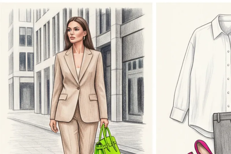
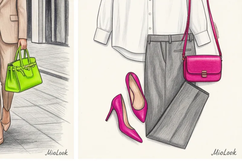
My favorite trick for minimalist clients who are afraid of color. Take the perfect beige all-over look: thick viscose palazzo pants, a textured cashmere sweater, and a beige coat. Add a neon lime-green micro bag. Or a cool gray suit and fuchsia shoes. The crisp base color calms the neon, and the neon instantly makes the base look sharp and modern.
Complementary duets: a play on contrasts
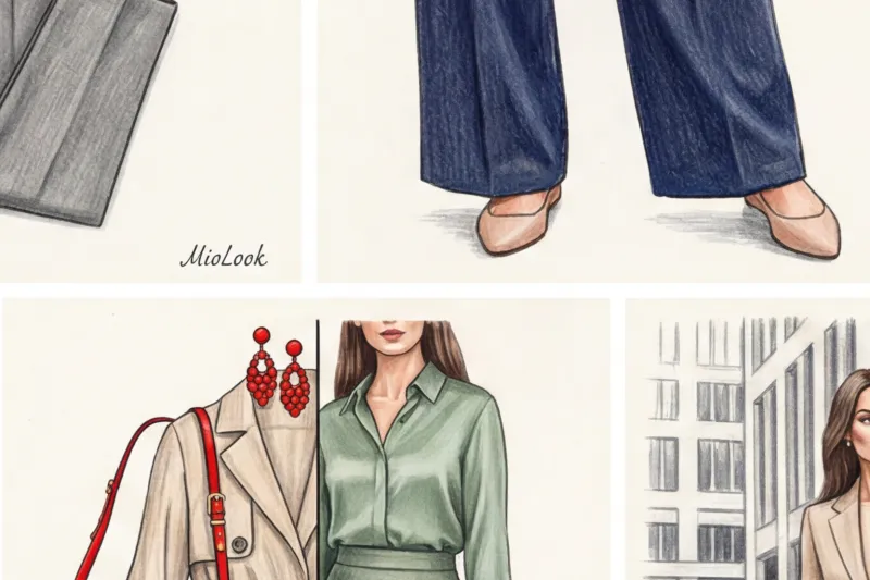
We build a look on opposites using Itten's classic color wheel, but with varying saturation. Never mix two overt colors 50/50. The right combination: a muted olive base (trench coat or suit) plus a deep, wine-colored accent bag in smooth leather. Dark blue jeans and a white shirt with tangerine pumps.
5 Fatal Mistakes When Integrating Bright Accessories
Over 12 years of wardrobe analysis, I've compiled a list of the top mistakes guaranteed to cheapen a look:
- Compensation for a bad base. Trying to salvage a cheap, ill-fitting €40 jacket with a flashy designer bag is a bad idea. The accent, like a magnifying glass, will only draw attention to the pilling and crooked seams on the garment.
- Cheap fittings on a bright background. A stylist's golden rule: a basic black mass-market bag can be passed off as premium if it has no logos. But a cheap yellow or red bag with shiny "gold" zippers will instantly reveal its true price (say, €30-40). Brilliant color requires impeccable quality material and matte, expensive hardware.
- Incorrect geometry. A brightly colored yet shapeless bag (for example, a soft hobo bag) often looks like a deflated balloon. The brighter the color, the more rigid the shape of the bag should be.
- "Christmas tree syndrome." More than three color anchors create visual chaos. A bag, shoes, scarf, and glasses frames all in the same dominant color are considered an animator's outfit, not a style.
- Ignoring the seasonality of textures. The summery neon lemon color on a thin clutch looks strange and out of place against the heavy winter wool drape. Deep tones and thick textures work best in winter.
Your perfect look starts here
Join thousands of users who look flawless every day with MioLook. Digitize your wardrobe in just a few clicks.
Start for freeChecklist: How to Digitize Wardrobe Accents with MioLook
Investing in statement accessories should be mathematically sound. I always recommend translating the emotion of shopping into a numeric calculation.
Step 1: Digitization of the database. Take photos of all your shoes and bags and upload them to the MioLook app.
Step 2: Color audit. Filter your basics by color. You'll likely see a sea of black, beige, and brown on your screen. This is the perfect starting point. Consider whether your basics are warm or cool. This will determine the color of your future purchase.
Step 3: Virtual test drive. Before shelling out €300 for red shoes, find a similar photo online, add it to the app, and generate 5-7 virtual looks with your current clothes. If the bright item doesn't create at least four harmonious looks from what's already in your closet, pass on the purchase.
Color is a powerful tool for controlling others' attention. Don't buy bright shoes or a bag just because they look pretty on display. Buy them to draw attention to your surroundings while maintaining your own visual status.