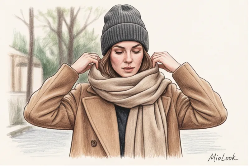
Recently, the CEO of a large IT company came to me for a personal consultation. She was wearing a luxurious double-breasted camel-colored Max Mara coat, costing around €2,000. The cut was impeccable, the fit perfect. But the entire look literally fell apart before her eyes due to one detail: her head and neck were adorned with an identical, perfectly matching acrylic hat and scarf set, costing €30. This small detail instantly destroyed the status quo of the expensive coat, transforming the look from "quiet luxury" to fussy mass-market fare.
When clients ask me, How to combine a hat and a scarf , they're most often looking for a cheat sheet for choosing the perfect tone-on-tone shade. But the truth is, modern elegance is built on entirely different principles. We've covered the fundamental rules of matching in more detail in our complete guide. Basic hats and scarves: a stylish capsule collection , and today I want to look at the most common mistake that 8 out of 10 women make.
The Myth of the Perfect Set: Why Matching Hats and Scarves Cheapen Your Look
According to behavioral psychology research (and the recent WGSN 2024 report on visual merchandising), the first-three-second rule applies: 80% of a person's attention when meeting you is focused exclusively on the facial area—the face, neck, and shoulders. This is your primary focus. What's near your face is processed by your subconscious faster than the brand of your shoes or bag.
So why has the era of "twin sets" come to an end? A hat and scarf knitted from the same yarn, in the same pattern, and dyed the same color convey a sense of stylish laziness. It's a sign of haste, a quick purchase from a ready-made cardboard box at a fast-fashion brand's checkout. True luxury houses rarely sell identical sets—they offer complementary stories.
The concept of "quiet luxury" has radically changed the approach to winter accessories. Today, status is conveyed through micro-details: a subtle casualness, a complex mix of textures, and a lack of ostentatious perfection. If you want to look expensive, your look should communicate: "I just threw on my favorite scarf before going out." , and not "I spent an hour choosing a hat that matched my scarf exactly.".
The main rule of a stylist: how to combine a hat and scarf by texture, not color
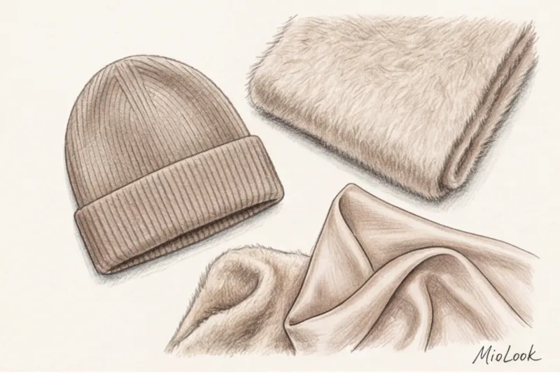
Over 12 years of working with luxury wardrobes, I've discovered a golden rule: the texture of a fabric speaks volumes ten times louder than its color. True chic is born from the juxtaposition of contrasting materials.
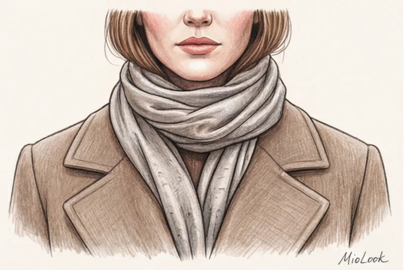
You need to create an architectural volume. If you choose a smooth hat (for example, made of fine merino or cashmere no thicker than 19 microns), then the scarf simply must be voluminous. This could be a textured bouclé, a chunky hand knit, or a dense stole that holds its shape. Conversely, if you're wearing a voluminous ushanka or a chunky knit beanie, calm the portrait area with a smooth cashmere scarf.
"A perfect match is the enemy of elegance. Seek harmony in the difference in density: let matte silk compete with coarse wool, and fluffy alpaca offset smooth felt."
Let's calculate your real benefit using the Cost-per-Wear model. You buy a cashmere scarf for €250. You'll wear it at least 100 days a year for five years. The cost per wear is €0.50. Now let's take an acrylic set for €25. After three weeks of active wear, it becomes covered in pills and loses its shape. You wear it 20 times before it's ready for the dacha. The cost per wear is €1.25. It's a paradox, but "cheap" synthetics cost you two and a half times more than premium ones. slow wardrobe.
Secrets of Expensive Textures: Avoiding Synthetic Shine
Cheap acrylic and polyester reveal themselves not only by their feel. They have a characteristic "squeaky," flat sheen in the light. Natural combed wool, baby alpaca, or cashmere, on the other hand, absorb light. Their matte, deep texture looks elegant even in the simplest black or gray.
My clients often use MioLook to digitize your winter accessories. The app's artificial intelligence is great for visualizing how matte surfaces interact with glossy jacket fabrics in a virtual fitting room.
Color architecture: modern color combination formulas for the portrait area
If we're giving up on matching sets, how do we combine colors? There are three formulas that guarantee flawless results.
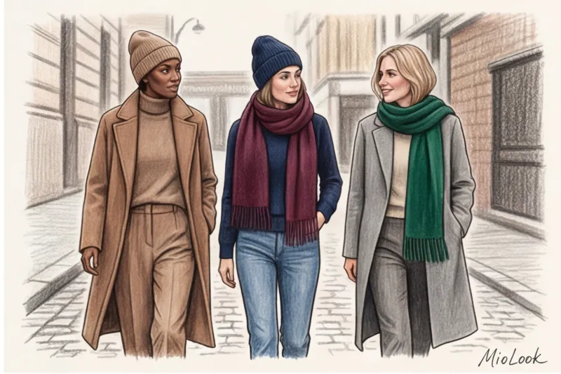
- Monochrome with color stretch. Choose one base color and play with its saturation. For example: a light camel hat (closer to beige) and a deep chocolate scarf. This creates a visual vertical line and looks very European.
- Complementarity method. Combine complex, muted colors. An emerald scarf works beautifully with a graphite or navy blue hat. A deep wine shade (burgundy) looks luxurious next to a cool beige. Just avoid bold, neon colors (unless you're going for a high-concept street style look).
- Temperature rule (critical!). Never mix overtly warm and overtly cool tones directly near the face.
Let me explain the temperature rule with an example. If you wear a cool ash-gray hat and pair it with a warm mustard-yellow scarf, you'll create a visual clash. This temperature clash doesn't just look odd—it will immediately highlight any signs of fatigue on your face, under-eye circles, and uneven skin. Keep the shade that flatters your skin tone close to your face, and move the contrasting shade lower, draped across your chest.
Prints and patterns: when a scarf becomes an accent
If you want to incorporate classic tartan or aristocratic houndstooth into your look, your hat should be completely neutral. A printed scarf steals the show. Pair it with a sleek, solid-color beanie that matches the lightest or darkest shade of the scarf's print.
What you should absolutely avoid are large monograms and brand logos in the portrait area. The days when a scarf screamed its price with the letters LV or GG across the entire width of the fabric are gone. Today, when choosing elegant style We convey our status through the quality of Loro Piana or Brunello Cucinelli cashmere, which does not have a single inscription on it.
Your perfect look starts here
Join thousands of users who look flawless every day with MioLook.
Start for freeTypical mistakes that ruin the status of your winter wardrobe
Even with excellent taste, technical errors can ruin the look. Here are the top three mistakes I regularly correct when sorting through winter capsules:

- Violation of proportions. A thin, short viscose scarf, tightly wrapped around the neck over a huge, oversized puffer jacket, makes your head appear tiny and your figure appear massive. Bulky outerwear requires proportionate, large accessories.
- Pilling (pellets). I'll be categorical: even the most expensive cashmere coat looks like a flea market item if your hat has pilling. Accessories near your face should be impeccable. If an item has lost its shape or is pilling, say goodbye to it without regret.
- Inappropriate decor. Rhinestones, sequins, appliqués and huge faux fur pom-poms will add a touch of elegance to your look.
I should add an important caveat here: this rule has exceptions. Playful hats with exaggerated pom-poms or bright embroidery are perfectly appropriate if you're spending the weekend at a ski resort, walking your dog in the woods, or going skating. In a relaxed, casual setting, they add a touch of irony. But if you wear such a hat with a classic coat on your way to a board meeting, you'll instantly lose your professional credibility in the eyes of your colleagues.
A Practical Guide: Choosing Accessories for a Basic Coat and Down Jacket
Theory is dead without practice. Let's look at specific scenarios for different types of outerwear we encounter from November to March.
For a classic wool coat:
Elegance reigns supreme here. Choose smooth textures. A fine cashmere beanie, an elegant felt hat, or a silk scarf tied in the style of Grace Kelly. The scarf should be wide but flexible (fine wool with added silk) so it drapes beautifully under the lapels of your coat without creating a bulge at the back.
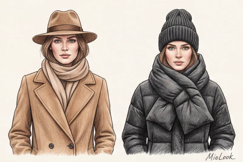
For a puffy down jacket:
A down jacket combines sportiness and utility. Wide-ribbed beanies with a cuff (the cuff adds just the right amount of volume), balaclavas, and puffy quilted scarves pair beautifully with it. Textured, fluffy alpaca yarn is perfect here.
For the aviator sheepskin coat:
An aviator jacket itself is very effective in portrait mode thanks to its fur collar. I recommend my clients avoid bulky scarves here altogether to avoid creating the "neckless person" effect. Swap the scarf for a minimalist cashmere turtleneck, and layer a simple, flat-knit beanie without a cuff.
Checklist: Auditing Your Accessory Capsule Before the New Season
This evening, go to your closet and do a quick inventory. It won't take more than 15 minutes, but it will completely change your appearance tomorrow morning.
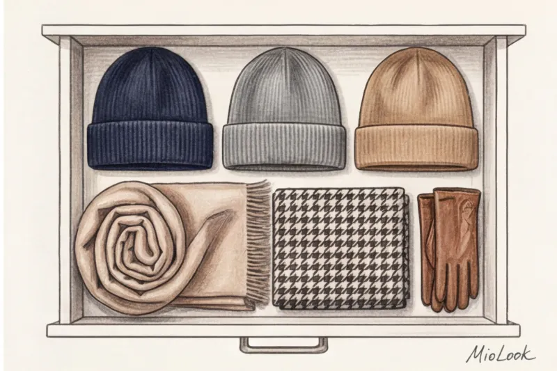
- Step 1: Brutal cleaning. Get rid of ready-made twin sets. If you don't want to throw them away, simply separate them and never wear them together. Ruthlessly discard anything that has lost its shape, faded, or is covered in intractable pilling.
- Step 2: Color strategy. Consider your outerwear palette. Buy two neutral scarves (for example, graphite and camel) and two accent ones (deep burgundy or emerald). Do the same with hats, but in different shades.
- Step 3: Checking invoices. Make sure you have a variety of weights in your arsenal. You need at least one smooth cashmere item and one with a distinct texture (chunky knit, bouclé, or mohair).
To avoid getting confused with the resulting combinations, upload the remaining accessories to the "smart wardrobe" function via the app MioLook — the algorithm itself will suggest dozens of new fresh combinations for different weather conditions.
Remember the most important thing: your face is a masterpiece, and your hat and scarf are just a mat and frame. Invest in refined textures and complex volumes, and even the simplest basic coat will sparkle with the colors of true luxury.


