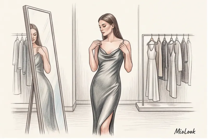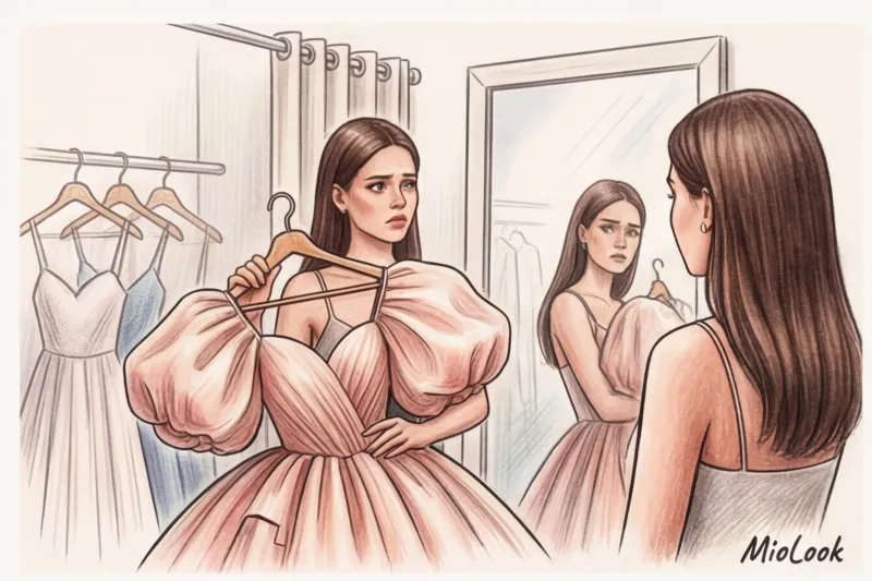

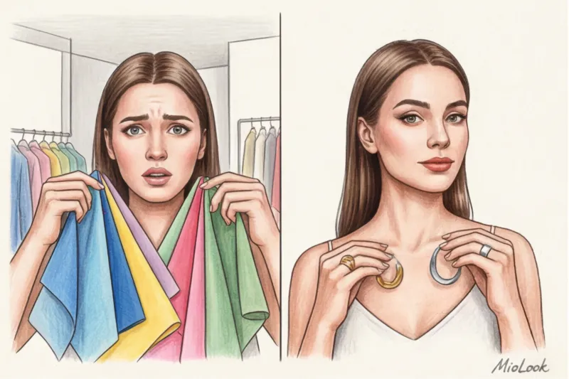
Did you know that almost 60% of girls secretly hate their prom photos and try not to open them a couple of years later? And it's not about a bad hairdo or weird makeup look that seemed like a great idea when you were 17. The problem lies in the physics of light: a bright camera flash in a dimly lit restaurant can turn a gorgeous peach outfit into a "naked body" effect, and leave your face looking a sickly gray. When young clients come to me for consultations, the most common question is exactly this: What color dress should I choose for prom? to look flawless both in the mirror and in digital photos? We've already covered styles and fits in more detail in our The complete guide to choosing a prom dress , but today we're exclusively dissecting color. And no, we won't be looking for "deep autumn" or "bright spring" in you.
Why the Classic '4 Seasons' Is Outdated (and What to Use Instead)
In 12 years of working as a personal stylist in Europe, I've never seen a completely "pure" color type that fits perfectly into the widely circulated four-season theory. The rigid division into winter, spring, summer, and fall is a coloristic relic from the 1980s. This system confines you to rigid boundaries, forcing you to reject stunning shades simply because they're not in your assigned palette.
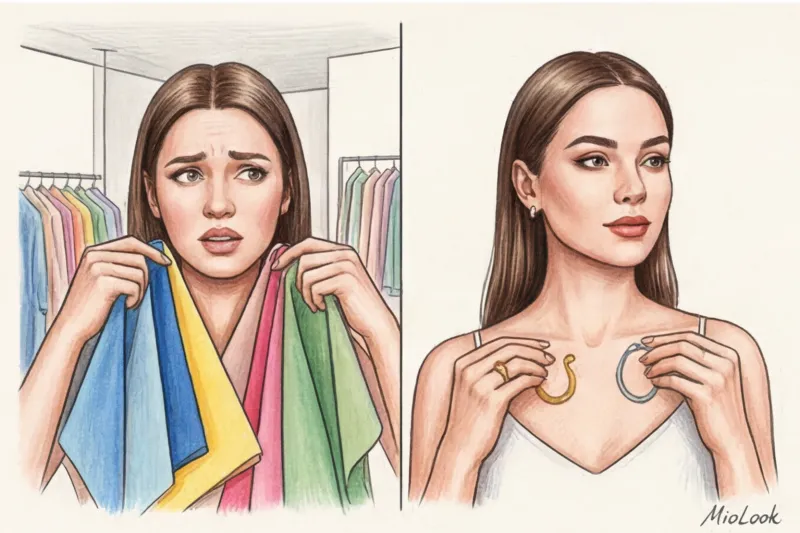
Modern, applied styling works differently. We don't look for your "season," but rather for dominant features—temperature (warm or cool undertones) and the overall contrast of your appearance. Instead of buying expensive palettes and agonizingly comparing them to items in stores like Zara or H&M, do a simple practical test right in the fitting room.
Take a plain white A4 sheet of paper (even a white grocery bag will do) and place it on your face in neutral daylight. If your skin appears grayish, olive, or pinkish against the white sheet, you have a cool undertone. If your skin takes on a peachy, yellowish, or golden hue, you have a warm undertone.
"A color type isn't a death sentence or a prison, but merely a guide. It's important to understand not the beautiful name of your season, but how your skin physically reacts to light and shadow"—I repeat this rule during every shopping session.
Access to MioLook for €0.99 — one-time payment
A smart AI stylist will select the perfect look.
Get access — €0.99 onceWhat color prom dress should I choose? A strategy of contrasts.
Remember Johannes Itten's color theory, taught in art schools? It's based on the understanding of color contrast. It's the contrast in your appearance that dictates, What color dress should I choose for prom? so that the outfit doesn’t “eat” your face.
If you have high-contrast appearance (For example, porcelain fair skin and dark brown hair), you absolutely need deep, pure, vibrant shades. Emerald, royal sapphire, fuchsia, rich ruby. In pastel pink or powder, you'll simply get lost, turning into a pale blur.
And vice versa, low-contrast appearance (light brown hair, soft features, light eyes without a bright iris) literally blossoms in muted, dusty tones. Sage, ash rose, complex mocha, lavender—they work like a delicate frame for a watercolor painting, without overpowering the natural softness.
Many girls, in a fit of panic, make a fatal mistake: buying a black dress. There's a myth that black suits everyone. In fact, black is the most demanding and harsh color for an evening out. It draws out all the shadows, highlighting even the slightest under-eye circles and signs of fatigue from studying for exams. And pure white and off-white often play a cruel joke at prom: you risk looking like a runaway bride, especially if the dress is maxi or has a full hem.
Skin Temperature: The Finishing Touch
While contrast determines the depth and saturation of a color, temperature is its specific nuance. Do a quick jewelry test in the mirror: hold a chunky silver necklace to your collarbones, then a yellow gold one. Which one makes your complexion more even and fresh? If silver, your undertone is definitely cool. If gold, your undertone is warm.
How does a warm skin tone react to trendy cool neon (like electric blue or fuchsia)? Horrible. This dissonance instantly brings out all imperfections, highlighting micro-redness, spider veins, and yellow teeth. If you're still unsure about your skin temperature, opt for universal neutrals. In my experience, a classic deep navy or rich wine suits 90% of European women, regardless of their natural skin tone.
The Treachery of Texture: How Fabric Changes the Same Color
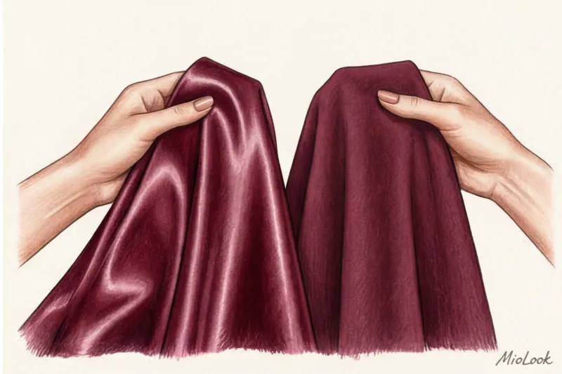
A stylist's top professional secret: never judge a dress's color without examining the fabric's reflectivity. The same shade of red on silk and cotton are two completely different colors. The difference in texture explains why the color of an item in an online store catalog and in reality often differs dramatically.
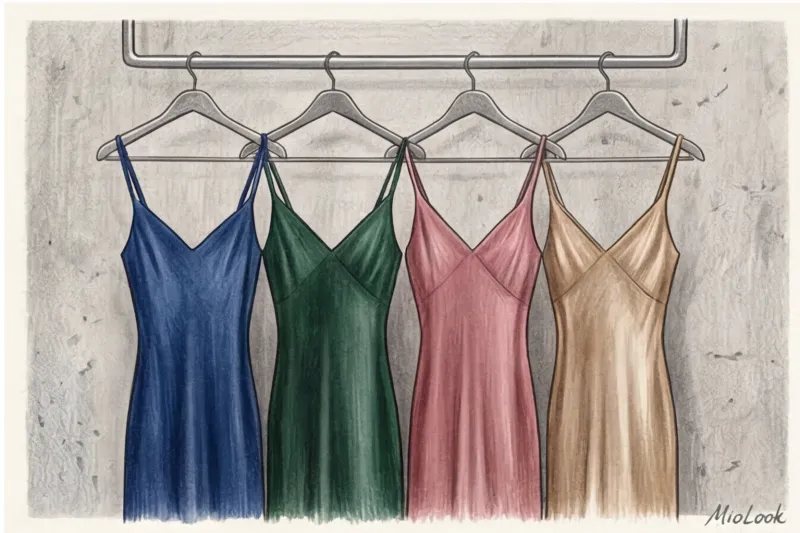
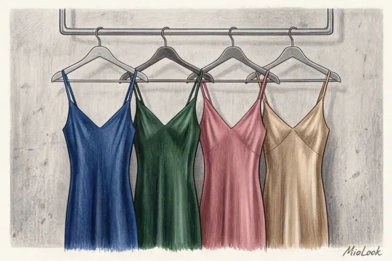
Shiny fabrics (natural silk, satin, viscose with a satin weave) act like mirrors. They reflect light, "lightening" the shade of any curves of the figure—the chest, hips, and stomach. This inevitably adds visual volume. Emerald silk will always appear brighter and lighter in movement.
Matte textures, such as velvet, suede, or heavy matte crepe, on the other hand, greedily absorb light. They make any shade, even the brightest, deeper, darker, and more substantial. I had a client who bought a perfectly colored sapphire dress made of thick matte cotton. In evening flash photos, she looked completely flat—the fabric had absorbed the light and devoured all the natural volume of her body. For an evening event, at least a minimal sheen or interplay of translucent layers (chiffon, tulle) is always needed, creating a watercolor effect and beautifully "whitening" the color in motion.
Access to MioLook for €0.99 — one-time payment
Start creating perfect images with the help of artificial intelligence
Get access — €0.99 onceThe Cost-Per-Wear Rule in Color: Investing Wisely
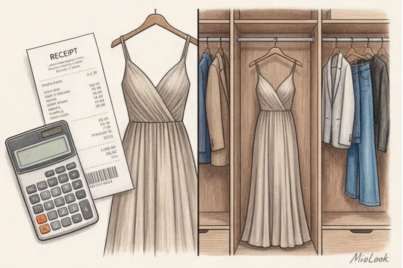
Buying a one-day dress is a financial crime against your wardrobe. A 2024 study by global platform Lyst shows that conscious consumption has finally supplanted fast-fashion trends. Therefore, when choosing a color, I always encourage my clients to apply the Cost-Per-Wear rule.
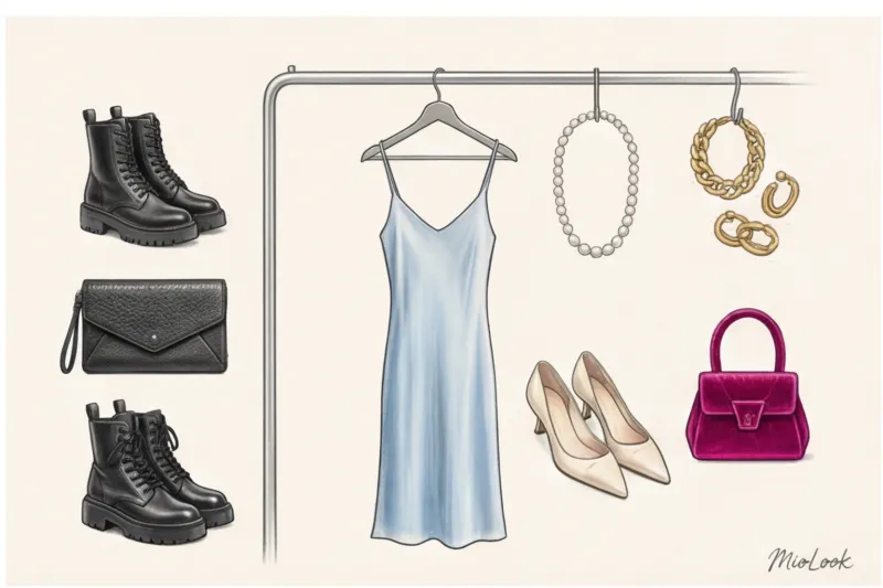
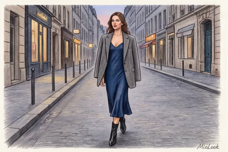
Imagine you bought a trendy, acid-toned "brat green" dress for €150. You'll wear it once, to your graduation ceremony. The price per outfit is €150. Now, take a simple, dark chocolate-colored slip dress for the same €150. After graduation, you'll wear it with an oversized gray jacket and chunky Chelsea boots to university classes, with an oversized cashmere sweater on fall dates, and with white sneakers on summer walks. That's at least 30 outfits a year. The price per outfit drops to €5.
Overly "recognizable," loud, trendy colors (like Barbie pink) are instantly memorable. If you wear such a dress a second time, everyone will think you have nothing to wear. The top 3 best investment shades for basic dresses are deep chocolate, graphite, and dark emerald. They easily integrate into a casual-chic style.
If you find it difficult to imagine how a luxurious evening dress will look with everyday clothes, use MioLook Upload a photo of a dress into the app, and a smart algorithm will help you put together a capsule wardrobe, showing you how this color will pair with your favorite fall jackets and sneakers.
Beware: 3 Shades That Will Ruin Your Graduation Photos
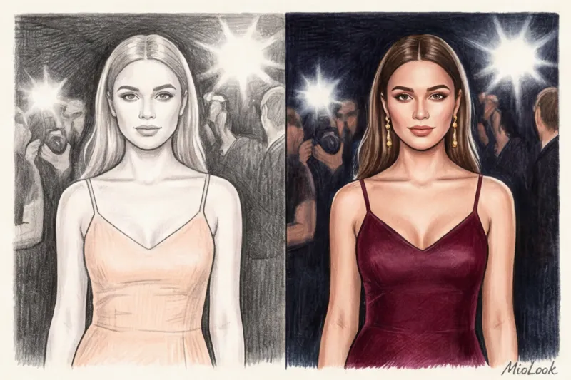
We live in the age of digital memory. Your dress shouldn't just look beautiful in the mirror; it must be photogenic. According to the Pantone Color Institute's reports on the impact of artificial lighting on digital color perception, modern camera sensors can distort some pigments beyond recognition. Here are the three main color enemies of your photos:
- Pale yellow and peach. Under the direct light of a smartphone flash, these warm pastel shades blend perfectly with fair European skin. The result in the group photo? The illusion of being naked. The "naked body" effect is the main reason for deleted banquet photos.
- Poisonous neon. Smartphone cameras can't handle white balance correctly when a large, reflective neon color (like light green or fuchsia) appears in the frame. To compensate for the dress's brightness, the camera darkens everything else. Your face will appear either a deathly gray or an unhealthy red in the photo.
- Pure white in low light. In a dimly lit restaurant or on a nighttime embankment, a crisp white dress instantly absorbs the ambient light, fading to a dirty blue or dusty gray. If you really want a light dress, choose ecru or champagne—the yellow pigment in their formula maintains the color's warmth in any lighting.
"I want this one!": How to tame a dress that's not your color type
Imagine this: you've found the perfect-fitting dream dress at Massimo Dutti or & Other Stories, but it's completely wrong for your temperature. It's a cool, icy shade, and you're a classic "warm autumn." What should you do? Take it to the checkout! There's a rule of thumb in styling: any "wrong" color can throw off your face.
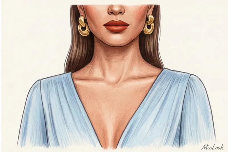
I had a challenging case: a client with red hair and freckles fell in love with an icy silver silk dress. We saved the situation with two powerful techniques. First, we chose a dress with a deep V-neck. This is called the "portrait zone rule." We simply moved the dangerous cool color away from the chin, leaving a safe buffer of bare skin there.
Secondly, we balanced the look with makeup and metallics. The vibrant, warm brick-red lipstick and chunky, sculptural yellow gold earrings stole the show. The dress became merely a neutral backdrop. But be honest with yourself: this neckline and embellishment trick WON'T work if you've chosen a high-neck dress (like a stand-up collar or turtleneck). With high-neck styles, the color must match your natural body temperature 100%.
Your perfect look starts here
Join thousands of users who look flawless every day with MioLook.
Get access — €0.99 onceStylist Checklist: Test Drive Color at the Checkout
Before you swipe your card, give your items a thorough test drive. No matter what color prom dress you choose, it must pass this four-step filter in the store:
- Step 1: Change location. Be sure to step out of the fitting room and into the sales floor. Lighting in mass-market fitting rooms is often intentionally set to a warm yellow light to make skin appear more tanned and healthy, and clothes more attractive. Check the shade in the neutral light of the store.
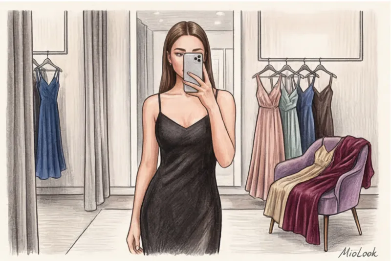
- Step 2: Take a selfie. Take two photos of yourself in the mirror: with and without flash. If, in the flash photo, a fine emerald turns into a cheap green tint, or the fabric takes on a plasticky sheen, leave the item in the store. The camera sees what the brain smooths out.
- Step 3: Test without makeup. Hold the fabric up to your face when you're bare of concealer or foundation. The perfect, "yours" color will make your face look rested even without makeup. If your dress without foundation makes you look older or emphasizes fatigue, it's a failure.
- Step 4: Calculate Cost-Per-Wear. Ask yourself a very specific question: "What three items from my current wardrobe will I be able to wear with this dress for brunch with my girlfriends in September?" If your mind is blank, you're about to buy disposable props for the photo shoot.
Choosing a prom dress isn't a color theory exam. Don't limit yourself to outdated theories. By understanding your contrast ratio, knowing your skin temperature, and avoiding tricky color shifters, you'll find a dress that works for you. And most importantly: the perfect color is one that makes you feel confident, even if it breaks all the rules of fashion magazines.