Print Names and Their Status: Why Some Patterns Look Expensive While Others Don't
Have you ever wondered why a €1,500 silk blouse and its mass-market polyester counterpart for €30 can have the same floral pattern, yet the former is stunning while the latter looks downright cheap? It's not just the quality of the material itself. Studying names of prints and the history of their creation, we begin to understand: pattern is the language your clothes speak to others long before you utter your first word.
Our brain is a brilliant, yet very strict, scanner. There's a clear pattern in the psychology of perception: in a split second, we can discern the status of someone we're talking to through the complexity of a fabric pattern. Deep, multifaceted color schemes, where halftones blend into one another with mathematical precision, subconsciously signal high production costs. The brain interprets this as a marker of well-being and stability. Conversely, flat, garish colors or the blurred contours of a printed fabric immediately reveal a factory's strict savings on high-quality dyes.
Over 12 years of working in luxury styling, I've learned one ironclad rule of professional buyers. Do you know what we look at first when assessing the quality of a checked jacket? The alignment of the lines on the shoulder seam and lapels. If the pattern is out of place, the garment looks cheap, even if it's made of magnificent Italian wool.
In the segment fast fashion Prints are often applied using surface stamping, and fabric is cut in huge stacks to save millimeters of material and hours of labor. As a result, the geometry breaks at the seams. In luxury patterns, the alignment is perfect: the artisan manually adjusts the details so that the lines flow from the back to the sleeve, creating the illusion of a single seamless fabric.
A logical question arises: why do clients outside the industry need to know precise terminology? Believe me, this isn't snobbery, but your primary tool for smart online shopping. When you search for a simple "checkered dress" or "patterned blouse" online, the search engine returns thousands of options of dubious quality. But enter "glen check jacket" or "silk millefleur blouse," and the algorithms instantly suggest a completely different, more prestigious segment of brands. Knowing the precise terminology helps you consciously build your wardrobe and eliminate visual clutter. Incidentally, when my clients begin to digitize their closets through MioLook , we often see that the most unsuccessful, incompatible things were bought spontaneously, simply because “I liked the pattern.”
This leads to the main rule of an investment wardrobe: a print should serve you, not steal the show. If, when you enter a room, people notice the bold pattern first, and only then your face and personality, then the investment has been a failure. A prestigious pattern always works like an elegant picture frame, subtly highlighting your individuality without ever overshadowing it.
Classic Geometry: Print Names That Never Go Out of Style
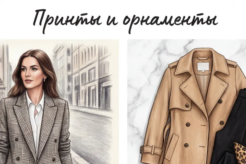
While florals in a wardrobe evoke emotions, classic geometric patterns are pure, cold calculation. When clients come to me with the request, "I want to look expensive and authoritative, but not too boring," we always begin our wardrobe review with geometric patterns. In style psychology, there's a clear rule: straight lines, sharp angles, and repeating symmetrical blocks visually unify the silhouette, creating an invisible framework around you.
This is why geometric shapes have historically become the unshakable foundation of business and smart-casual styles. Clean lines subconsciously convey confidence, a love of structure, and high professionalism. A person in a suit with crisp pinstripes or a precise checkered pattern is perceived as a more composed and reliable partner—this is confirmed by numerous studies on power dressing, dating back to the 1980s.
In my luxury consulting practice, I tirelessly repeat: geometric prints are the safest and smartest investments. It all comes down to dry math and metrics. cost-per-wear (cost per outing). A classic double-breasted checked jacket for €1,200, which you'll wear 150 times over five years, will cost you only €8 per outing. It will never go out of style, unlike an impulse buy with a trendy neon gradient for €150, which you'll wear exactly three times (€50 per outing). Geometric shapes save you money.
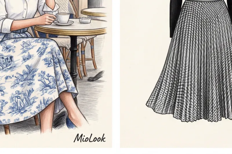
Plaid: from tartan to glen check (Prince of Wales)
Plaid is the most architectural of all existing prints. However, it's important to understand that the names of prints in this category carry completely different social and stylistic connotations.
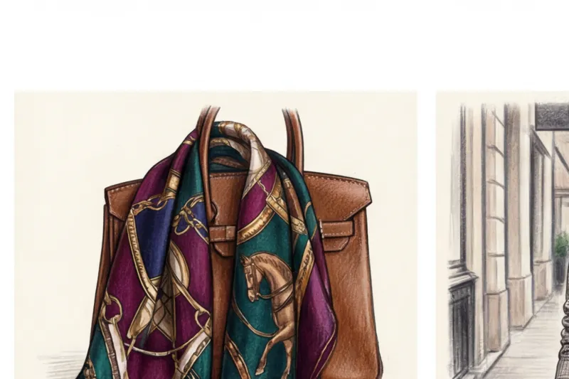
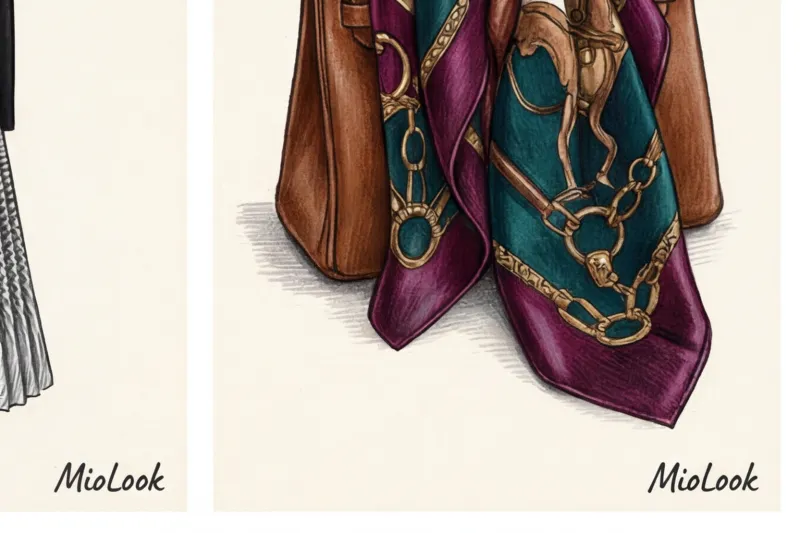
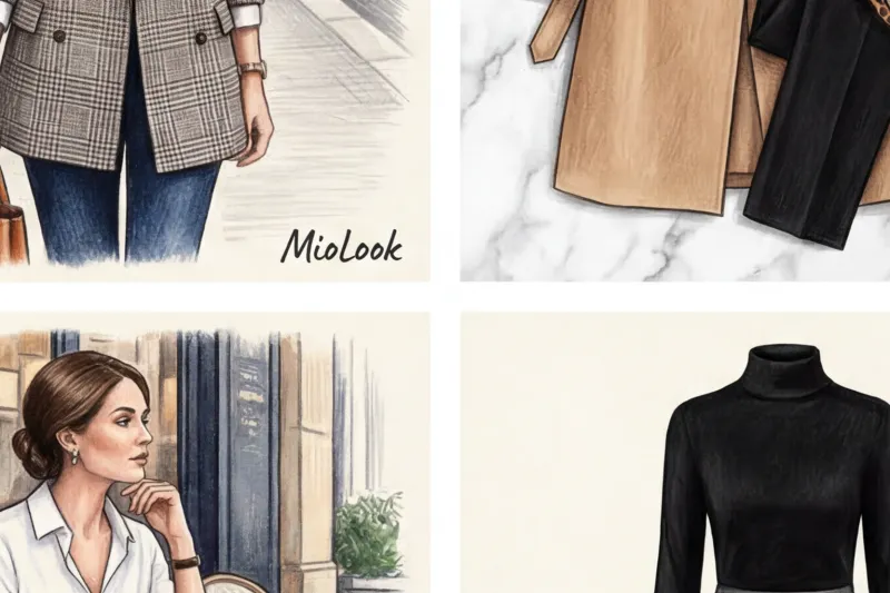
Tartan Tartan is a historically encoded pattern. Originally, the intersecting of colored threads denoted membership in a particular Scottish clan. Today, tartan is associated with thick wool, the aesthetics of old British universities, and, of course, the heritage of fashion houses like Burberry and Vivienne Westwood. In a modern interpretation, tartan requires caution: to avoid looking like a lumberjack, choose this print on premium fabrics (cashmere, fine suiting wool) and avoid cheap flannel.
Glencheck (Prince of Wales) Glencheck is the most aristocratic pattern for office suits. It owes its name to Edward VIII, who adored this intricate design. Glencheck is a weave of small and large houndstooth stitches, often layered with a thin contrasting thread (overcheck)—usually blue, pink, or burgundy. It's the perfect choice for those who want to demonstrate status without flashy logos.
Vichy (Gingham) — the complete opposite of austere tartan. It's a two-tone check (usually white with red, blue, or black) originally used for home textiles. Brigitte Bardot brought it into high fashion when she wore a pink Vichy check dress at her wedding in 1959. Today, it's synonymous with relaxed summer chic, the aesthetics of the French Riviera, and Provençal style. It looks perfect on cotton and linen.
Argyll — a pattern of diamonds intersected by thin diagonal lines. If you're looking to create a quiet luxury or preppy look, an argyle jumper made of fine merino wool is your go-to. This print is traditionally associated with golf clubs and Ivy League schools.
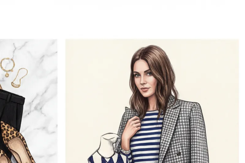
Stripes: Breton, chalk and rayon
Stripes can either elongate a silhouette to fit a model's parameters or mercilessly widen it. The key is to know the correct print names and their optical properties.
Breton stripe (sailor's shirt) — is a staple of Parisian chic. The original French naval uniform of 1858 had exactly 21 stripes—representing Napoleon's victories. Coco Chanel adapted it for women's wear, and Jean-Paul Gaultier made it his signature. Stylist's secret: To make a striped shirt flatter your face, choose styles with a white stripe that's wider than the blue or black. However, be mindful of your body type: a classic boat neckline paired with a horizontal stripe visually broadens the shoulders.
In the world of formal suits, two other types of stripes rule the roost, but they are often confused:
- Pinstripe — is a fine, sharp line, literally a single thread wide. It's applied to smooth worsted wool and looks very formal. It's a classic of Wall Street and aggressive power dressing.
- Chalk stripe — a wider, slightly blurred line, as if drawn with tailor's chalk. Most often found on textured flannel, it looks softer, warmer, and slightly less formal, perfect for smart-casual winter looks.
Raye Raye stripes are contrasting stripes of varying widths and often different colors. Unlike a formal suit stripe, raye is a bold accent. A vertical raye on a silk blouse or palazzo pants creates stunning movement and visually adds a few centimeters of height.
Try MioLook for free
A smart AI stylist will analyze your appearance and select the perfect print combinations that will highlight your best features and elevate your look.
Start for freePolka Dot and Pied-de-poule
While straight lines are associated with rigidity, rounded shapes add femininity and playfulness to the look. But even here, there are strict rules.
Polka Dot — a print whose seriousness directly depends on its scale. Micro polka dots on a dark blue background are perfectly acceptable even in a strict corporate dress code, as from a distance they blend into a single texture. Medium polka dots convey romance and lightness (remember Julia Roberts' iconic brown dress in Pretty Woman). But large, contrasting polka dots always evoke retro drama in the 1950s style. Save them for theater premieres or as accent accessories, as they will look comical in the office.
Two patterns deserve special attention, as even fashion commentators regularly confuse them: Pie de poule (crow's foot) And Pepita The ability to distinguish them is a marker of your perceptiveness.
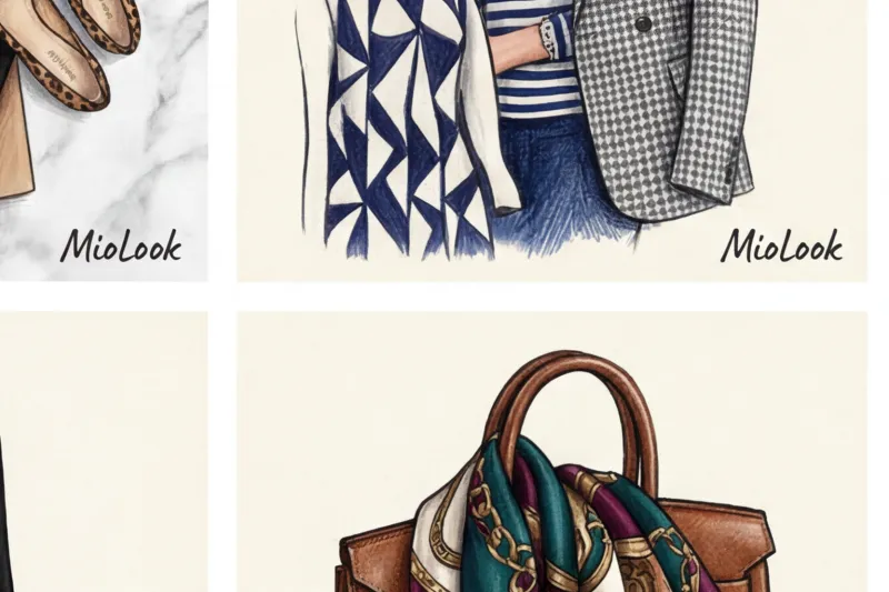
Pied-de-poule is an abstract broken pattern where each square has elongated "tails" or "hooks" that interlock with one another. This pattern became the legacy of Christian Dior, who used it not only in tweed suits but also in the packaging of his first perfume, Miss Dior. Pepita, named after the Spanish dancer Pepita de Oliva, is made up of small squares with slightly rounded corners, connected diagonally. Pepita has no sharp hooks. Keep this distinction in mind when choosing your next vintage jacket—an eye for detail always reveals a true connoisseur of luxury.
Animal Prints: How to Wear Leopard and Python Without Looking Vulgar
There's a persistent myth I regularly hear during initial consultations: "Not leopard print, it looks too provocative." And every time, I have to explain that the vulgarity isn't in the design itself, but in the inability to work with it. In the premium segment, animal print has long been considered a basic palette. A properly chosen "predatory" pattern is a marker of self-confidence, high style, and refined taste, not an attempt to attract attention at any cost.
To invest in such things consciously, it is important to understand the textures and know the exact names of prints , each of which carries its own visual code:
- Leopard: An absolute classic, introduced into haute couture by Christian Dior back in 1947. It conveys dominance and chic.
- Zebra: A clean, graphic pattern. Ideal for those who prefer monochrome but are tired of the usual stripes.
- Python: A complex, intelligent design with fine detailing that looks great on shoes and bags.
- Crocodile: Most often, this is embossing on leather, which gives a rigid, expensive texture to accessories.
- Tortoiseshell: A delicate spotted pattern in amber-brown tones. It's an absolute must-have for status accessories—from sunglasses frames to the buttons on a fine trench coat.
The main secret that saves animal prints from being cheapened lies in the quality of the material. Why does a leopard-print skirt made of thick silk for €300 look so classy, while a thin knit top for €15 looks ridiculous? The answer lies in the physics of fabric. Cheap elastane, when stretched over the body, distorts the geometry of the print, stretching it. Silk, cashmere, or thick cotton, on the other hand, hold their shape and create a refined matte or satin sheen that adds depth to the print.
A stylist's golden rule that never fails: use exactly one animal print for the entire look. A leopard coat requires a completely neutral canvas—a black turtleneck, straight jeans, and simple shoes.
Animal print is a brilliant tool for working with strict dress codes, when you need to add character to an outfit without breaking the rules. We recently put together a capsule collection for a top manager at a Swiss bank. The dress code there tolerates no liberties. Our best investment was a pair of classic python-print pumps in muted taupe tones. Paired with a crisp navy pantsuit, these shoes instantly upped the style ante. The look remained impeccably businesslike, but no longer felt bland.
If you've bought an accent piece but are afraid of overloading your outfit, try adding it to MioLook Smart wardrobe algorithms will analyze your wardrobe and suggest the safest and most elegant combinations to "calm down" a bold print with neutrals.
Floral and Botanical: Print Names for Romantic and Business Styles
Research into the psychology of visual perception conducted by specialists at the London College of Fashion proves that floral patterns are the most emotionally charged of all existing patterns. Unlike strict, predictable geometry, plant motifs lack right angles; they are fluid, organic, and always convey a specific mood.
That's why I always warn my clients: large, contrasting flowers are absolutely not suitable for tough negotiations or communication with investors. Giant poppies or peonies on a €2,000 silk dress will work against you, conveying unpredictability and blurring the focus of your conversation partner. In the boardroom, cool logic is needed, not a riot of color. However, at a pitch meeting at a creative agency or for creative professionals, the same large pattern will brilliantly highlight unconventional thinking, boldness, and openness to the world.
To consciously manage the impression and not make a mistake with the dress code, it is important to know the right ones names of prints and their stylistic weight.
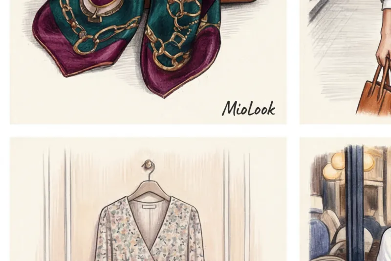
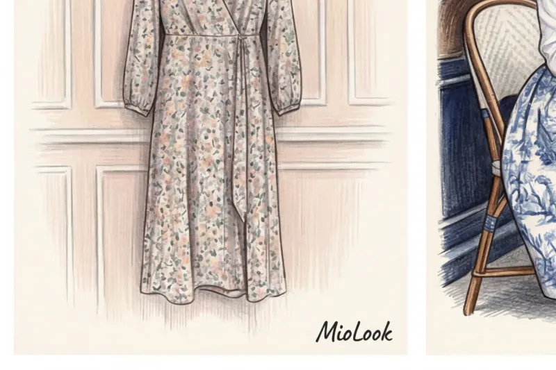
Millefleurs Translated from French, this elegant word means "thousand flowers." It's a scattering of small, often wildflower buds against a contrasting background. Millefleur is the perfect pattern for summer dresses, tea-length sundresses, and flowing blouses. It doesn't break up the silhouette and creates a delicate, romantic flair. It's no coincidence that this pattern is a favorite among Parisians—from vintage Yves Saint Laurent collections to modern capsule collections of the French mid-range. To prevent a millefleur look from appearing too childish, play with textured contrasts: pair such a dress with chunky leather boots or layer it with a structured men's blazer.
Paisley (Turkish cucumber) This teardrop-shaped pattern of Persian origin is the absolute quintessence of bohemian chic. Italian house Etro built an entire empire on it, forever cementing paisley's status as an intellectual luxury. Integrating it into a modern wardrobe requires careful consideration: if you don't want to look like you just returned from Woodstock, use the pattern sparingly. A silk blouse made of heavy crepe with this pattern will perfectly soften a formal pantsuit, and a square scarf will add a sophisticated touch to a basic trench coat.
Arabesque and damask When discussing print names for evening and formal wear, intricate, ornate patterns come to the fore. Damask and arabesque are symmetrical floral weaves. Damask gets its name from the Syrian city where the most expensive fabrics for European nobility were woven in the Middle Ages. Today, such patterns are often not printed on fabric, but rather rolled out using a jacquard technique. They look luxurious on dense textures such as brocade, velvet, and heavy silk. A jacket with a damask pattern in a deep wine, sapphire, or emerald hue is a long-term investment that instantly elevates the solemnity of your appearance.
Tropical prints Palm leaves, exotic vines, and hibiscus are a special category that requires strict stylistic discipline. Remember the iconic green Versace dress with the Jungle print, made famous by Jennifer Lopez—it's the epitome of relaxed resort luxury. Spoiler: tropical influences are only appropriate for cruise collections and vacations. In the concrete jungle of the metropolis, a bright Hawaiian shirt or a dress with a large monstera plant looks out of place, visually cheapening even the most expensive fabric. Save these cheerful motifs for strolls along the Riviera promenade or lounging by the pool.
Try MioLook for free
Start creating perfect looks with the help of artificial intelligence. Upload your floral prints, and the algorithm will suggest how to incorporate them into your everyday or business wardrobe without losing your style.
Start for freeEthnic and historical patterns in modern fashion
We often wear veritable museum pieces without even realizing it. Studying the archives of European manufacturers and traditional dyeing techniques, one is struck by the fact that what seems like an ultra-fashionable trend today was actually invented centuries ago. Remembering the complex historical names of prints, many women are wary of adding them to their wardrobes—it seems that such clothing requires palace interiors or, at the very least, the red carpet. In reality, however, it's a powerful tool for creating an intellectual, profound style.
Let's take a look at Toile de Jouy. Literally translated, this term means "fabric from Jouy"—the small town of Jouy-en-Josas near Paris where Christophe-Philippe Oberkampf opened his manufactory in 1760. Pastoral scenes, monochrome landscapes, and ancient ruins, printed in delicate lines on light cotton, initially adorned the interiors of the aristocracy. Christian Dior triumphantly brought this pattern back into fashion in 1947, covering the walls of his first boutique on Avenue Montaigne. Today, Toile de Jouy is an absolute hallmark of French luxury.
When Maria Grazia Chiuri transferred this motif to Dior's oversized shopper bags and summer cardigans, she proved that historical monochrome looks luxurious in the dynamism of the modern metropolis.
Another example of a timeless classic is the ancient Greek meander. This continuous, broken pattern, symbolizing eternity and the endless flow of life, has become the unmistakable signature of the House of Versace. Gianni Versace brilliantly understood its nature: the meander works best not as a solid fill, but as an architectural border. A basic silk blouse for 800 euros with meander edging on the collar and cuffs looks formal, yet with a clear, confident claim to high status.
While European history gravitates toward graphic precision, the artisanal aesthetics of the East brought controlled chaos to high fashion. Ikat and tie-dye have long since left the niche of cheap beachwear. True ikat is a complex technique in which threads are dyed. to before they hit the loom, creating the pattern's characteristic "fuzzy" edge. And tie-dye, as performed by luxury brands, draws on the ancient Japanese tie-dye technique of shibori. Designers like Dries Van Noten and Proenza Schouler regularly prove that a silk dress with such patterns is appropriate even for a social event, provided it's crafted in elegant shades of indigo, terracotta, or ochre.
Historical ornamentation brooks no competition. When wearing a centuries-old piece, treat it as the main piece of jewelry in your outfit.
A natural practical question arises: how to integrate these expressive patterns into everyday casual wear without looking like an actress from a historical theater? The secret lies in playing with contrasts:
- Undercut pathos with utilitarianism. If you've chosen a blouse with a pastoral Toile de Jouy, skip the midi skirts and heels. Pair it with straight-leg jeans made of thick, raw denim and rugged leather loafers.
- Use the one thing rule. A kimono robe with an ikat pattern will be the perfect companion for a completely neutral base—a white T-shirt and minimalist wide-leg trousers.
- Leave some air. Any complex print names with historical backgrounds require a clean background. Avoid an abundance of small embellishments and complex arrangements—let the fabric pattern take center stage.
Optical illusions and abstraction: ombre, color blocking, and op art
In 1965, Yves Saint Laurent created his famous Mondrian dress, forever proving to the world that clothing can physically control the viewer's gaze. Today, when we say things like names of prints Like color blocking or op art, we're not just talking about a decorative fabric pattern. We're discussing a powerful tool for visually correcting proportions that works flawlessly—if you know how to use it correctly.
Color block — is an uncompromising, geometric clash of large color splashes. Unlike a small pattern, it works like a plastic surgeon's scalpel. Vertical contrasting blocks on the sides of a dress can visually reduce up to two sizes, elongating the figure and creating a stately posture. According to the PANTONE Color Institute, color blocking remains a key commercial technique for premium brands due to its ability to create a dynamic look without excessive garishness. The main rule I always tell my clients is that the shades in such pieces should have the same temperature saturation.
A soft, enveloping alternative is ombre (or gradient) — a smooth transition from one color to another. In true luxury (look at Loewe's runway collections or Zimmermann's silk dresses priced between €800 and €1,500), the gradient is often created by intricately dyeing the threads themselves before the fabric is woven. A proper ombre should always darken toward the area you want to visually slim.
The highest level of styling is considered to be op art (optical illusions) Lines that graphically converge toward the center of the waist create the illusion of an hourglass silhouette, even if you naturally have a rectangular body type. But herein lies the most insidious mistake, which I regularly observe on the streets of Milan and Paris. Women buy trousers or skirts with vibrant, pulsating op-art prints, attempting to blur wide hips. Remember: any dynamic 3D pattern acts like a magnifying glass, producing the exact opposite effect. If you want to conceal volume, redirect the optical illusion to the portrait zone, leaving the problem area in a deep, matte monochrome.
"Optical prints don't tolerate competition. If you wear something with an op-art effect, everything else in your outfit should fade into the background."
Finally, abstraction Brushstrokes, paint splashes, and chaotic splashes of color are the perfect choice for creative professionals, architects, and art directors. Abstract patterns convey free thinking and creative boldness. Unlike strict geometry, abstraction doesn't require a perfect fit and is perfectly forgiving of subtle asymmetries in cuts or complex draping.
To avoid mistakes with the scale of spots and lines, I recommend uploading a photo of a potential purchase to MioLook Smart wardrobe algorithms will help you visually assess how a specific optical pattern will fit into your capsule wardrobe and whether it will suit your body type.
Your perfect look starts here
Join thousands of users who look flawless every day with MioLook.
Start for freeStylist Secrets: How to Combine Different Print Names in a Single Look (Print Mixing)
Belgian designer Dries Van Noten's show in Paris proved once again that the pinnacle of styling lies in juxtaposing seemingly incompatible patterns in a single look. Many women fear print mixing, considering it the preserve of eccentric fashion bloggers. In reality, it's not magic, but pure mathematics. If you know the names of prints and understand their visual weight, you can create complex, layered outfits that will leave you wanting to stare at them for hours.
The first and most important rule that will protect you from visual chaos is single color rule You can confidently combine completely different patterns as long as they share a common color palette. Imagine a silk blouse with an emerald-blue paisley pattern. It would look flawless with a navy blue Breton striped skirt. Why does this work? The brain doesn't perceive a clash of shapes, but a harmony of shades. Color acts as a bridge, connecting two different worlds on the fabric.
The second constant is rule of scale Never pair two identically sized patterns in the same outfit. They will aggressively compete for attention, creating a rippled effect that can be tiring to the eyes. The secret to a luxurious look lies in the contrast of volumes: pair a large print with a small one. A classic example, often seen in Celine lookbooks, is a chunky wool jacket in a large tartan (with a repeat size of about 10 centimeters) worn over a flowing dress with subtle, small polka dots. In this duet, the large geometric pattern creates a rigid structure, while the small scattering of dots delicately acts as a neutral backdrop.
If you're just starting out experimenting with patterns, use my favorite fail-safe formula: Print + Geometry You've probably noticed that lush, romantic flowers always look stunning with a crisp stripe. The answer lies in the balance of energies. Floristry conveys dynamism, natural chaos, and soft femininity, while geometric lines convey order, statics, and confident masculinity. This play on stylistic contrasts creates an intellectual and prestigious look.
In professional environments we often use the concept neutral prints Surprisingly, leopard print and the classic Breton top have long been considered staples in the styling world. Their visual signature is so familiar to our eyes that they practically work as solid-color pieces. Try wearing a basic coat with a high-quality leopard print over a pinstripe suit. You'll see how the vibrant, predatory pattern instantly "calms down" against a backdrop of strict office geometry, creating an elegant, rather than vulgar, ensemble.
"The secret to mixing is not to wear all the best at once, but to make sure that each subsequent pattern supports the previous one without shouting it down."
Let's look at a specific, complex case. How do you mix houndstooth, stripes, and floral prints to look like a Milan Fashion Week street style icon, not a city nut?
- Step 1. Base (background): We choose a cotton shirt with a thin, barely noticeable blue stripe. This is our first layer, which creates a clear vertical line.
- Step 2. Structure: We put on a medium-sized, thick wool jacket in a black and white pied-de-poule pattern. The black and white monochrome here acts as a rigid frame and neutralizer.
- Step 3. Emphasis: Add a silk scarf or a midi skirt with a large, sweeping floral print. The key: one of the shades of the buds (for example, a muted gray-blue) should perfectly match the color of the stripe on the shirt.
This set masterfully follows all the rules: there's a unifying color, completely different scales (small stripes, medium paw prints, large flowers), and a masterful balance of strict geometry and romantic florals. To avoid wasting precious morning hours in front of the mirror trying to put together a similar ensemble, I recommend digitizing your closet. Download printed blouses, skirts, and jackets to MioLook — The smart wardrobe feature allows you to virtually "collide" checkered patterns with flowers and appreciate the scale of the patterns right on your smartphone screen, even before you open the closet door.
Checklist: How to choose a print based on your body type and appearance
At the Istituto Marangoni in Milan, there's an unspoken rule in the styling course: a poor cut can be concealed by a perfect fit, but an incorrectly scaled pattern will ruin even a tailored suit. The physics of visual perception are inexorable. You can learn everything. names of prints , understand their historical subtext and buy a silk blouse for 800 euros, but if the size of the pattern conflicts with your natural features, the look will fall apart.
The concept of "appearance scale" is the architectural foundation of personal style. It includes not only height and build, but also the size of facial features, bone density, and contrast. These parameters dictate which patterns will flatter you and which will draw attention to themselves.
For petite women (up to 160 cm tall, with delicate features), the law of proportionality applies. Your ideal base is a small to medium pattern. Classic French millefleurs or delicate polka dots will highlight your natural fragility. If you try on a maxi dress with huge peony buds or a wide contrasting stripe, the large pattern will visually "eat away" your height. People will notice the dress first, and only you second.
The situation is completely opposite for plus-size women. I strongly recommend reconsidering established stereotypes. Often, out of fear of looking bigger, women opt for what they perceive as a saving grace: small calico floral prints. This is a fatal mistake in visual correction. Patterns that are too small on a voluminous figure begin to "ripple" and, in contrast, only emphasize the size of the body. Your safe choice is a medium or large print. A striking abstraction, a wide diagonal stripe, or a color block visually pull together the figure, giving it a clear, confident frame.
"A pattern on fabric works like a magnifying glass: it always magnifies the area it's placed on. The main goal is to focus this magnifying glass on your best features." I learned this rule of visual correction during my internship at a Parisian atelier, and it works flawlessly.
Any pattern is an eye-catcher. Use printed pieces as focal points to strategically direct attention. If you have a pear-shaped figure (voluminous hips and a slender top), wear a blouse with a bold geometric pattern paired with simple dark trousers. Your conversation partner's gaze is guaranteed to remain focused on your portrait area. Conversely, an A-line skirt with a tartan or pied-de-poule print will subtly draw attention away from broad shoulders if you have an inverted triangle body type.
Assessing the proportions of a pattern in a store can be difficult—your eyes quickly become blurred, and artificial lighting distorts the proportions. To avoid mistakes, I recommend taking photos in the fitting room and using the "smart wardrobe" feature in MioLook On your smartphone screen, it's immediately clear whether the pattern's scale conflicts with your facial features.
There are no random decisions in an investment wardrobe. Patterns are not just seasonal decoration, but a fully-fledged impression management tool. Explore textures, test different scales, and invest in impeccable craftsmanship. When you find your ideal patterns, even the most minimalist basic capsule will acquire character, status, and genuine elegance.