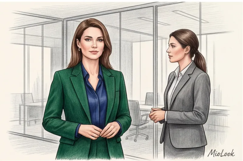
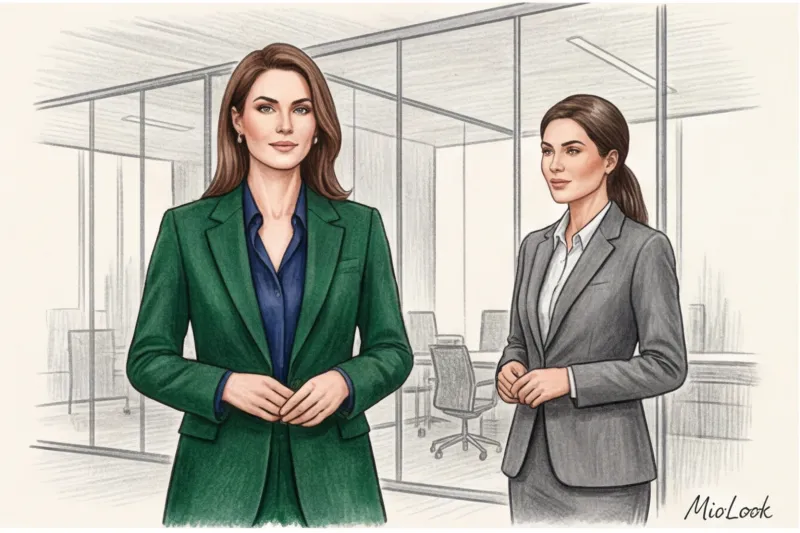
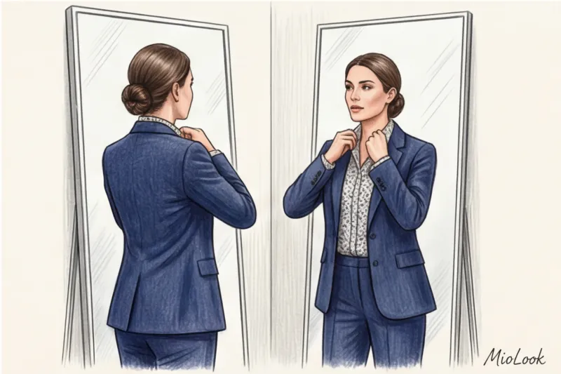
Five years ago, Anna, a senior partner at a large law firm, came to see me. Her request was typical: "Olena, I'm tired of black and gray; they blend in with the office furniture. But I'm afraid bright colors will undermine my credibility." We took a risk and replaced her usual solid black suit with a deep emerald two-piece. The result surprised even Anna herself: clients began to appreciate her empathy, negotiations became smoother, and her status as an expert remained intact; in fact, it became more polished.
Over 14 years of working as a personal stylist, I have realized the main thing: to integrate bright colors in office wear It's not about wearing every color of the rainbow. It's a subtle play with contrasts, textures, and the psychology of perception. We've covered more about how to balance formality and self-expression in our the complete guide to creative business style.
Today I'll share with you some subtle tips for incorporating color and print into your business wardrobe that truly enhance your personal brand, rather than detract from it.
The Psychology of Color: How Bright Colors in Office Wear Control Impressions
The fear of looking like a parrot has driven many brilliant experts to hide behind beige, navy blue, and gray for years. Let's be honest, ladies: basic colors are great, but in a creative or modern business style, color is your primary nonverbal sales tool. It speaks for you before you even open your mouth.
In 2014, Harvard Business School researchers Silvia Bellezza and Francesca Gino published a paper on the so-called "Red Sneakers Effect." They demonstrated something astonishing: in the business world, people subconsciously attribute higher status and competence to those who consciously, but in measured ways, violate strict dress codes. Why? Because only someone who is absolutely confident in their position can afford to deviate from the uniform.
The Pantone Color Institute also regularly publishes data on the psychology of color perception in the business environment. Here's how it works in practice:
- Deep Emerald: Associated with stability, growth, and money. Ideal for the financial sector.
- Cobalt Blue: It conveys intelligence and trust. One of my clients, the founder of an IT startup, used a cobalt jacket when pitching to investors—and closed a funding round.
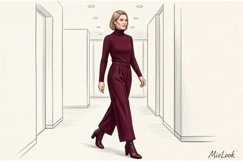
- Deep burgundy (marsala, wine): the color of hidden power and aristocracy.
- Fuchsia (in measured quantities): demonstrates creativity, dynamism and readiness for non-standard solutions.
You can read more about how shades affect your negotiations in the article about the psychology of color in clothing.
Your perfect look starts here
Join thousands of users who look flawless every day with MioLook. Our intelligent AI stylist will select the perfect palette for your office.
Start for freeThe biggest mistake newbies make: why the "bright spot" rule no longer works
If you ever read glossy magazines from the 2000s, you'll likely remember this advice: "Wear a sharp black suit and accessorize it with bright red pumps or a neon scarf." I'm officially stating: this trick is hopelessly outdated and is currently working against you.
A bright, contrasting spot on a dark background visually cuts off your silhouette. Red shoes with black pants draw the other person's gaze down to your feet, drawing the focus away from your face—the area where eye contact occurs and trust is built. This contrast also makes you appear shorter.
A modern, much more prestigious alternative is tonal monochrome (Total Color Look) Instead of pitting black and red against each other, create a look in one complex shade, but with different textures.
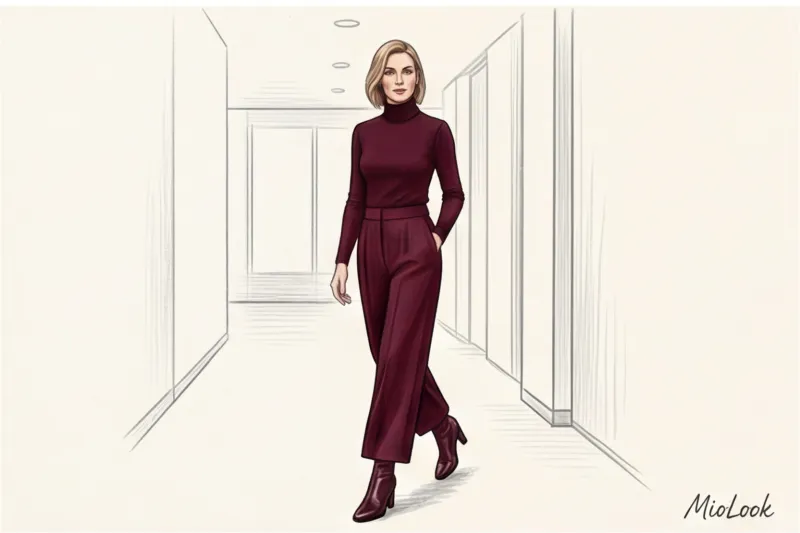
For example: wide-leg trousers made of thick, cold-spun wool in a ripe cherry shade, a silk blouse (from 19 momme) a shade lighter, and leather ankle boots to match the trousers. The eye perceives this look as a single, continuous vertical line. You appear taller and slimmer, and the outfit itself looks as if it was put together by stylists from premium brands like The Row or COS.
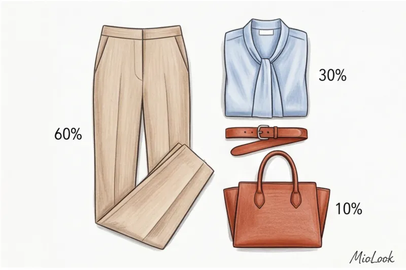
The 60-30-10 Formula: The Mathematics of the Ideal Business Image
How do you avoid going overboard when you're just starting to introduce color? I always recommend my clients use a classic interior design rule that perfectly applies to wardrobe color schemes: the 60-30-10 formula.
Here's how it's deciphered in clothing:
- 60% — Base color. This is the foundation of your look: a pantsuit, a midi dress, or a skirt and jacket. Choose muted shades: graphite, camel, deep blue, or dark chocolate.
- 30% - Additional color. This is your blouse, shirt, turtleneck, or jumper under a jacket. Here you can add a soft color: dusty rose, pistachio, muted blue.
- 10% - Accent color. That one statement piece: a stiff, structured bag, eyeglass frames, a scarf, or shoes (as long as they don't contrast sharply with the trousers).
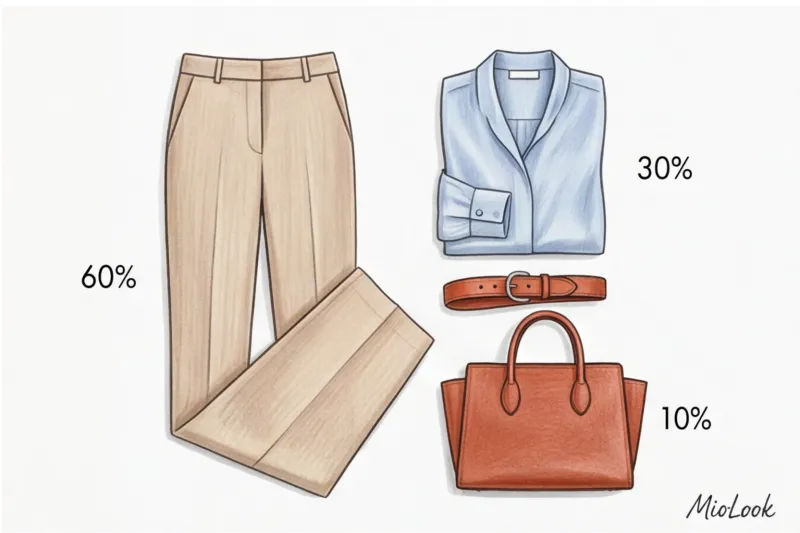
An example of an ideal application: 60% - a wet asphalt suit, 30% - an icy blue silk shirt, 10% - a rich terracotta tote bag. To avoid having to remember all these formulas, I recommend using the "smart wardrobe" feature in the MioLook app You simply upload photos of your items, and the algorithm itself suggests combinations with the right balance of shades.
Try MioLook for free
Start creating your perfect looks with artificial intelligence. Upload your wardrobe and receive ready-made capsule collections for every day.
Start for freePrints in a business wardrobe: from safe classics to bold solutions
Wearing a print in the office is always a risk. A pattern on fabric attracts much more attention than a solid color, so it automatically becomes a focal point. The key rule that 90% of women forget is that the scale of the print should be proportionate to your facial features and body type.
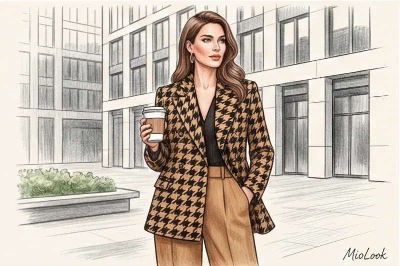
Strict geometry: checkered, striped and houndstooth
Geometric shapes are the safest and most prestigious choice for business formal and smart casual dress codes. But even here, there are nuances.
A thin, barely-there pinstripe conveys the utmost austerity and conservatism. A wide, contrasting stripe, however, is a bold statement of creativity. If you want to introduce color but are wary of losing the seriousness, try a colorful check. For example, a classic gray tartan with a thin yellow or burgundy thread. This thread can be "supported" by a blouse of the same color, creating a stunningly cohesive look.
Floral, abstract, and animalistic: red flags
Now, about when prints don't work. I once attended a major fintech conference. A woman, a top bank manager, took the stage. She was wearing a dress with a small, colorful floral pattern (millefleur) made of thin viscose. Despite her brilliant speech, visually she looked less like a financial strategist and more like a girl on a summer picnic. Small flowers undermine authority and make an image appear childish. If you like florals, choose large, abstract ones, as if painted with watercolors.
As for animal prints (leopard, zebra, python) in the office, it's a bit of a stretch. Leopard is only acceptable in muted, low-contrast tones or in a 10% volume (for example, loafers). Abstract color-block prints, however, are ideal for creative professionals such as architects, designers, and marketers.
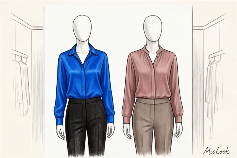
Color type and contrast: why the same print can make you look both beautiful and old
You bought a stunning blouse with a bright geometric pattern, put it on, and in the mirror you see a tired face with dark circles under your eyes. Sound familiar? It's not that you didn't get enough sleep. It's the level of contrast in your appearance.
If you have a soft, low-contrast appearance (light brown hair, light eyes, fair skin), an aggressive black-and-white or acid-colored print will simply "eat up" your face. People will see the dress, not you. You need softer transitions: instead of black and white, try dark blue and cream. For more information on how to determine your contrast level, read our article about 12 color types of appearance.
We once rescued a client's beloved, but completely "wrong" temperature, bright coral blouse. The color made her face look reddish. We didn't throw it out. We simply layered it with a thick, neutral ecru jacket, thereby offsetting the dangerous color. It worked flawlessly.
Ready to get started?
Try the MioLook free plan—no commitments required. Artificial intelligence will analyze your color type and suggest ideal combinations.
Start for freeStylist Checklist: Testing Your Look Before Going to the Office
To ensure you're always confident in your choices, I'm giving you my professional checklist. Run your outfit through it every morning.
- The "squinted eye" method. Stand in front of a mirror and squint hard. If the print on your blouse starts to flutter aggressively, blur into a dirty spot, or make you feel slightly dizzy, take it off immediately. In a busy office, this will irritate your interlocutors.
- Focal point test. Statistically, we only have 7 seconds to form a first impression. Where does your gaze fall in the first 3 seconds in front of a mirror? If it falls on the bright hem of a skirt, that's a mistake. Your gaze should be directed toward the portrait zone (your face).
- The one active thing rule. If a complex print or rich color is the star of an outfit (for example, fuchsia trousers), the cut should be as simple as possible. No ruffles, flounces, or complex asymmetry. Color is the design.
- Assessment of appropriateness. A bright color should match the agenda. For routine office work, emerald or burgundy are suitable. However, if a difficult conversation about firing an employee or tough negotiations is imminent, it's best to tone down the brightness to avoid appearing aggressive.
By the way, in MioLook You can save your most successful looks that pass this checklist into a separate "Office" lookbook so you don't have to waste time thinking about them in the morning.
Incorporating bright colors and prints into your business wardrobe isn't about being the most dressed-up in the open office. It's a strategic attention-grabbing tool. Your goal is to ensure that color highlights your competence, not overpowers it. Start small: swap out your usual white shirt for a dusty rose shade or add a deep wine-colored jacket instead of black. You'll be surprised how it changes not only your reflection in the mirror but also how your colleagues treat you.


