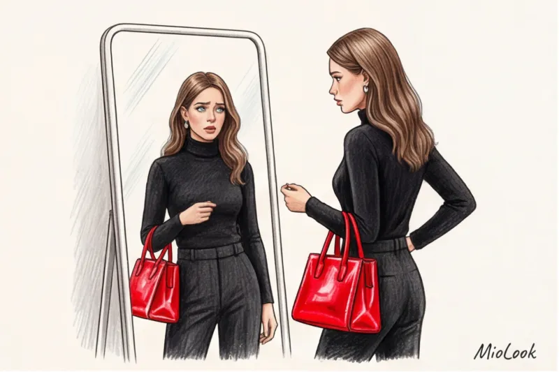
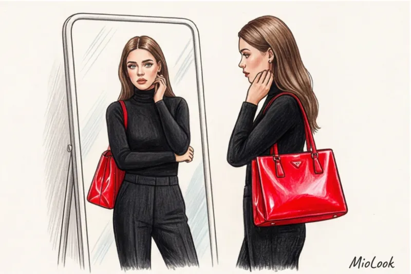
Think back to 2012. You put on a sheer black dress, thick black tights, black shoes, and then pick up a bright red patent leather bag. Back then, many thought this was the pinnacle of style—the perfect contrast. Today, looking at such looks, we realize: the bag looks like it has a life of its own, its silhouette mercilessly cut in half.
I'm Katarzyna Nowak, and in 12 years as a personal stylist, I've seen hundreds of closets filled with "survivorship bias." Women buy neon jackets or loud shoes on sale to "spice up a boring basic," and then these items hang around with the tags for years. Modern European minimalism dictates different rules. Fit bright accents in clothing It is necessary that the color becomes a logical continuation of the texture, and not a signal beacon.
We have already talked in more detail about the physics of color and how shades interact with each other in our a complete guide to the rules of combination and the Itten circle Today, let's talk about pure pragmatism: how to buy bright things that you can wear every day, not just once a year.
Why "Just Buying a Red Bag" No Longer Works: The Biggest Mistake Newbies Make
The idea of "black canvas plus a pop of color" is hopelessly outdated. When you use a single, contrasting accessory without support, it creates a detached effect. The person's gaze is drawn to your bag or shoes, ignoring your face.
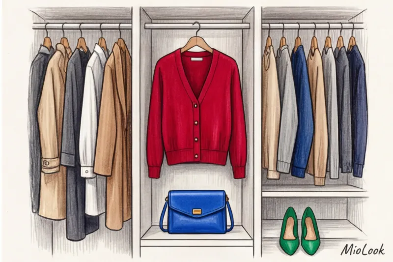
Last week, we were sorting through a client's wardrobe in Warsaw. From the top shelf, she pulled out a neon-green micro bag from Zara, brand new. "I bought it to liven up my drab work clothes, but when I hold it in my hands, I feel ridiculous." " she confessed. In the same closet, a dark burgundy leather Massimo Dutti belt hung on a hook, showing signs of heavy wear—the client had integrated it into at least 30 different outfits. Why did the belt work, but the bag didn't?
The answer lies in psychology and geometry. The bag was too bright, too glossy, and took up too much space against the matte gray wool. It clashed with the suit. The belt, however, delicately accentuated the waist, blending with the texture of the trousers. Color should reflect your energy, not be a random trophy from a seasonal sale.
The 10% Rule and "Shading": How Brands Like COS and Massimo Dutti Integrate Color
As a former fashion retail insider, I often observed visual merchandisers at work in H&M Group stores (especially in premium lines like COS and & Other Stories). You'll never see one huge splash of color on their mannequins. They use a strict 80/20 ratio, with no more than 10-15% of the silhouette being dedicated to pure, vibrant color.
"The secret to a luxurious look isn't wearing a brightly colored item, but rather making the viewer's eye seek out that color in other details. We call this 'color echo.'"
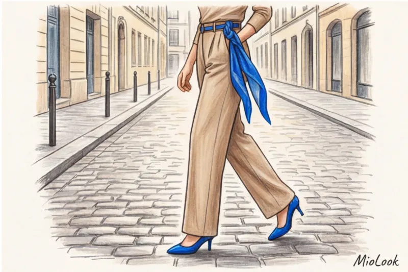
What's the principle of shading? If you're wearing blue shoes, the same cobalt hue should be repeated elsewhere, but on a micro-scale. For example, in the print of your scarf, the pinstripes on your shirt, or even the color of your glasses frames. This ties the look together.
And here, fabric texture comes to the rescue. WGSN consumer research (2024) shows that shoppers are willing to pay 30% more for a colorful item if it has a complex texture. Matte silk, grained calfskin, or fluffy mohair absorb some of the light, making any shade, even the most garish, deep and refined. Smooth, shiny polyester, on the other hand, will cheapen even the most beautiful emerald green.
Your perfect look starts here
Tired of racking your brain over color combinations in the morning? MioLook's smart AI stylist will analyze your wardrobe and suggest perfect combinations with bold accents.
Start for freeTemperature is more important than shade: how to combine base and accent colors
The most common cause of a "dirty" look is a temperature clash. You can have perfect proportions, but if you wear a cool graphite gray suit and pair it with a warm tomato red top, the pieces will begin to visually clash.
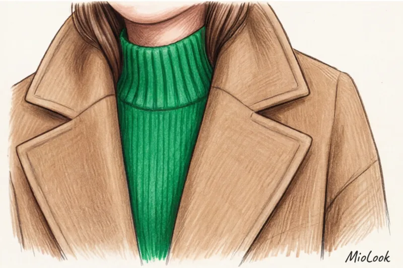
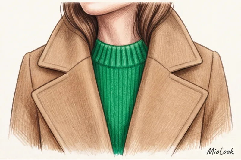
My personal life hack: Always test fabric combinations in daylight by a window. Store lighting distorts the color temperature beyond recognition. Cool beige (with a grayish undertone) calls for cool accents—emerald, sapphire, fuchsia. Warm camel thrives next to warm orange, terracotta, or forest green.
Where to start: 3 safe zones for incorporating color without breaking the bank
Please don't start integrating color by buying a bright coat or fuchsia pants. That's too big, too expensive, and too risky. Start with areas that are easy to control and, if necessary, conceal.
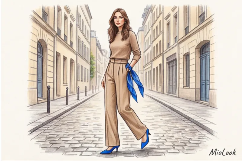
- Zone 1. Portrait zone. Silk scarves (bobble scarves), thin turtlenecks worn as an underlayer under a voluminous shirt, or statement collars. The color around the face brightens up the skin tone. If you feel uncomfortable, you can always remove the scarf and tie it around your bag.
- Zone 2. Shoes and lower tier. Colorful suede pumps, retro sneakers with bright accents (like Adidas Gazelle or New Balance), or simply peek-a-boo colorful socks. This area is furthest from the face, so bold colors are perfectly safe here.
- Zone 3. Inner layers. A bright top worn under a simple, single-button jacket. The color will only be visible when you move, creating intrigue.
Let's face it: a quality silk scarf from &OtherStories for €40 will add ten times more to your everyday style than a poorly tailored but brightly coloured jacket from a mass market for €100 that will start pilling within a month.
Investing Smart: Which Spectacular Items Are Worth the Money (Cost-Per-Wear Analysis)
If you want your wardrobe to work for you, learn to count Cost-Per-Wear (cost per wear) The formula is simple: divide the price of the item by the number of days you wore it.
Let's say you're choosing between two strategies. The first is to buy a basic, high-quality trench coat for €200 and add a luxurious, bright cashmere scarf for €80. You'll wear the scarf every day all fall (about 60 times). Your CPW for the scarf will be only €1.30. The second strategy is to buy a cheap, bright red polyester coat for €150. You'll wear it maybe 3-4 times because you'll get tired of the vibrant color and the fabric's lack of breathability. Your CPW is almost €40 per outing. The math is merciless.
Ready to start shopping mindfully?
Digitize your wardrobe with the MioLook app. Artificial intelligence will show you the Cost-Per-Wear (CPE) for each item and help you avoid unnecessary spending on impulsive, flashy purchases.
Try it for freeWhat you CAN and should invest money in:
- High quality leather belts (they last for years).
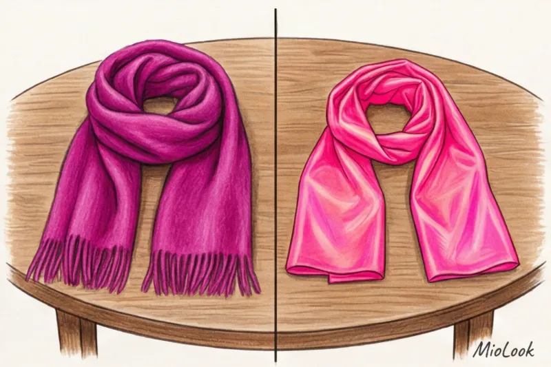
- Cashmere and wool blend scarves.
- Structured micro bags with a rigid shape.
- Comfortable colored shoes made of natural suede (suede holds pigment better than smooth leather).
What you CAN save on:
Don't spend hundreds of euros on trendy colors that will go out of style within a season (remember the recent obsession with Bottega Green). Feel free to shop for bright T-shirts, socks, funky tights, and jewelry in the basic lines of H&M, Mango, or Uniqlo.
But there is one strict exception: Never buy cheap, brightly colored knitwear. A neon-colored acrylic sweater will lose its pigment after the second wash, become covered in pilling, and will only convey one thing to others—its low price.
How to choose the right hardware for statement accessories
Another subtle detail that can ruin a minimalist look is clashing accessories. Imagine: you're wearing a minimalist gray coat and silver earrings, and then you grab a bright blue bag with a chunky, cheaply shiny gold chain and logo. The attention is distracted, and visual noise appears.
My advice to clients is always the same: if you're buying a statement bag or belt, look for models with hidden hardware or matte hardware that matches the leather (tone-on-tone). Let the color, not the metal, take center stage.
Katarzyna's Checklist: A Step-by-Step Plan for Incorporating Bright Accents This Week
I don't believe in theory without practice. I give each of my clients homework after a shopping tour. Here's your assignment for this week if you want to become friends with color:
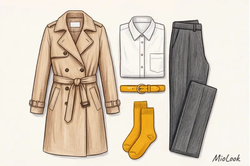
- Step 1: Inventory the base. Before adding accents, make sure you have a "solid canvas." A pair of perfect gray or beige trousers, a white T-shirt with a weight of at least 180 g/m², and a classic jacket will suffice. Without a base, the color won't have anything to cling to.
- Step 2: Choose a complimentary shade. Don't blindly follow the Pantone Institute's reports. Choose one color that makes YOUR eyes brighter and your skin look fresher. Place a cloth over your bare face—the right color will reduce under-eye circles, while the wrong one will accentuate them.
- Step 3: Buy a micro-accent. Go to your favorite store and buy just one micro-sized test item: a pair of high-quality colored mercerized cotton socks or a scarf. Nothing else.
- Step 4: Building images. Stand in front of a mirror and create at least three different looks with this new item. Take photos of them with your phone. (By the way, a phone is perfect for this kind of task.) virtual try-on feature in the MioLook app ).
Style is a muscle. It needs to be developed gradually. You don't need to buy half a mall to start looking interesting. Learning to control just ten percent of your look is enough, and those ten percent will change everything.


