Пам'ятаєте Ганну, IT-директора, про яку ми говорили у минулій статті? Вона зробила класичну помилку розумної жінки: вичистила шафу, купила сірі, бежеві і чорні речі, що бездоганно сидять, і... стала абсолютною «невидимкою» у власному офісі. Її гардероб був функціональним, але мертвим. Докладніше про те, як ми виводили її стиль із коми, я розповідала у нашому повному гіді з того, як поєднувати принти в одязі: правила стильної капсули. Сьогодні ж ми копнемо глибше.
За 12 років роботи стилістом на тижні моди від Парижа до Мілана я помітила стійкий патерн: 80% жінок плутають поняття «універсальність» з «відсутністю характеру». Нам роками вселяли, що правильний базовий гардероб із принтами - Це оксюморон. Але що, якщо я скажу вам, що саме складний малюнок — це архітектурний фундамент, на якому будується по-справжньому дорогий образ?
Анатомія нудьги: чому чистий мінімалізм у мас-маркеті не працює
Давайте будемо чесні: мінімалізм на кшталт сестер Олсен (бренд The Row) працює не за рахунок кольору, а за рахунок феноменальної архітектури крою та неймовірної вартості матеріалів. Кашемір за 3000€, щільний матовий шовк, структурована шерсть. Коли ми намагаємося повторити цю естетику, скуповуючи гладкі однотонні речі у мас-маркеті, відбувається візуальна катастрофа.
Чому? Гладкі матові тканини однакової (зазвичай невисокої) щільності - на кшталт бавовни за 30 € або тонкої костюмної тканини - візуально "злипаються" в одну плоску пляму. Оку нема за що зачепитися. Ви виглядаєте не як представник «тихої розкоші», а як людина в уніформі.
«Головний колористичний міф сучасності — переконання, що базовий гардероб може бути нейтральним і позбавленим візерунків. Насправді гладка фактура без малюнка прощає набагато менше помилок крою, ніж складний принт», — зазначає історик моди та дослідник трендів.
За даними аналітики WGSN за 2024 рік, запит на «фактурну базу» серед багатих покупців зріс на 45%. Жінки втомились від стерильності. Їм потрібні речі, які легко поєднуються, але при цьому мають особу.
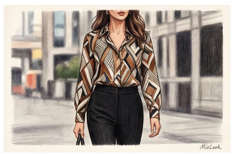
Принт як нова база: ламаємо стереотипи про колір та малюнок
Француженки давно опанували мистецтво впровадження малюнка у повсякденну рутину. Їхній секрет криється в концепції Faux Plains — «хибні однотонники». Це принти, масштаб яких настільки малий, а контраст настільки делікатний, що людський мозок зчитує їх як орнамент, бо як багату, складну текстуру.
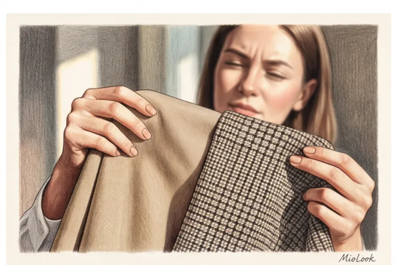
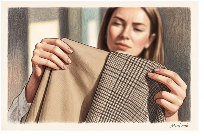
Професійний секрет: "Тест прищуром"
Як практично відрізнити базовий принт від акцентного? У примірювальних я завжди використовую з клієнтками один і той же трюк.
- Одягніть річ із малюнком.
- Відійдіть від дзеркала рівно на два метри.
- Злегка примружтеся, розфокусувавши зір.
Якщо візерунок злився в єдиний, злегка меланжевий або складний відтінок (наприклад, дрібна чорно-біла клітина почала здаватися благородним сірим) — вітаю перед вами база. Якщо ж принт продовжує рябити, кричати і чітко розбивається на колірні блоки - це акцент.
Важливе застереження: цей тест не працює для великих колор-блок рішень - вони завжди залишаються акцентами і вимагають вкрай обережної стилізації.
Формула ідеальної пропорції: скільки принтів реально потрібно
Багато модних блогів тиражують правило Парето: 80% гардеробу — база, 20% — акценти. Звучить логічно, але на практиці ці 20% «веселих» речей роками висять у шафі з бирками, бо їх елементарно нема з чим одягти. Вони живуть у відриві від решти шафи.
Натомість я пропоную своїм клієнтам комбінаторну формулу "3 до 1". Суть проста: на кожні три однотонні речі (обов'язково різних фактур!) повинна припадати одна річ із базовим принтом.
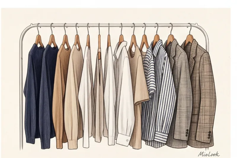
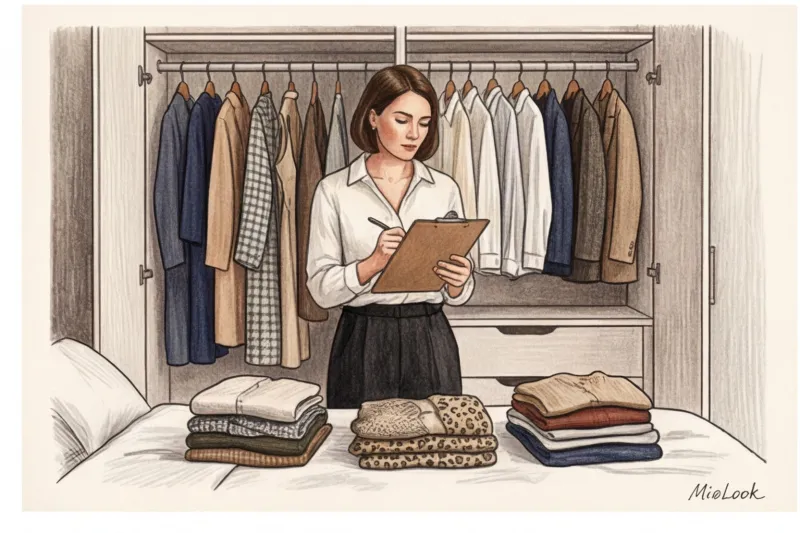
Давайте порахуємо математику розумної капсули на сезон. Візьмемо 12 речей:
- 9 однотонних/фактурних: джинси із щільного деніму, вовняні штани, шовкова спідниця-сліп, кашеміровий светр, бавовняна сорочка, структурний жакет, футболка, тренч, пальто.
- 3 принтовані: блуза в мікро-горох, жакет у клітку «Принц Уельський», шийна хустка з геометрією.
Ця комбінація дає понад 40 ненудних, стилістично цілісних образів. Якби всі 12 речей були однотонними, ви отримали б ті ж 40 комбінацій, але візуально вони здавалися б п'ятьма однаковими вбраннями.
Ваш ідеальний образ починається тут
Приєднуйтесь до тисяч користувачів, які щодня виглядають бездоганно з MioLook, створюючи капсули за допомогою ІІ.
Почати безкоштовно5 принтів, які працюють як ідеальна однотонна база
Не кожен візерунок здатний витримати випробування часом. Якщо ви хочете зібрати капсулу, яка не вийде із моди через сезон, сфокусуйтеся на цих п'яти історичних патернах.
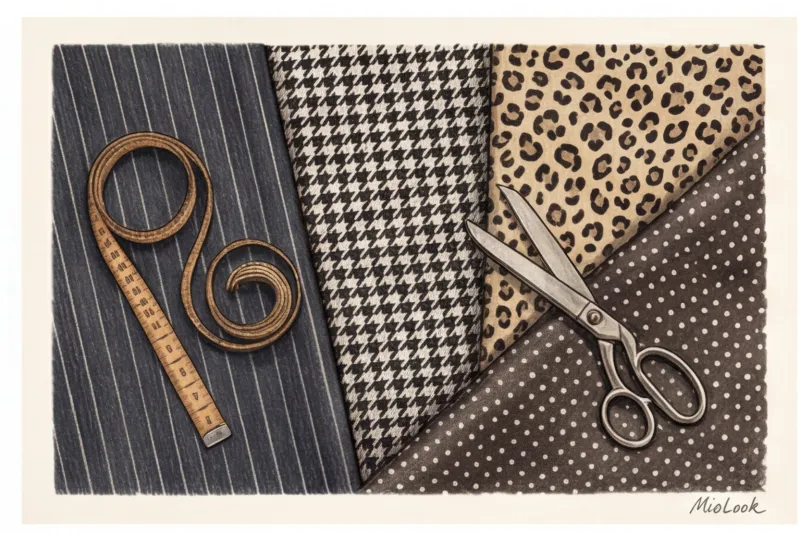
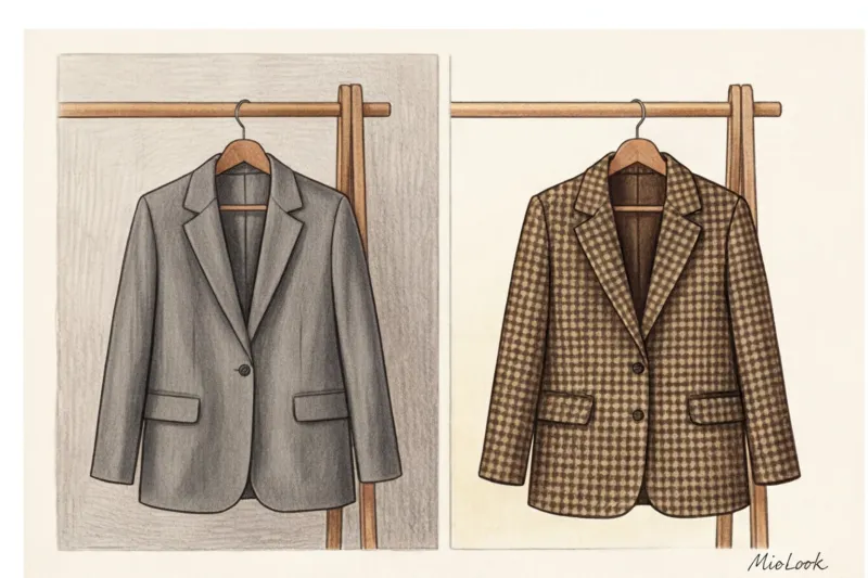
- Гусяча лапка (Houndstooth): Спадщина Крістіана Діора, який у 1947 році переосмислив цей британський візерунок, зробивши його символом елегантності. Дрібна чорно-біла лапка — ідеальна, значно динамічніша заміна глухого сірого кольору.
- Крейдяна смужка (Pinstripe): Витягує силует як за помахом чарівної палички. Тонка світла смуга на темно-синьому або графітовому тлі додає енергії навіть консервативному діловому костюму.
- Мікро-горох (Polka dot): Безпечна жіночність без ризику скотитися в інфантильність. Чим дрібніший горох, тим статусніше виглядає річ.
- Леопард у приглушених тонах: Так, ви не дочули. Як доводить геній роботи з принтами Дріс Ван Нотен, якщо прибрати з леопарду жовтий підтон і відвести його в холодний біж або хакі, він починає працювати як абсолютно нейтральна база.
- Класична клітина "Принц Уельський": Найкраща інвестиція в осінньо-зимовий гардероб. Жакет у таку клітку моментально «збирає» образ із простими джинсами та білою футболкою.
Парадокс інвестицій: чому принтована річ не має бути дешевою
Зараз я скажу річ, яка йде врозріз із порадами більшості глянцевих журналів. Зазвичай нас навчають: «Вкладайтесь у базові однотонні речі, а трендові принти купуйте в мас-маркеті на один сезон». Насправді цей підхід руйнує ваш стиль.
Дешева однотонна річ (наприклад, біла футболка з щільної бавовни Uniqlo за 20 €) може виглядати абсолютно пристойно. Але дешевий принт завжди видає свою вартість. Чому?
- Нестиковка швів: У бюджеті до 50 € ніхто не витрачатиме тканину, щоб підігнати клітку чи смужку на бічних швах та кишенях. Розірваний, кривий малюнок миттєво здешевлює образ.
- Плоский друк та дешеві барвники: Малюнок наноситься поверх тканини, а чи не вплітається до неї. Після першого прання контури попливуть.
Виникає парадокс: дорога шовкова блуза зі складним принтом (скажімо, щільністю від 16 моммі) за 200-300 € здатна візуально витягнути бюджетні однотонні штани від COS. Але дешева синтетична кофточка в кривій квіточці вб'є навіть бездоганні штани від Max Mara. Інвестуйте в принти саме вони задають планку вартості всього комплекту.
Чи готові почати?
Спробуйте безкоштовний план MioLook без обов'язків. Оцифруйте свій гардероб за кілька хвилин.
Почати безкоштовноПокрокова інструкція: впроваджуємо принти без паніки
Якщо до цього ваша шафа складалася з п'ятдесяти відтінків бежевого, не варто одразу купувати леопардове пальто. Дійте стратегічно.
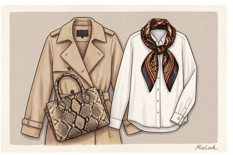
Крок 1: Аксесуарна мікродоза. Почніть із шовкового каре на шию, сумки під пітона (в нейтральних тонах) або лоферів з фактурним малюнком. Це безпечна зона, яка не перенавантажує портретну область.
Крок 2: Безпечний "низ". Психологічно нам простіше носити візерунки далеко від обличчя. Штани в тонку смужку або спідниця-міді в гусячу лапку - чудовий старт. До них підійде будь-який ваш однотонний светр.
Крок 3: Сендвіч метод. Це мій улюблений прийом. Якщо у вас є активна блуза принтована, «заспокойте» її з двох сторін. Надягніть зверху строгий однотонний жакет, а знизу - лаконічні штани. Принт буде видно лише вузькою вертикальною смугою, створюючи інтригу, але не перетягуючи увагу на себе. Ви можете легко потренувати цю навичку, завантаживши свої речі в функцію «розумний гардероб» у MioLook щоб подивитися, як метод сендвіча працює саме на вашій фігурі.
Секрет сполучного кольору: Щоб образ склався, знайдіть найменш помітний відтінок усередині принта та продублюйте його в базовій речі. Якщо в леопардовому візерунку є мікро-вкраплення гіркого шоколаду - надягніть шоколадну водолазку.
Чек-лист: аудит вашої поточної капсули
Теорія мертва без практики. Сьогодні ввечері виділіть 15 хвилин, відкрийте шафу та проведіть жорстку інвентаризацію.
- Порахуйте загальну кількість «верхів» (блузи, светри, футболки). Скільки з них абсолютно гладкі та однотонні? Якщо більше 85% – ваш гардероб знаходиться у зоні ризику «нудної бази».
- Знайдіть три речі, які ви не одягали більше року просто тому, що вони «якісь похмурі». Подумайте, чи можна замінити їх на аналогічні силуети, але у категорії Faux Plains (наприклад, сірий жакет → жакет у мікроклітину).
- Перевірте стикування швів на принтованих речах, які у вас вже є.
Запам'ятайте головне: базовий гардероб з принтами - це не спроба наздогнати тренди. Це усвідомлений перехід від одягу, який просто прикриває тіло до гардеробу, який має власний голос. Дозвольте вашим речам стати трохи складнішим, і ви побачите, як спростяться ваші ранкові збори.


