За 12 років практики розборів гардеробу я вивела одну сумну статистику. У восьми з десяти шаф моїх клієнток висить хоча б одна сукня в квіточку, яку одягали рівно один раз. Зазвичай його купують навесні, піддавшись романтичному настрою, а потім роками перекладають із полиці на полицю. Чому? «Дарина, я вдягаю його і почуваюся тіткою», — найчастіше пояснення.
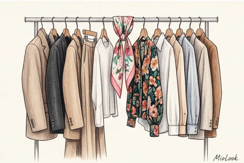
Справді, квітковий принт в одязі - Це мінне поле. Одне неправильне рішення у фактурі чи масштабі, і замість легкої паризької естетики ви отримуєте ефект «обивки радянського дивана». Докладніше про базові правила роботи з малюнками ми вже розповідали у нашому повному гіді по поєднанню принтів в одязі Але сьогодні я хочу розібрати саме флористику. Ми не говоритимемо про банальне «повне — великі квіти, худе — дрібні» (до речі, це шкідливий міф). Ми подивимося на квітковий візерунок очима дизайнера та колориста.
Спробуйте MioLook безкоштовно
Розумний AI-стиліст підбере ідеальний образ з урахуванням ваших пропорцій
Почати безкоштовноЧому квітковий принт в одязі часто виглядає як привіт із минулого
Наше сприйняття флористики сильно пов'язане з культурним кодом. Як зазначає історик моди Кессі Девіс-Стоддарт (2023), до промислової революції квітковий орнамент був символом найвищого статусу — на вишивку одного камзолу витрачалися місяці ручної праці. Але з здешевленням виробництва квітів стало дуже багато. Вони перекочували на дешевий ситець, домашні халати та штори.
Головна помилка, яку я бачу на шопінгу - оцінювати сам малюнок у відриві від крою та тканини. Ви можете знайти приголомшливий акварельний патерн, але якщо він надрукований на кволому трикотажі, який розтягується на грудях, магія зникає. Флористика виступає безжальним індикатором смаку: цей орнамент не прощає економії як основи.
Архітектура тканини та правило «сліпого дотику»
У текстильній промисловості є два принципово різні підходи до створення візерунка. Перший - коли малюнок вплітається в саму структуру тканини нитками різних кольорів (жаккард). Другий – коли фарба наноситься поверх готового полотна. І ось тут криється головна пастка мас-маркету.
Більшість недорогих речей із квітковим принтом (у сегменті 20–40 €) створюються методом пігментного друку на поліестері. Барвник не проникає у волокна, а лягає зверху гумовою плівкою. Щоб відсіяти такі речі, я навчаю своїх клієнток авторському тесту «сліпого торкання» прямо у примірювальній.
- Крок 1: Закрийте очі (щоб не відволікатися на гарний малюнок).
- Крок 2: Затисніть тканину між великим та вказівним пальцями.
- Крок 3: Злегка потріть полотно про себе.
Якщо ви відчуваєте характерний «скрип», липкість або відчуваєте, що місця з нанесеною квіткою жорсткіші, ніж тло — річ купувати не можна. Після першого ж прання на цій гумовій плівці з'являться мікротріщини, і принт виглядатиме брудним.
Вплив дешевого принту на ваш комфорт
За даними дослідження McKinsey про розвиток текстильної індустрії (2024), щільний поверхневий друк знижує повітропроникність синтетичної тканини ще на 40%. Це створює класичний парниковий ефект. Ви купуєте тонку, здавалося б, літню сукню, але потієте в ній сильніше, ніж у щільній бавовняній худорляві. Багатошаровий строкатий візерунок часто використовується брендами навмисно, щоб візуально замаскувати пухке, неякісне плетіння полотна.
Ваш ідеальний образ починається тут
Приєднуйтесь до тисяч користувачів, які щодня виглядають бездоганно з MioLook.
Почати безкоштовноМасштаб та геометрія: як вибрати квітковий принт під риси обличчя
Забудьте застаріле правило, яке кочує з одного глянсового журналу до іншого: «великим жінкам — великі квіти, мініатюрним — дрібні». Це сильне спрощення, яке часто дає збій. При виборі масштабу флористики потрібно дивитися не розмір одягу, а масштабність ваших чорт обличчя.
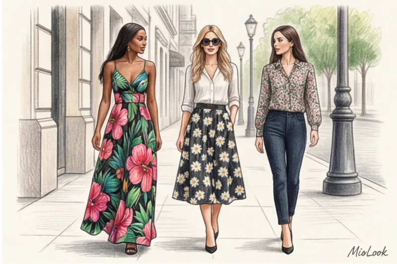
Якщо у вас великі, виразні риси (пухкі губи, широкі брови, великі очі), дрібна «ситцева» квіточка на вашому тлі просто загубиться, а обличчя здаватиметься важким. І навпаки: дівчину з тонкими, витонченими рисами обличчя величезні тропічні лілії перетворять на «додаток до сукні».
Але важливий як розмір. Зверніть увагу на геометрію бутонів:
- Округла флористика (Півони, пишні троянди, гортензії) ідеально підкреслює м'які лінії обличчя, пухкі щоки або кучері.
- Загострена флористика (листя монстери, іриси, орхідеї з гострими пелюстками) гармонізує гострі вилиці, прямий ніс та графічну стрижку.
І ще один інсайдерський секрет: звертайте увагу на ритм візерунка. Розріджене «повітря» (порожній простір фону) між бутонами завжди виглядає статусніше і дорожче, ніж суцільне строкате місиво, де квіти налазять одна на одну.
Головний міф стилістики: чим небезпечна дрібна квіточка (мільфлер)
Дрібний квітковий візерунок (він же мільфлер від французького mille fleurs, «тисяча квітів») традиційно вважається найбезпечнішим, дівочим і романтичним принтом. Але на своїй практиці я бачу протилежне: саме мілфлер найчастіше безжально накидає вік і «простить» образ.
Чому це відбувається? Історично дрібний, частий малюнок використовувався для пошиття робочого та домашнього одягу — на ньому не такі помітні плями. Наша підсвідомість зчитує цей патерн або як атрибут дитячого плаття, або елемент кухонного фартуха. Одягаючи таку сукню в офіс або на зустріч, ви транслюєте інфантильність чи побутову втому.
Але є виняток. Якщо ви любите дрібний принт, шукайте еталонну якість у стилі Liberty London. Знаменитий британський універмаг Liberty з 19 століття випускає тканини, де кожна міліметрова квітка промальована з неймовірною деталізацією, а відтінки глибокі та складні. Хороший мільфлер можна знайти у брендів рівня COS або преміум-лінійках (від 100 €), де складна колористика рятує ситуацію.
Контрастність та фон: визначаємо свою палітру флористики
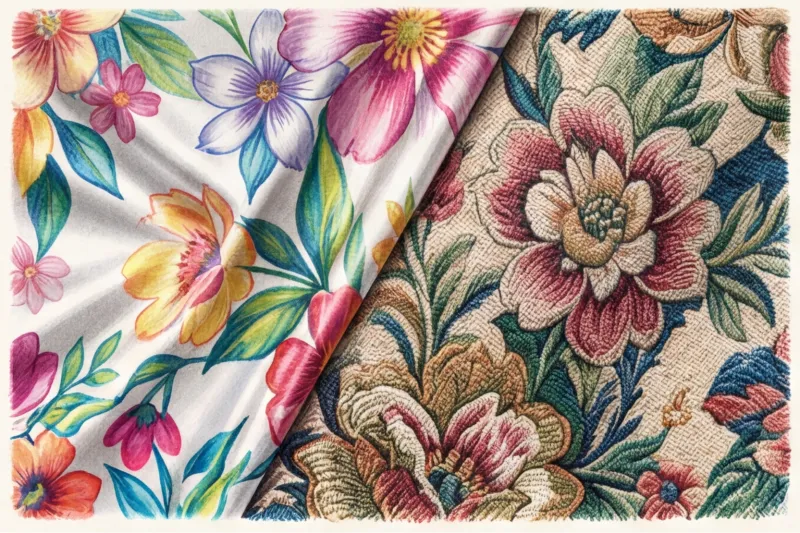
Як сертифікований колорист, я завжди починаю роботу з принтом через теорію контрастів Іттена. Флористика буває двох основних напрямків: акварельна (на світлому фоні) та дарк-флористика (яскраві квіти на чорному, темно-синьому або смарагдовому фоні).
Вибирайте контрастність принта, відштовхуючись від вашої природної зовнішності:
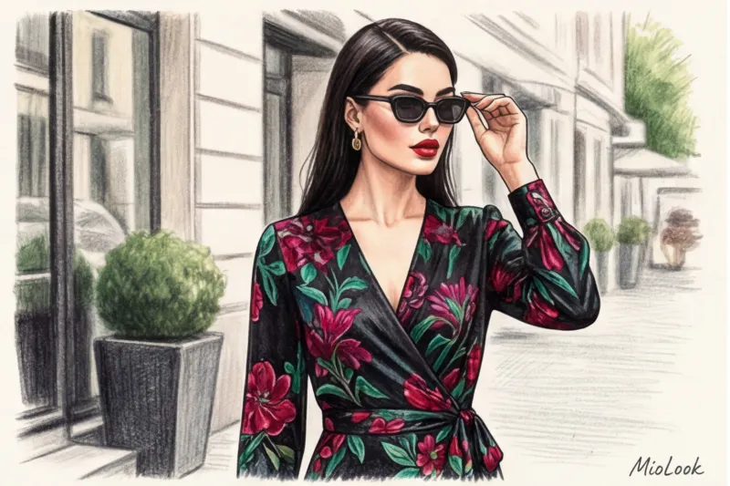
- Високий контраст: (наприклад, темне волосся, фарфорова шкіра, яскраві очі). Ваша історія – це дарк-флористика. Рубінові троянди на чорному шовку зроблять ваше обличчя виразним.
- Низький контраст: (русяве волосся, спокійний тон шкіри, світлі очі). Дарк-флористика вас «вб'є», обличчя здаватиметься втомленим. Ваш вибір – пастельні, акварельні квіти на бежевому або молочному тлі.
Чесне обмеження: цей метод (дарк-флористика) категорично НЕ працює для ділового стилю із суворим дрес-кодом. Якщо вам потрібен квітковий принт для офісу, єдиний компроміс - блузи з абстрактною, графічною квіткою в монохромі (наприклад, темно-сині контури на блакитному тлі), де флористика більше нагадує геометрію.
Правило фактурного зіткнення: з чим носити квіткові речі
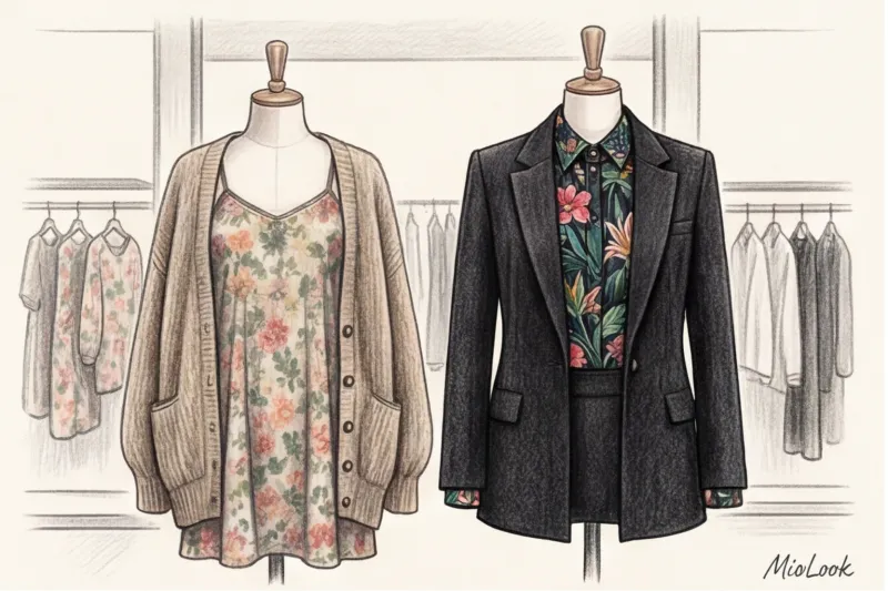
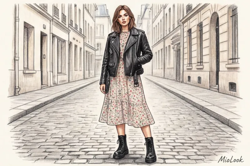
Нещодавно ми розбирали гардероб із клієнткою-керівником. Вона одягла гарне шифонове плаття в троянду, а зверху накинула тонкий пухнастий кардиган. У дзеркалі миттєво відбилася «вчителька на пенсії». Це головна помилка стилізації: ніколи не поєднуйте романтику з романтикою.
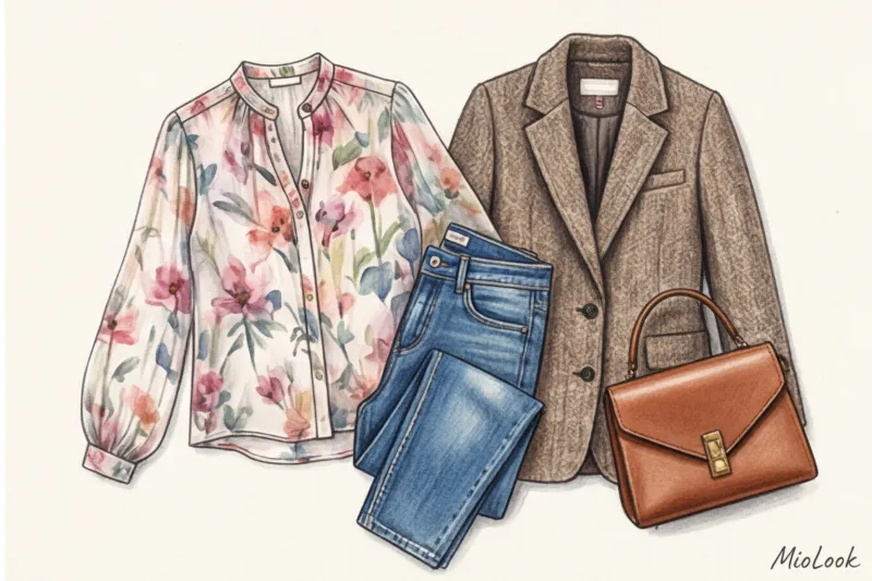
Сучасна формула стилю будується на фактурному зіткненні. Ніжний квітковий принт, що летить, відчайдушно потребує жорсткої, брутальної або архітектурної рамки. Якщо ви одягли шовкову блузу в квітах (яка сама по собі може коштувати і 200 €), не комбінуйте її з м'якою спідницею, що летить. Додайте жорсткий сиром денім, що стоїть колом.
Ось кілька безвідмовних комбінацій:
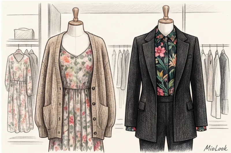
- Шифонова сукня в квітку + структурний чоловічий піджак із широкими плечима.
- Квіткова спідниця-міді + об'ємний светр великої в'язки (не тонкий трикотаж!).
- Сукня мільфлер + важка шкіряна косуха.
Взуття тут виступає якорем образу. Черевики на тракторній підошві, козаки або масивні лофери миттєво заземлюють наївність квітів та роблять образ зібраним.
Чи готові почати?
Спробуйте безкоштовний план MioLook без обов'язків. Завантажте свої квіткові речі та дозвольте ІІ зібрати з них стильні комплекти.
Почати безкоштовноЧек-лист: 5 ознак сучасного флористичного візерунка
Збережіть цей чек-лист перед наступним походом у магазин. Сучасний, дорогий квітковий принт повинен відповідати як мінімум чотирьом критеріям із п'яти:
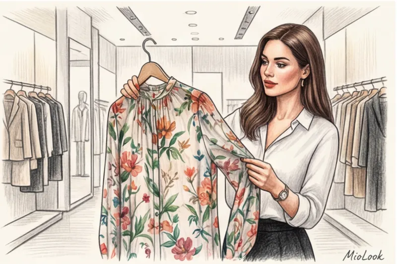
- 1. Чіткість: Відсутність пікселізації. Лінії мають бути різкими, без брудних переходів кольору, немов патерн малювали на поганому принтері.
- 2. Якість нанесення: Тканина проходить тест "сліпого дотику". Малюнок не відчувається гумовою наклейкою.
- 3. Актуальність крою: Квітка завжди краще виглядає на сучасних силуетах (асиметрія, гіпертрофовані рукави, архітектурний крій), ніж на застарілих приталених сукнях до коліна.
- 4. Ритм: Між елементами візерунка є «повітря», тло проглядається чітко.
- 5. Відсутність дешевого блиску: Базова тканина не повинна блищати (виняток - натуральний шовк або якісний атлас). Дешевий глянсовий поліестер із квітами завжди дешевить образ.
Висновок: квіти в гардеробі – це інвестиція
Квітковий принт не має віку, якщо він структурно правильний. Не варто боятися флористики чи вважати її «надто складною». Ставтеся до неї як до спецій у кулінарії: вам не потрібно засипати всю страву перцем, достатньо пари дрібок.
Проведіть аудит своєї шафи прямо сьогодні. Безжально позбудьтеся скрипучого поліестеру з гумовими трояндами. Залишіть 1-2 речі з благородним, якісним візерунком, який справді гармоніює з вашою контрастністю. А якщо сумніваєтеся, з чим поєднувати плаття, що залишилося, завантажте його фото в MioLook - Наш розумний AI-гардероб моментально запропонує вам сучасні комплекти з урахуванням правила фактурних зіткнень.