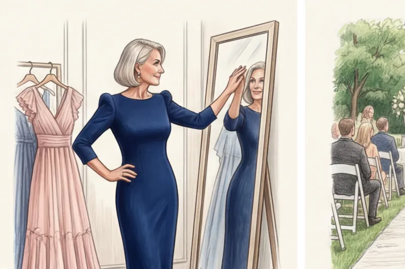

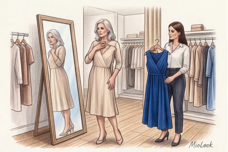
Did you know that in 70% of formal wedding photos, the mother stands right next to the bride? This statistic is often cited by wedding photographers I speak with backstage at European fashion shows. And it's precisely because of this close visual proximity mother of the bride dress color It becomes more than just a matter of personal taste, but a truly strategic decision. If you get the tone wrong, you'll either blend in with your daughter's crisp white dress or become a garish splash of color, stealing all the attention.
We have already discussed in detail the architecture of the silhouette, the correct length and styles in our The complete guide to the perfect mother of the bride dress Today, we'll explore the most insidious part of creating a look—the palette. I'll show you why traditional "safe" shades actually work against you, and how to use color as a powerful lifting tool.
The Main Rule: Why the Color of the Mother of the Bride's Dress Shouldn't Be "Safe"
In 12 years of working as a personal stylist, I've learned one phrase by heart. Every second client over 50 comes to me with a request: "Camilla, pick me something neutral, powdery, or beige. I don't want to stand out." This is the most dangerous optical trap you can fall into.
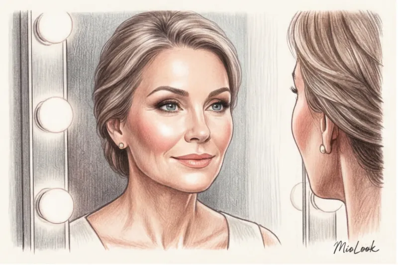
The universal and supposedly "safe" beige, champagne, or dusty rose is a myth. On women over 50, these shades often highlight fatigue, pigmentation, and visually add age. The secret lies in the reduction of natural contrast: with age, the pigment in our lips, eyes, and hair lightens. When you wear a dress that blends with your skin tone, your face literally "erases," requiring heavy, aggressive makeup.
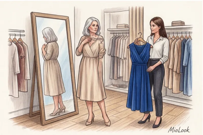
I recall a case from my practice: my client Elena was adamant about a classic champagne-colored dress. At the fitting in the boutique, with its bright artificial lighting, everything looked fine. But when we stepped out to the window, it became obvious she was blending in with the fabric. I persuaded her to try on a more elegant sapphire shade. The difference was phenomenal: her eyes sparkled, her facial contours were visibly lifted, and her skin acquired a healthy glow without a hint of highlighter. As a result, she received as many compliments as the bride herself at the reception.
Outdated Taboos and New Rules of Wedding Etiquette
Wedding dress codes have undergone dramatic changes over the past 20 years. While everything was once subject to strict, almost puritanical rules, today harmony and common sense are paramount.
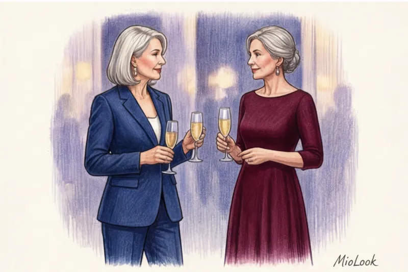
According to modern European wedding protocol, the bride's mother has the first choice of the color of her gown. This isn't a whim, but a logical sequence: she coordinates her choice with the wedding concept and her daughter's dress, and then delicately communicates her decision to the groom's mother. This simple communication rule eliminates awkward situations where both mothers arrive in identical burgundy dresses, creating an effect of unwanted rivalry in family portraits.
Your perfect look starts here
Join thousands of users who look flawless every day with MioLook.
Get access — €0.99 once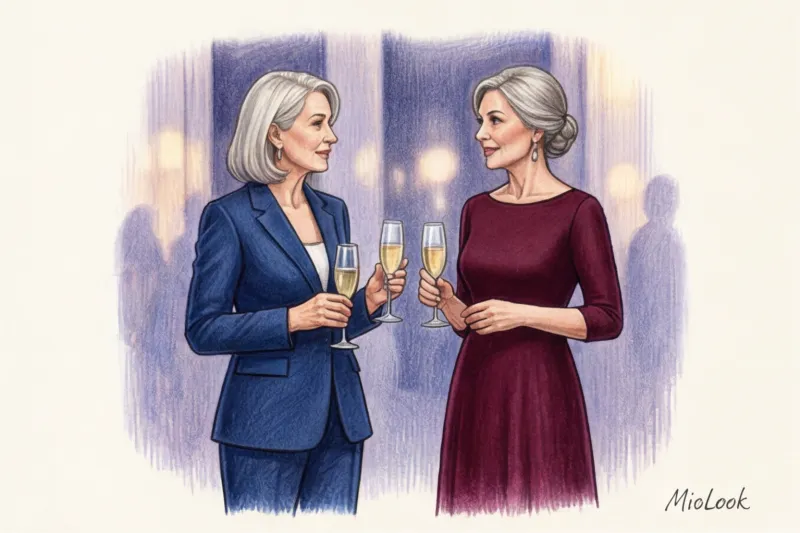
Can I wear black, red or white?
Let's take a look at the three most controversial colors, the ones that are surrounded by the most myths:
- Black: It has long ceased to be a symbol of mourning. For black tie evening weddings, a luxurious floor-length black dress is the epitome of elegance. The key is the right texture (silk, velvet) and accent embellishments.
- Red: Pure scarlet often looks too aggressive and overpowering. But if you choose a deep undertone—wine, burgundy, carmine, or ruby—the look will be classy and appropriate.
- White and ivory: The rule here remains firm. A categorical "no." You shouldn't compete with the bride. The only exception is a monochrome all-white wedding, where this color is strictly stipulated in the dress code for all guests.
Coloristics for 50+: How to Choose the Color of a Mother of the Bride Dress with a Lifting Effect
The Pantone Color Institute publishes trendy wedding palettes annually, but I urge you to filter these trends. What looks perfect on a 20-year-old bridesmaid can be detrimental to the appearance of an elegant, mature woman.
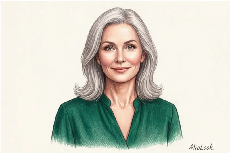
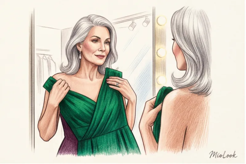
Based on Johannes Itten's color type theory, adapted for aging skin, I always recommend paying attention to jewel tones. Emerald, deep sapphire, ruby, amethyst, and malachite act as natural reflectors. They reflect light onto your face, concealing fine lines and counteracting sallow undertones.
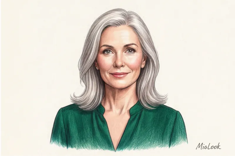
"The best color in the world is the one that looks good on you. Don't try to squeeze yourself into the season's trendy palette if it makes your face look tired." – Coco Chanel
What should you avoid? Dangerous undertones for women over 50 include neon flashes (they will dull the look), earthy tones (khaki, mustard, dull brown - they will highlight the shadows on the face), and washed-out, bleached colors. Of course, there are exceptions: if you know your profile in detail (I recommend studying A guide to the 12 color types of appearance ), you can masterfully incorporate even pastels, but this will require flawless makeup.
How to Match Your Dress Color to Your Wedding Color Palette (Without Going Invisible)
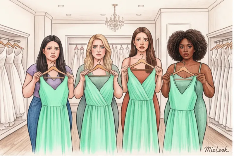
A common mistake is trying to match the color of the decor or the bridesmaids' dresses exactly. If your wedding is lavender-themed, you don't need to find a dress in the exact same shade. Use the "sister" color rule. Take the base color of the celebration and go deeper: instead of light lavender, choose a rich plum or eggplant.
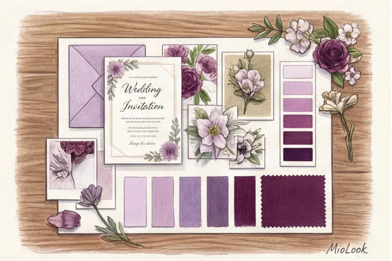
Be sure to consider the location. The color of your outfit should contrast with the backdrop of the restaurant or outdoor reception. If the celebration is taking place outdoors among greenery, an emerald dress will make you invisible to cameras. In this case, it's better to choose a deep blue or wine.
To avoid guessing how colors will work together, I often advise my clients to use digital tools. You can upload wedding design references to the app. MioLook , and the "smart wardrobe" feature will help you visualize how your outfit will look against the overall palette. This saves a ton of time and stress.
Fabric texture changes color: a secret salons keep quiet about
Color is simply light reflected from a surface. That's why the same dark blue shade appears as two completely different colors on different fabrics. I always repeat: poor texture can ruin even the most beautiful and expensive shade.
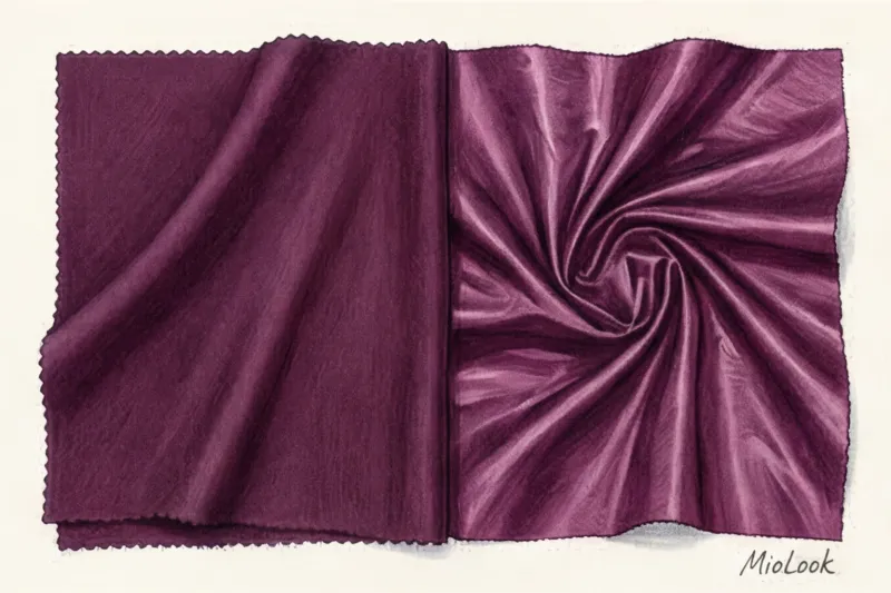
In my practice, I've strictly prohibited cheap, shiny taffeta and thin satin, especially if the fabric is heavily embroidered with glass beads (we've discussed this anti-trend in detail on our main page). Cheap sheen creates unnecessary bulk, highlights even the slightest imperfections, and flattens the color.
Access to MioLook for €0.99 — one-time payment
A smart AI stylist will select the perfect look based on texture and color.
Get access — €0.99 onceOpt for structured, matte fabrics. Thick crepe, high-quality silk twill, and suiting wool with added silk—these materials absorb light softly, creating a deep, velvety, and truly classy color. Structured fabric elongates the silhouette and maintains its shape, acting like a lightweight corset.
Pre-purchase checklist: 5 steps to the perfect shade
Before you take your dress to the checkout, run your selection through this short checklist from a practicing stylist. This will save you from disappointment on the big day.
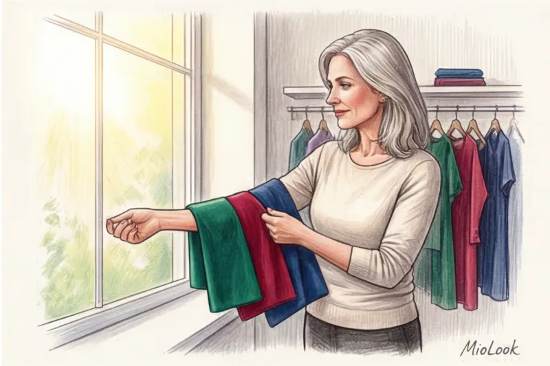
- Test in natural light. Lighting in boutiques is adjusted to flatter the garments. Always ask the consultant to let you stand near a window. Only in natural light will you truly see how the color interacts with your skin tone.
- Photo test with flash. Ask someone to take a photo of you in the dress with a phone flash. Some synthetic fabrics give off a cheap neon glare or become translucent in harsh light.
- Checking in with the groom's mother. Just call her and discuss the palette. It's a simple courtesy that guarantees perfect photos together.
- Testing for creasing. Squeeze the hem of your skirt in your fist for 10 seconds and release. If the fabric is covered in a stiff network of creases, discard it. Light will refract through the creases, and by the end of the evening, the elegant color will look sloppy.
- Fittings and accessories. The color of the dress dictates the metal of the jewelry. Cool emerald requires platinum, white gold, or silver, while warm ruby pairs beautifully with classic yellow gold.
Your child's wedding is an occasion where you have every right to shine. Your goal on this day is not to hide in a boring uniform that blends into the walls, but to share in the triumph with dignity and elegance. Choose a color that makes you sit up straight and smile at your reflection. And if in doubt, trust the analysis of your color type and palette selection to artificial intelligence. MioLook — your ideal image is already waiting for you.