Вы когда-нибудь стояли перед зеркалом в любимой юбке с активным узором, надевали к ней водолазку точно в цвет фона и вдруг понимали, что выглядите скучно, плоско и немного похоже на униформу? Это классическая ошибка. За 12 лет работы персональным шоппером в Европе я видела этот сценарий сотни раз. Девушки гуглят как сочетать принты и цвета, находят в интернете устаревший математический совет подбирать базу тон-в-тон — и убивают всю динамику образа.
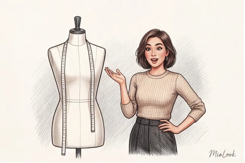
Подробнее об архитектуре цвета и базовых правилах колористики мы рассказывали в нашем полном гиде по идеальному сочетанию цветов в одежде: советы стилиста. Но сегодня мы перейдем к жесткой практике. Я Катажина Новак, и я покажу вам авторский метод, который используют байеры в премиальных бутиках, чтобы составлять «вкусные» комплекты на манекенах.
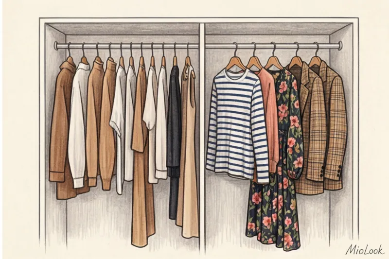
Как сочетать принты и цвета: забываем старые правила и ищем «невидимую нить»
Самое популярное правило стайлинга гласит: посмотрите на фоновый цвет вашего принта и купите такой же свитер. Забудьте его. Если у вас черная юбка в крупный белый горох, и вы наденете к ней черный джемпер — вы получите эффект «провинциального гламура». Образ станет плоским, а принт будет смотреться как аппликация, вырезанная из картона.
Вместо этого я предлагаю своим клиенткам использовать Правило 5% или метод «невидимой нити». Секрет дорогого образа заключается в том, чтобы найти в принте самый редкий, едва заметный акцентный оттенок (он обычно занимает не более 5-10% площади паттерна) и продублировать именно его в масштабной однотонной вещи.
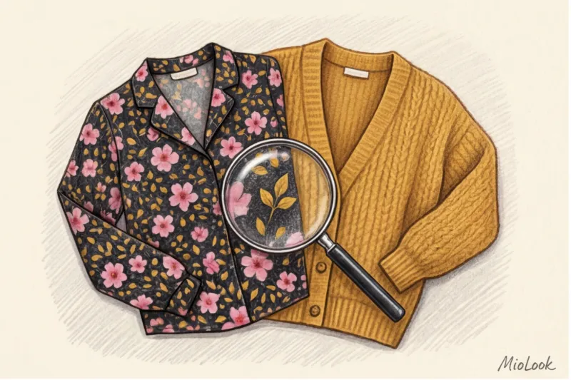
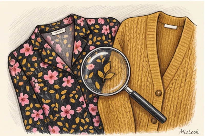
Представьте платье миди. Основной фон — темно-синий, на нем крупные голубые цветы, зеленые листья и крошечные, почти незаметные горчично-желтые тычинки. 9 из 10 женщин купят к нему синий жакет. Но если вы наденете поверх этого платья объемный кардиган насыщенного горчичного цвета — образ мгновенно перейдет из категории «просто одежда» в категорию «осознанный стайлинг». Вытягивая минорный цвет на передний план, вы заставляете принт звучать совершенно по-новому.
Ваш идеальный образ начинается здесь
Присоединяйтесь к тысячам пользователей, которые каждый день выглядят безупречно с MioLook.
Начать бесплатноТемпература важнее оттенка: почему ваши вещи визуально «спорят»
Иногда цвета вроде бы идеально подходят друг другу по цветовому кругу Иттена, но в реальности комплект выглядит грязно и неряшливо. Причина в температурном диссонансе. Как отмечает Институт цвета Pantone в своем ежегодном отчете (2024), человеческий глаз считывает разницу температур между соседними оттенками за 0,2 секунды, даже если человек совершенно не разбирается в моде.
Теплый принт плюс холодная база — это всегда стилистический конфликт. Если на вас шифоновая блуза в теплых осенних оттенках (терракотовый, оливковый, запеченное яблоко), кипельно-белый или ледяной серый жакет ее буквально «убьет». Белый цвет заставит теплый принт казаться застиранным и пожелтевшим от времени.
«На примерках я всегда заставляю клиенток выходить из примерочной в торговый зал или к окну. Искусственный флуоресцентный свет в кабинках Zara или H&M безжалостно искажает температуру желтого и красного спектра. То, что кажется идеальным совпадением под лампой, на улице может оказаться катастрофой».
Черный цвет — не универсальный спасатель
Привычка носить любой сложный принт с черным низом или верхом — это просто стилистическая лень. Да, черный стройнит. Да, он есть в каждом шкафу. Но глубокий черный цвет обладает способностью поглощать свет. Если ваш принт имеет среднюю или низкую контрастность (например, приглушенная пастельная геометрия), черный фон сделает его тусклым.
Чем заменить? Попробуйте глубокий темно-синий (navy), оттенок горького шоколада, графит или насыщенный бордо. Шоколадный оттенок работает с принтами гораздо мягче, создавая благородное, а не резкое обрамление.
Фактура меняет цвет: секрет, о котором молчат блогеры
По данным исследования потребительского восприятия от WGSN (2023), 70% впечатления о стоимости вещи формируется за счет фактуры ткани, а не ее цвета. Это подводит нас к важнейшему правилу сочетания принтов: смешивайте фактуры, чтобы управлять цветом.
Глянцевые ткани с принтом (шелк, вискоза, атлас, сатин) отражают свет. Если вы подберете к ним такую же гладкую однотонную вещь, образ получится дешевым и «скользким». Глянцу нужна матовая, поглощающая свет база — кашемир, плотная мериносовая шерсть, замша или структурный хлопок.
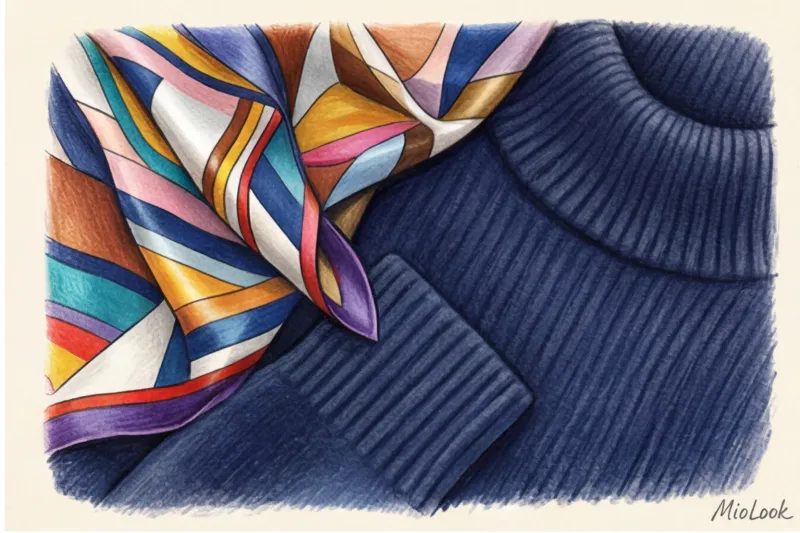
Именно здесь отлично работает европейский принцип high-low dressing (смешивание ценовых сегментов). Дешевый полиэстеровый или вискозный топ с активным цветочным паттерном из масс-маркета будет выглядеть в 10 раз дороже, если надеть его в паре с качественным, тяжелым шерстяным кардиганом от COS, &Other Stories или Massimo Dutti. Матовая дорогая фактура базы «успокаивает» блеск бюджетного принта.
Попробуйте MioLook бесплатно
Умный AI-стилист подберёт идеальную комбинацию фактур и оттенков из вашего реального гардероба.
Начать бесплатноРазбор популярных паттернов: с какими однотонными вещами их носить
Не существует единой формулы для всех узоров. То, что работает с морской полоской, превратит леопардовый принт в катастрофу. Давайте разберем самые частые запросы из моей практики.
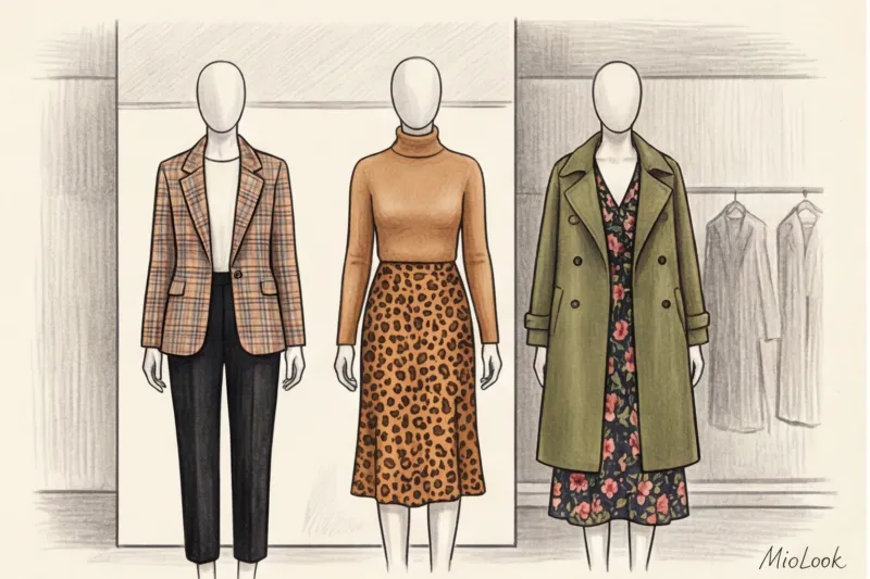
Анималистика (леопард, зебра, питон)
Анималистичные принты сами по себе несут огромный заряд агрессивной сексуальности. Наша задача — снизить этот градус с помощью спокойной, благородной базы.
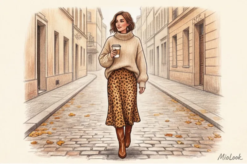
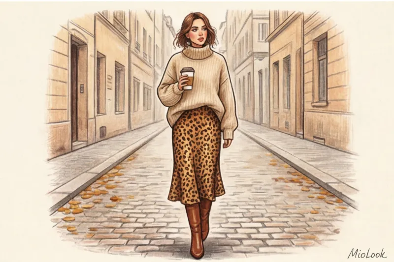
- Леопард: Строго избегаем красного и черного — это прямая отсылка к стилю нулевых. Однажды ко мне пришла клиентка, которая пыталась «успокоить» леопардовую миди-юбку черной водолазкой, но лишь усилила драму. Мы заменили черный верх на объемный фактурный свитер оттенка кэмел (верблюжья шерсть), добавили замшевые ботильоны, и юбка мгновенно стала выглядеть статусно. Отлично работают также небесно-голубой (denim blue) и глубокий изумрудный.
- Зебра: Вместо банального кипельно-белого (который даст тот самый температурный конфликт), выбирайте для базы оттенки экрю, цвет сливочного масла или яичной скорлупы.
Цветочные и растительные орнаменты
Здесь всё зависит от масштаба. Огромные бутоны (макро-принт) требуют воздуха. Для них мы используем то самое правило «невидимой нити», вытягивая самый мелкий оттенок.
А вот мелкий ситцевый принт (мильфлер), который часто встречается в летних платьях, таит в себе опасность. При неправильной стилизации он моментально превращает девушку в «крестьянку на сенокосе». Чтобы этого избежать, выбирайте для базы один чистый, урбанистический цвет — например, архитектурный жакет насыщенного кобальтового или травянисто-зеленого оттенка. Строгость кроя и чистота цвета однотонной вещи компенсируют простоту мелкого цветочка.
Геометрия (клетка, полоска, гусиная лапка)
В отличие от флористики, жесткая геометрия стерпит колорблок. Бретонская полоска отлично смотрится с яркими контрастными цветами — красным, желтым, фуксией. Геометрия задает ритм, а яркий монохром его поддерживает.
Если вы носите сложную клетку (тартан или «принц Уэльский»), используйте прием вытягивания света. Найдите в переплетении нитей самый светлый оттенок (обычно это тонкая белая, кремовая или светло-серая полоса) и подберите блузу или свитер именно такого цвета. Это мгновенно освежит лицо.
Визуальный вес и масштаб: баланс пропорций в образе
Даже если вы идеально подобрали цвета, образ может развалиться из-за неверных пропорций. В колористике есть золотое правило 60-30-10, которое я адаптирую для гардероба так: 60% занимает основной цвет (матовая однотонная база), 30% — принт, 10% — яркий акцент (обувь, сумка, помада). Почему именно так? Потому что 70% вашего бюджета на образ должно уходить именно на качественную базу, она "несет" на себе всю конструкцию.
Исследования визуального восприятия показывают, что контрастные геометрические принты утомляют взгляд собеседника уже через 15 минут, если их не сбалансировать спокойным фоном. Как проверить себя? Используйте профессиональный стилистический трюк — Squint test (тест прищуренным глазом).
- Оденьтесь и отойдите от зеркала на два метра.
- Сильно прищурьте глаза, чтобы ресницы размыли фокус. Образ должен превратиться в цветовые пятна.
- Если одно из пятен (например, юбка с принтом) буквально «кричит» и перетягивает на себя всё внимание, оставляя верхнюю часть тела незаметной — баланс нарушен.
- Добавьте визуального веса наверх: накиньте плотный жакет или замените тонкую блузу на фактурный свитер.
Честное ограничение: этот совет работает не для всех. Если вы обладательница высококонтрастного типажа внешности (например, глубокая Зима с белоснежной кожей и черными волосами), вы можете вытянуть пропорцию 50/50 или даже print clash (сочетание двух разных узоров). Но для девушек со средней и низкой контрастностью тест прищуром обязателен.
Чек-лист Катажины: 4 вопроса перед выходом из дома
Давайте систематизируем всё, о чем мы говорили. Прежде чем выйти за дверь в новом комплекте, задайте себе эти четыре вопроса:
- Совпадает ли температурный подтон? (Не спорит ли льдисто-белый жакет с теплым горчичным цветком на платье?)
- Выбран ли неочевидный цвет? (Вытянута ли та самая «невидимая нить» в 5%, или вы пошли по легкому пути и слились с фоном принта?)
- Есть ли разница фактур? (Гладкий шелк юбки компенсирован пушистым мохером или плотной шерстью свитера?)
- Пройден ли squint test? (Прищурьтесь — не рябит ли в глазах от избытка активного паттерна?)
Принты — это не страшно. Они не делают гардероб сложным, если у вас есть надежный фундамент. Ваша главная задача — перестать воспринимать узор как главную звезду, которой нужно во всем потакать. Сделайте качественную, фактурную однотонную вещь полноправным партнером в этом дуэте, и ваши образы всегда будут выглядеть так, словно над ними поработал профессиональный стилист.
Готовы начать?
Загрузите свои вещи в MioLook, и алгоритм сам подскажет, какие фактуры и принты из вашего шкафа создадут дорогой образ.
Начать бесплатно