I remember my client Anna, a senior partner at a law firm, literally turning red when I suggested she try on a silk blouse with an animal print. "Sofia, I work with serious people, I don't perform in a cabaret," she snapped. It's a typical reaction. Over 12 years of working with personal style and textiles, I've realized one thing: women aren't afraid of leopard or zebra print itself. They're afraid of the cheap associations these prints have evoked since the '90s and 2000s.
The paradox is that the predatory pattern itself is neutral. It's natural camouflage. What makes it vulgar isn't biology, but the chemical industry and a lack of knowledge of the basic rules of coloristics. We've already discussed the mechanics of working with patterns in more detail in our A complete guide to combining prints in clothing: the rules of a stylish capsule collection Today, we'll examine the anatomy of animal prints through the lens of fabric quality and optical illusions.
The Anatomy of Vulgarity: Why It's Not the Print, but the Fabric
Have you ever wondered why leopard print looks like the epitome of "old money" in Christian Dior's archival collections, but is considered a fashion faux pas on mass-market shelves? The answer lies in the physics of light and the properties of fiber.
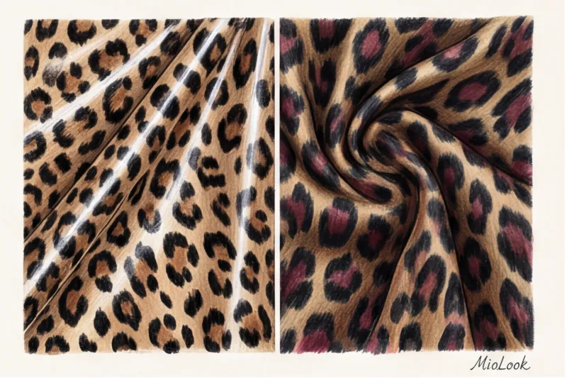
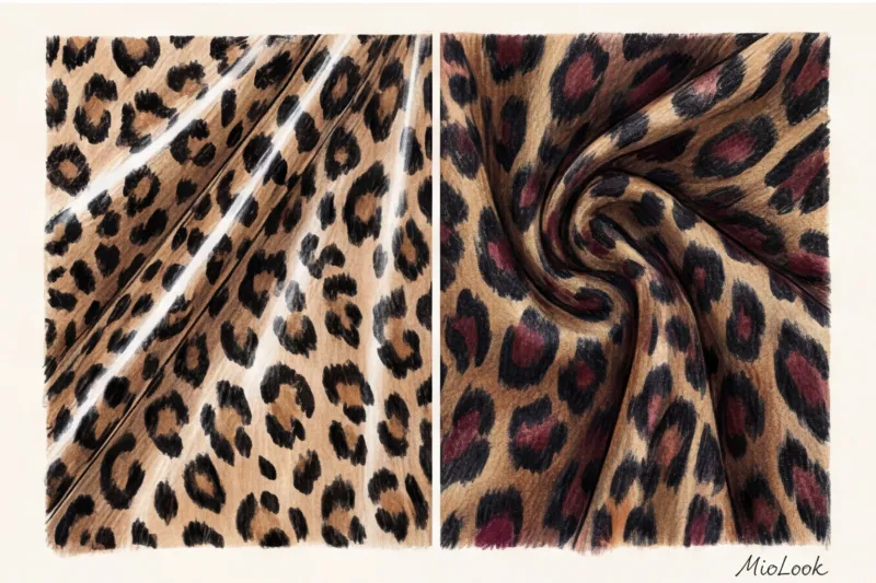
Smooth, cheap synthetics, like low-quality polyester, are made of extruded fibers shaped like perfectly smooth plastic cylinders. They refract light directly, creating a harsh, unnatural, "glassy" sheen. When a contrasting spotted pattern is applied to such a surface, this sheen visually cheapens the design, making it appear flat and garish. According to the Textile Exchange (2023) report, this type of shiny polyester accounts for up to 60% of the entire fast fashion market.
Natural and high-quality synthetic fibers—silk, organic cotton, cupro, or Ecovero viscose—behave differently. Silk, for example, has a triangular prism structure. It absorbs and scatters light from within, giving any printed image a matte, deep, and velvety feel. Leopard print on matte silk loses its aggressiveness and becomes a refined texture.
"An animal print on cheap, glossy polyester is visual noise. The same print on dense, matte Tencel is a complex architectural image."
The Stylist's Top Rule: What to Wear with Leopard Print Every Day
There's a particularly pernicious style myth that permeates magazine after magazine: "leopard should be tamed with black." When people ask me what to wear with leopard print, I always start by saying no to all-black.
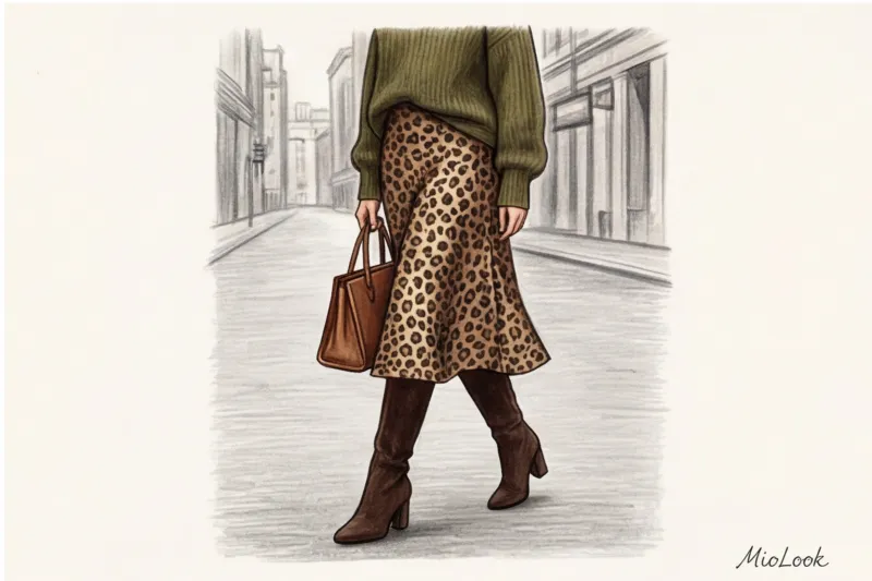
Why is this a mistake? Let's look at color theory. The leopard print is composed of warm tones: caramel, beige, bronze, and pops of black. When you wear a leopard blouse with a black pencil skirt, you create maximum temperature and light contrast. The black acts like a magnifying glass: it brings out all the predatory and aggressive energy in the print. It's this combination that most often veers into the notorious 2000s aesthetic.
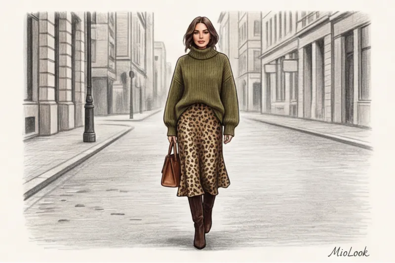
I once experimented with a client. We ditched that black skirt and paired it with textured khaki wool palazzo pants over a leopard print blouse. The look instantly became bohemian and relaxed. The best companions for warm animal prints are shades in the same temperature range:
- Dark chocolate and coffee;
- Olive, swamp and khaki;
- Rich burgundy;
- Terracotta and burnt caramel.
The second most important principle is textured contrast A smooth silk print needs to be grounded. If the blouse is flowy, choose a chunky knit cardigan. If the skirt is satin, pair it with a voluminous suede jacket or thick matte leather.
Your perfect look starts here
Join thousands of users who look flawless every day by digitizing their wardrobe with MioLook.
Start for freeZebra and Snake: An Architectural Alternative to Leopard
If leopard seems too emotional, consider zebra. Its monochrome and geometric nature has made zebra a favorite among minimalists. This print creates visual rhythm without overloading the color palette.
The scale of the print dramatically changes perception. A dress with a large, sweeping zebra print is a statement. But a silk shirt with a micro-zebra print, from a distance, reads simply as a complex gray melange or an optical illusion, and only up close does its animalistic character reveal itself.
Snake print, on the other hand, works not as a pattern but as a complex, neutral texture. It works especially well in accessories. Python-embossed shoes in gray-olive tones will fit into 90% of basic outfits, replacing boring black shoes.
Integration into a business wardrobe: from boring to status
Let's get back to my client Anna. A completely monochromatic capsule wardrobe for the office is safe, but it also makes you visually invisible. A strict dress code doesn't mean sacrificing your character.
In a corporate environment I use "10% predator rule" This means that the animal print takes up no more than a tenth of the overall look. How can this be achieved in practice?
- A micro leopard silk scarf tied to the handle of a tailored tote bag;
- Python textured loafers paired with a grey suit;
- Thin leather belt with zebra print on wool trousers;
- The lining of a formal jacket (your personal secret, which is only visible when you move).

Ultimately, we introduced a matte cupro blouse with an abstract, very small leopard print into Anna's wardrobe. Paired with a heavy dark chocolate jacket and pleated trousers, it worked beautifully. The print conveyed creativity and inner strength without violating corporate ethics. Anna later admitted that paradoxically, the level of trust during negotiations increased—she stopped looking like a "woman in a uniform" and began to be perceived as a confident expert.
A fair limitation: this technique doesn't always work. If you have a very contrasting appearance and a large facial contour, a micro print can visually "flicker" and be forgiving. In this case, it's better to choose a medium-sized pattern.
Try MioLook for free
A smart AI stylist will find the perfect animal print combinations from your own items in seconds.
Start for freeAn eco-friendly approach: how to choose an animal print that will last for years
The quality of the print directly depends on the dyeing technology. Mass-market products often use surface printing on dry synthetics to save money. The result is that white backing that instantly reveals the garment's cheapness at the slightest breath of wind.
High-quality printing, used by brands like Stella McCartney or Dries Van Noten, requires up to four times longer for the pigment to set. The dye must penetrate deep into the fiber structure. Yes, such a product is more expensive, but this is where the mathematics of conscious consumption comes into play.
Let's count Cost-per-wear A €35 leopard-print polyester skirt from a fast-fashion store will quickly become covered in snags, its back will turn telltale white, and you'll only wear it three times (€11.60 per outfit). A €180 certified matte Tencel skirt will last you five years and survive 100 wears without losing its appearance (€1.80 per outfit). Investing in quality fabric saves you money in the long run.
Vintage is a great solution. Animal prints from premium brands from the 80s and 90s (especially Italian ones) were created according to old quality standards. The dense, natural silk of that era practically never wears out if properly cared for.
Checklist: 5 Signs of an Expensive Animal Print
As a textile expert, I've developed a quick checklist for clothes right in the fitting room. Save this checklist for your next shopping trip:
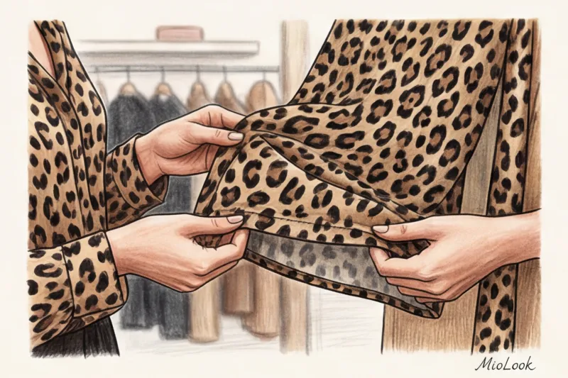
- Matching pattern on seams. Look at the side seam of the garment. If the zebra stripes or leopard spots are cut off abruptly and don't meet, the manufacturer cut corners on the fabric. On expensive garments, the print always transitions from the back to the front as smoothly as possible.
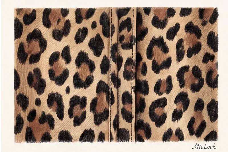
- Noble texture. The fabric should be either matte (wool, cotton, linen, cupro) or with a soft satin sheen (silk, high-quality viscose). No glossy sheen in the artificial light of the fitting room.
- Complexity of color. A cheap print is two flat colors (a yellow background, black spots). An expensive print is always multifaceted: the background transitions from caramel to sand, and within the black spots there is a brown core (consisting of at least 3-4 halftones).
- Deep coloring. Turn the hem inside out. If the back is pristine white, return the garment to the hanger. High-quality fabrics have backs that match the background or have a distinct, slightly muted pattern that shows through.
- Proportionality. The scale of the spots or stripes should complement your facial features. Girls with fine features shouldn't wear a huge, sweeping leopard print—it'll "eat them up."
Conclusion: Taming Predators
Animal print isn't a passing trend or a cause for style anxiety. It's a powerful, classic tool that adds depth, rhythm, and character to any wardrobe. By rejecting stereotypes of "vulgarity" and replacing black with refined natural shades, you'll discover a whole new level of elegance.
The key to conscious style is understanding how new, complex pieces will fit into your current wardrobe before you buy them. Don't try to keep every combination in your head. Digitalize your basics (like those olive pants or chocolate-colored jacket) in an app. MioLook and use a smart AI stylist to virtually try on leopard or zebra print accents. Remember: high-quality fabric and the right color scheme can tame even the wildest predator.