Кінець епохи клонів: чому пряме поєднання кольорів в одязі пари більше не працює
За 12 років роботи на Тижнях моди – від дощового Парижа до сонячного Мілану – я навчилася безпомилково зчитувати статус пари ще до того, як вони займуть свої місця у першому ряду. Знаєте, що видає новачків, які відчайдушно намагаються довести світові свою ідеальність? Одинаковий одяг.
Стрітстайл-фотографи давно ігнорують пари, одягнені в парні світшоти або абсолютно ідентичні бежеві тренчі. Сьогодні грамотне поєднання квітів у одязі пари - Це тонка гра, візуальний діалог без слів, де кожен зберігає свою індивідуальність. Докладніше про еволюцію цього явища від однакових худи до естетики quiet luxury для двох ми вже розповідали у нашому повному гіді за стильними парними образами. Але сьогодні я хочу розібрати найскладнішу частину цієї головоломки професійну колористику.
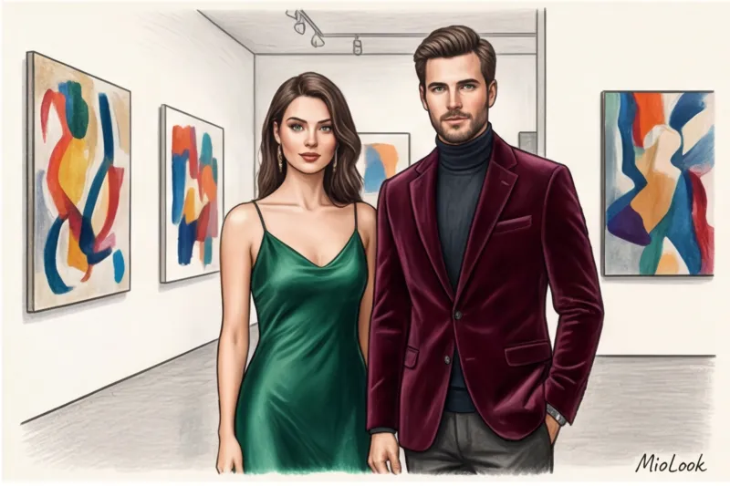
Якось до мене звернулася пара клієнтів для підготовки до світського гала-вечора. Вони гордо продемонстрували мені свій задум: розкішна бордова сукня в підлогу для неї і зшита на замовлення бордова трійка з тієї ж тканини для нього. «Ми виглядатимемо як голлівудська пара!», — впевнено заявили вони. Я була змушена їх розчарувати: у такому вигляді вони нагадували швидше двох аніматорів, найнятих на дитяче свято, ніж гостей рівня A-list.
Дослідження fashion-платформи Lyst за 2024 рік підтверджує мої спостереження: 78% опитаних вважають пряме копіювання одягу партнером ознакою невпевненості та спробою штучно довести близькість (так званий cheap look). У психології моди це пояснюється концептом Занурення Cognition (Дослідження Північно-Західного університету, США): одяг безпосередньо впливає на наші когнітивні процеси. Коли ви повністю дублюєте гардероб партнера, ви стираєте особисті межі.
Але найголовніший стилістичний злочин — це так званий «синдром випускного» (Prom Syndrome). Так, я кажу про ту саму популярну весільну раду, коли краватка або пластрон чоловіка обов'язково має бути пошитий з обрізків тканини від сукні жінки. Запам'ятайте: у сучасній стилістиці це абсолютний моветон. Справжній візуальний зв'язок будується на перетині півтонів та різниці фактур, а не на прямолінійному копіюванні.
Спробуйте MioLook безкоштовно
Розумний AI-стиліст підбере ідеальний образ для вас та вашого партнера
Почати безкоштовноТемпературна синхронізація: головний секрет стилістів для пар
Якщо ви відкриєте щорічні звіти Інституту кольору PANTONE, помітите одну цікаву деталь: гармонія відтінків будується не на збігу кольору, а на збігу його «теплоти». Людське око насамперед зчитує температурний контраст, а вже потім сам пігмент.
Забудьте про виснажливі спроби знайти «точно такий самий синій». Класична теорія кольору Йоганнеса Іттена (Johannes Itten's color wheel), яку викладають у кожній європейській школі стайлінгу, вчить нас базовому принципу: речі повинні дружити за температурним режимом.
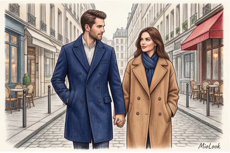
Правило єдиного підтону: теплий до теплого, холодний до холодного
Уявіть ситуацію: вона одягає приголомшливу холодну смарагдову сукню, а він вибирає піджак холодного сапфірового відтінку. Кольори різні? Абсолютно. Але за рахунок єдиного крижаного підтону вони виглядають як розкішне єдине ціле.
А тепер анти-приклад. Чоловік одягає теплий гірчичний джемпер (в якому багато жовтого та помаранчевого пігменту), а жінка – брючний костюм відтінку холодної фуксії. Навіть якщо ці речі куплені в одному дорогому бутику в преміум-сегменті від 500 €, разом вони візуально «сперечатимуться» і дратуватимуть око, бо один колір кричить про спекотне літо, а інший — про морозну зиму.
Рівень контрастності пари та 12 кольоротипів.
На моїй практиці найчастіша проблема – це кардинально різні природні дані партнерів. Що робити, якщо він – контрастна «Зима» (чорне волосся, бліда шкіра), а вона – «М'яка Осінь» (русяве волосся, теплий персиковий підтон)? Їй категорично не йде його улюблений графітовий чорний, а його обличчя губиться на тлі її оливкового.
Тут професійні іміджмейкери використовують метод «колірних мостів». Ми не змушуємо партнерів носити чужі кольори. Наприклад, він одягає свій ідеальний темно-синій костюм, а вона - сукня теплого теракотового відтінку, але з дрібним темно-синім принтом. Принт виступає тим самим візуальним мостом, який акуратно поєднує два різні всесвіти.
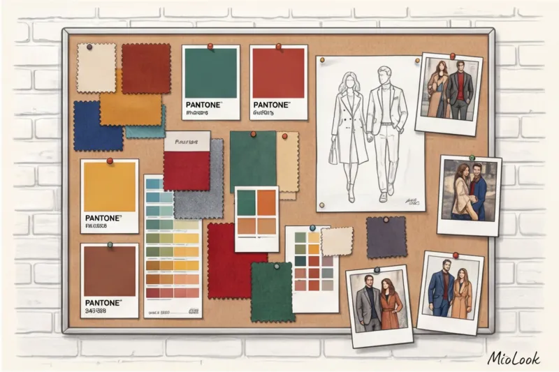
Базові схеми: як побудувати поєднання кольорів в одязі пари
Час переходити від теорії до практики. Коли ми з командою збираємо пари для зйомок Love Story або виходів на червону доріжку, ми ніколи не діємо навмання. Ми використовуємо три перевірені схеми, які можна адаптувати для свого гардероба. До речі, заздалегідь протестувати ці комбінації без утомливих примірок можна у додатку MioLook завантаживши туди свої речі.
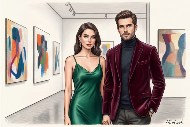
Комплементарна гармонія (Гра на розмаїттях)
Це гра на максимальних контрастах із використанням протилежних кольорів на колі Іттена. Моє улюблене поєднання для розкішних вечірніх виходів: глибокий бордовий та насичений темно-зелений.
Головне правило тут – жорсткий закон домінування. Ви не повинні ділити кольори порівну. Один колір завжди виступає базовим тлом, а другий зухвалим акцентом. Якщо на ній смарагдова шовкова сукня в підлогу (80% візуальної площі), то на ній може бути темно-сірий костюм, з-під якого видніється бордовий жилет або краватка з бордовим патерном (20% площі).
Ваш ідеальний образ починається тут
Приєднуйтесь до тисяч користувачів, які щодня виглядають бездоганно з MioLook.
Почати безкоштовноАналогова естетика (Рідневі відтінки)
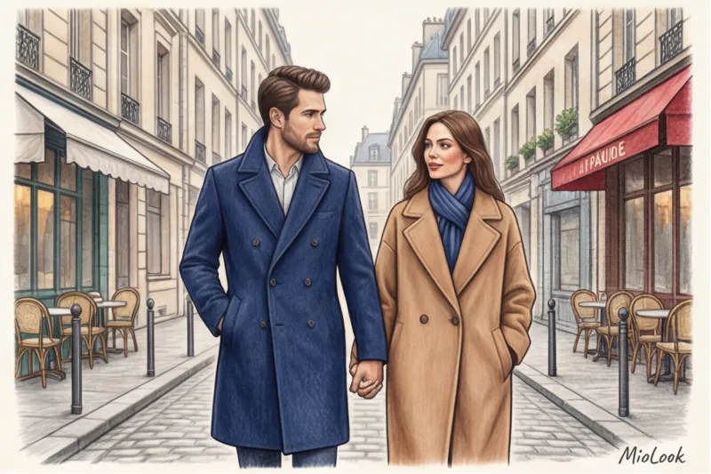
Ідеальний прийом для створення парного образу в естетиці old money (тиха розкіш). Ми беремо кольори, які стоять поряд у колірному спектрі. Наприклад: глибокий синій, синьо-зелений та смарагдовий.
Створюється чудовий ефект плавного перетікання одного образу в інший. Коли ви йдете поруч, здається, що ваше вбрання намальовано одним пензлем. Надягніть темно-синє вовняне пальто, а партнеру запропонуйте кашеміровий светр глибокого відтінку морської хвилі. Це виглядає нескінченно статусно і не впадає у вічі.
Правило "Третього кольору" (Візуальний міст)
Що робити, якщо ваші повсякденні гардероби складаються з абсолютно різних, здавалося б, непоєднуваних речей? Вас врятує нейтральний відтінок-посередник.
Додайте в обидва образи один і той же шляхетний базовий колір: правильний camel (верблюжий), графітовий або екрю (колір нефарбованого шовку). Якщо на вас одягнено класичне пальто бежеве (нехай навіть базове з COS за 200 €), а у вашого партнера пов'язаний бежевий кашеміровий шарф — ваші образи автоматично синхронізуються. Навіть якщо під верхнім одягом ховаються різні палітри.
Оптичні ілюзії: робота з принтами та фактурами через призму кольору
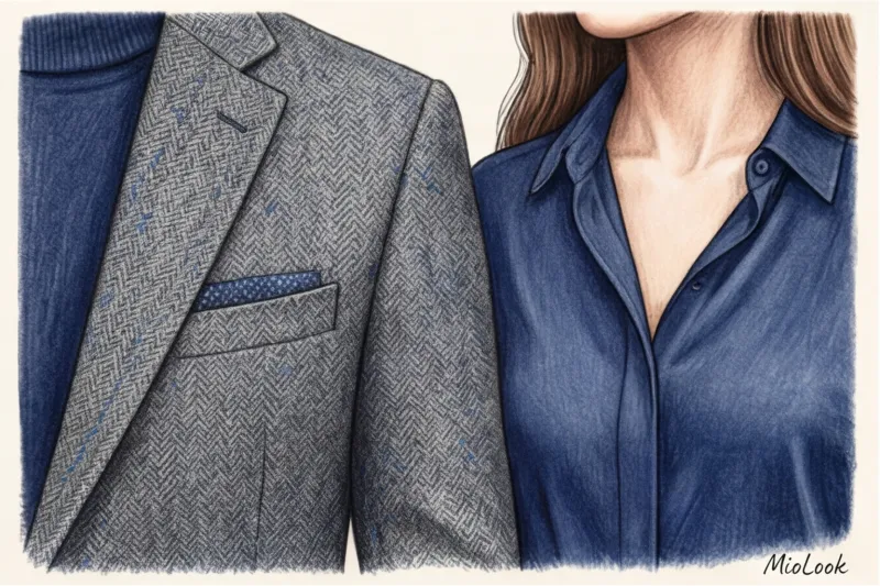
Багато хто забуває, що колір не існує у вакуумі. На сприйняття відтінку критично впливає сама тканина. Одне й те ж бордове волокно виглядатиме зовсім по-різному в гладкому шовку і щільній вовні.
Шовк і атлас відбивають світло, роблячи колір яскравішим, кричущим і холодним. Твід, вельвет і щільна шерсть, навпаки, поглинають світло, роблячи відтінок глибшим, приглушеним і теплим. Тому, якщо ви хочете створити тонку перекличку між образами, грайте різниці фактур. Нехай це буде гладка синя блуза у жінки та фактурний твідовий піджак із рідкісними вкрапленнями синьої нитки у чоловіка.
Цей прийом на професійному знімальному сленгу називається color extraction (Вилучення кольору). Ми беремо найнепомітніший мікро-відтінок із принта сукні жінки — наприклад, крихітну фіолетову квітку у візерунку — і робимо її основою чоловічого образу, підбираючи фіолетову сорочку з єгипетської бавовни. Зв'язок виходить настільки неочевидним, що оточуючі просто відчувають вашу загальну гармонію, але не можуть відразу логічно пояснити, в чому секрет.
Критичні помилки, що перетворюють елегантний couple look на уніформу
Як я люблю повторювати своїм клієнтам: стиль закінчується там, де починається уніформа. Давайте розберемо три часті помилки, які миттєво руйнують навіть найдорожчий задум.
- Маніакальний збіг тону (matchy-matchy). Якщо ви витратили тиждень, щоб знайти светр "точно такого ж рожевого кольору, як моя спідниця", ви вже програли. Це виглядає надумано та неприродно. Залишіть собі право на легку стилістичну недбалість.
- Ігнорування контексту та дрес-коду. Часто пари так захоплюються поєднанням кольорів, що геть-чисто забувають про поводження. Якщо вона одягає вечірню смарагдову сукню в білизняному стилі, а він смарагдовий спортивний худорлявий, це стилістичний провал. Рівень формальності речей повинен збігатися набагато суворіше, ніж їх колір.
- Порушення пропорцій кольорових плям. Коли ви обидва з ніг до голови одягнені в два однакові кольори (наприклад, білий верх і чорний низ у обох), ви перетворюєтеся на уніформу обслуговуючого персоналу на круїзному лайнері. Змінюйте ритм: у одного колір може бути у великому блоці (пальто), у іншого — у деталях (взуття, хустка, сумка).
«Я завжди чесно попереджаю: жодна колірна гармонія не спрацює, якщо посадка ваших речей залишає бажати кращого. Ідеальне попадання в півтон не врятує чоловічий піджак, який великий у плечах на два розміри, або сукню, що деформує фігуру. Спочатку – архітектура силуету, і лише потім – колористика».
Чи готові почати?
Спробуйте безкоштовний план без зобов'язань. Організуйте гардероб з розумом.
Почати безкоштовноЧек-лист стиліста: збираємо гармонійні образи перед виходом
Перед тим як вийти з дому, просто встаньте разом перед дзеркалом на повний зріст і пройдіться по цьому короткому списку:
- Визначте домінанту. Хто сьогодні солює? Чий образ яскравіший і привертає більше уваги? Якщо у вас приголомшливе плаття кольору фуксії, партнер повинен піти в тінь, вибравши нейтральну базу, що підтримує (сірий, темно-синій), можливо, додавши лише мікро-деталь вашого кольору у вигляді нагрудної хустки.
- Звірте освітлення. Те, що ідеально поєднується в затишній напівтемряві вашої вбиральні, може жорстоко конфліктувати за холодного денного світла на вулиці. Завжди перевіряйте образи біля вікна із природним світлом.
- Додати «повітря». Якщо образи здаються занадто важкими або перевантаженими кольорами, терміново розбавте їх ахроматами. Якісна біла футболка під піджаком, бездоганна біла сорочка, світло-сірий кашеміровий шарф - вони працюють як пауза в музиці, дозволяючи основному кольору зазвучати набагато чистіше.
Щоразу, коли ви складаєте парний образ, пам'ятаєте головне правило професійного стайлінгу. Справжня гармонія пари - це гарний візуальний діалог двох впевнених, самодостатніх особистостей, а не похмурий монолог соліста та його покірної тіні. Одягайтеся так, щоб ви виглядали бездоганно окремо, але разом ставали витвором мистецтва.