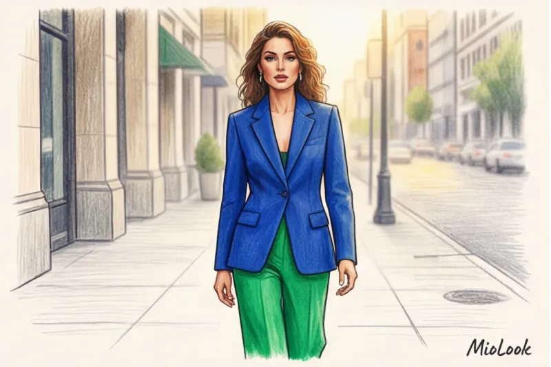
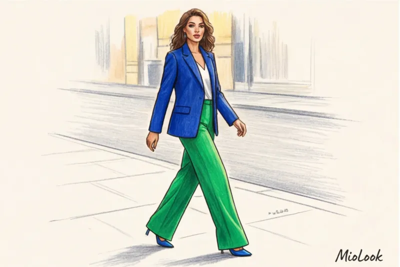
Six months ago, I conducted a personal experiment: for six months, I meticulously tracked my public speaking looks and analyzed audience reactions. My hypothesis was that a calm, monochrome look would evoke more trust. But the numbers revealed something unexpected. On days when I wore a bold, graphic color block (for example, a cobalt jacket with emerald trousers), audience engagement increased, and twice as many people approached me after the lecture. The most interesting thing? As a fairly private person, I felt completely safe on stage.
Usually color combinations in clothing and psychology Their perceptions are reduced to platitudes like "red is the color of passion." But when colors not only mix but collide in large geometric planes, completely different mechanisms are activated. We discussed the basic principles of color reactions in more detail in our complete guide: The Psychology of Color in Clothing: Its Impact on Mood Today we'll talk about color blocking as a powerful social engineering tool.
The Neurobiology of Contrast: How Color Combinations Work in Clothing and the Psychology of Color Blocking
Our brains are evolutionarily programmed to respond to contrast. According to visual perception research from the University of Rochester (2022), a sharp transition between two complementary colors triggers a micro-release of dopamine in the visual cortex. We literally derive pleasure from the eye's ability to easily discern the boundaries of objects.
Color blocking isn't just two bright shades worn together. It's an application of Gestalt psychology principles to styling. The brain thrives on complete forms. When you wear a dress with a clear, geometric division of colors, you physically structure the space around you. Statistics confirm this: outfits featuring contrasting color blocking are 300% more memorable than monochrome outfits or clothes with a small floral print. The print draws the eye, while the color blocking focuses it.
Hidden Motives: Why We Unconsciously Choose Color Blocking
Over 12 years of working as a stylist, I've noticed a curious pattern. Clients begin to gravitate toward drastic color transitions during periods of life chaos—job changes, divorces, or relocations.
We analyzed anonymized data from MioLook app users over the past year. It turned out that during quarterly report and financial period closing months (March and December), users were 40% more likely to add hard color blocking to their virtual capsule collections. Why? Hard color blocking acts as a subconscious stop sign. It's a need to establish clear personal boundaries through clothing when life is blurry.
This phenomenon could be called Dopamine dressing 2.0. Sometimes a bright color alone isn't enough to lift your mood—you need a clash of shades to feel energized.
Busting the Myth: Color Blocking as "Visual Armor" for Introverts
There's a cast-iron stereotype: only extroverts who crave attention wear bold contrasts. I argue the opposite: this is the ideal style for introverts.
Extroverts thrive in monochrome or nude shades because they're ready to be the center of attention—their facial expressions, gestures, and voice fill the space. This is difficult for introverts. And here, color blocking works as a brilliant "visual armor."
"Contrasting blocks take all the visual impact. People look at your brilliant combination of fuchsia and mustard, admire your boldness, but without invading your personal emotional space."
One of my clients, Anna, the IT director of a large company, is a deeply introverted individual. She had a series of keynote presentations coming up at industry conferences. Instead of trying to break her character with public speaking training, we put together a wardrobe based on strict color blocking. Perfectly tailored suits from COS and Massimo Dutti (in the €150-€200 per piece range) in combinations of navy blue and neon orange did the trick. The clothes screamed leadership, while Anna spoke calmly and quietly about data. The effect was stunning.
The Anatomy of an Impression: What Specific Contrasting Combinations Convey
Johannes Itten, the founder of color theory, demonstrated the power of subjective contrast back in 1961. Translating his theory from the language of artists to the language of personal branding and HR, we get clear instructions for impression management:
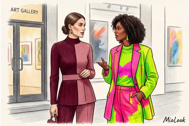
- Complementary contrast (colors opposite each other on the wheel - blue and orange, purple and yellow): Conveys maximum dynamism, innovation, and a willingness to take risks. Ideal for startup pitches or creative presentations. Looks bold.
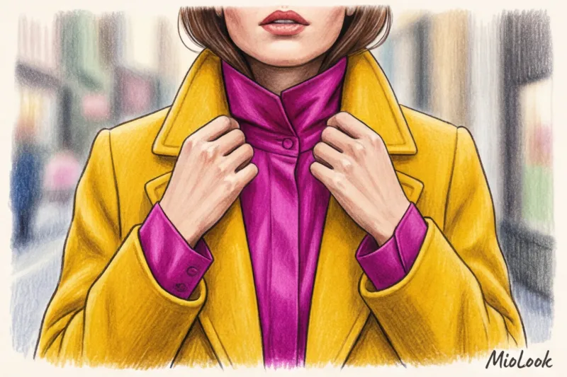
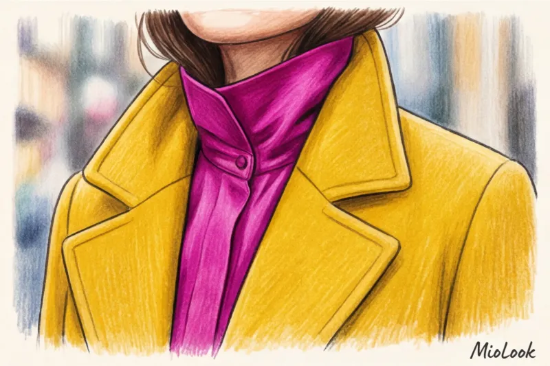
- Analogous contrast (adjacent colors are fuchsia and red, blue and green): Creates the impression of creative yet controlled energy. The brain perceives this combination as complex and "precious." It's the choice of art directors and top managers in the creative industries.
- Contrast in saturation (neon paired with a muted, “dusty” shade of the same color): This indicates a complex, multi-layered personality prone to deep analysis. If you show up to negotiations in a dusty pink suit with a neon crimson top, you'll be perceived as a strategist who knows how to place emphasis.
Try MioLook for free
A smart AI stylist will select the perfect look based on color contrast theory specifically for your wardrobe.
Start for free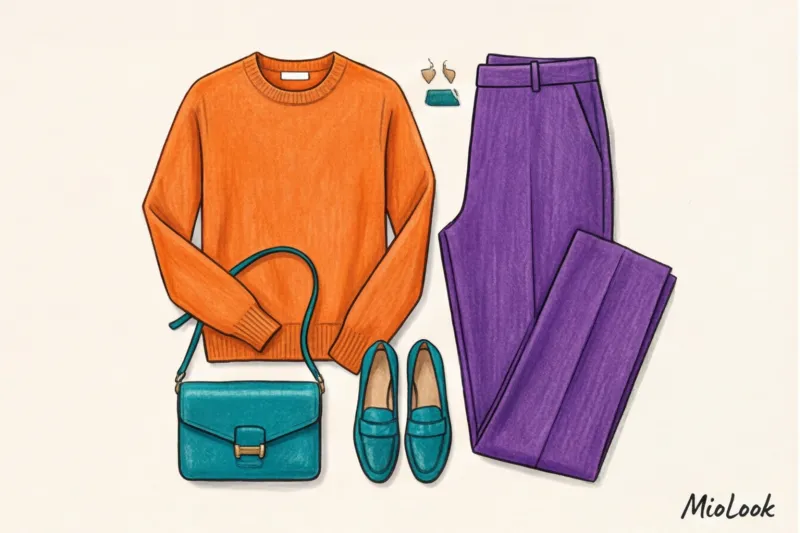
Optical Illusions and Eye Control: Hacking Your Look
Remember: where two contrasting colors meet, that's where the other person's gaze will stop. This is the "horizon line" rule. If you wear a white shirt and black pants, you're cutting your figure in half at the waist/hips. If that's not the area you want to draw attention to, you've got a problem.
As a stylist, I constantly use optical illusions of color blocking:
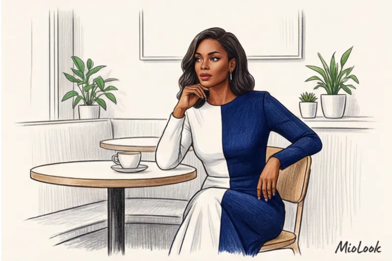
- Vertical color block: Two-tone dresses (where the left and right halves are different colors) or an unbuttoned contrasting jacket over a monochrome base. This doesn't just elongate the silhouette a couple of sizes; it's subconsciously read as a core and authority.
- Focal Point Control: Research shows that 70% of a person's visual attention is unconsciously focused on the line of maximum contrast. Wear a smart navy suit and fuchsia shoes. During difficult negotiations, your opponent's gaze will periodically "draw" to your shoes, giving you a psychological advantage and seconds to consider your response.
MioLook's Checklist: How to Incorporate Contrast into Your Basic Wardrobe Without Stress
If you're used to a total beige look, don't immediately dress up in a parrot costume. A smart approach to style requires a system. I recommend using an algorithm similar to the "smart wardrobe" feature in MioLook:
- The 80/20 Rule: Your look should consist of 80% neutral base and only 20% two contrasting accents. For example, a gray trench coat, jeans, and two bright pieces—an orange sweater and a green scarf.
- The secret of a uniform texture: This is a crucial rule that's often forgotten. Contrasting colors should clash on fabrics of similar weight. Avoid mixing fine, flowing silk with coarse drape in the same block. Ideal color blocking is achieved on matte, dense materials—for example, heavy cotton (180 g/m² and above) with the same cotton.
- Keep contrast away from your face: If you're unsure whether bright neon suits your color type, use it on the lower half of your figure (pants, skirts, shoes). Keep the area around your face to a complementary, but softer, shade.
Your perfect look starts here
Join thousands of users who look flawless every day with the MioLook app. Upload your items, and the AI will create contrasting looks.
Start for freeColor Blocking Mistakes: When Color Psychology Works Against You
Let's be honest: color blocking doesn't always work. There are strict visual ecology constraints, and if you violate them, you turn from a stylish expert into a source of irritation.
RAM overload. The human brain can comfortably process a limited amount of visual information. More than three active colors in a single image (not counting the basic black/white/gray) cause visual fatigue in the viewer. The person you're talking to will begin to unconsciously avoid eye contact with you simply because their eyes are tired.
Ignoring context. The stark contrast of red and black has historically been interpreted as anxiety, danger, and aggression. Wearing this combination to negotiate a salary increase or resolve a conflict means you'll fail before you even open your mouth.
Controversial proportions 50/50. Never divide your figure by color in equal proportions. Equal division creates psychological discomfort and visually cheapens the look. Always use the golden ratio: one color should take up about 70% of the area (for example, a suit), and the other 30% (a top or shoes with a bag).
Summary: Your Experience Control Panel
Color blocking is far from just a fashion trend from the '60s or '00s. It's a highly precise focus-management tool that works equally well for outrageous leaders and quiet introverts looking to deflect attention.
Now for a practical exercise: analyze your closet today. Find two items in clean, contrasting shades (even blue jeans and a bright yellow sweater) and try to put them together for Friday. Gauge your mood and the reactions of your colleagues. Color is energy, and geometric contrast is your control panel for directing that energy.